Futura's Agua Bendita Mezacal designs celebrate rule-breaking and defiance of norms
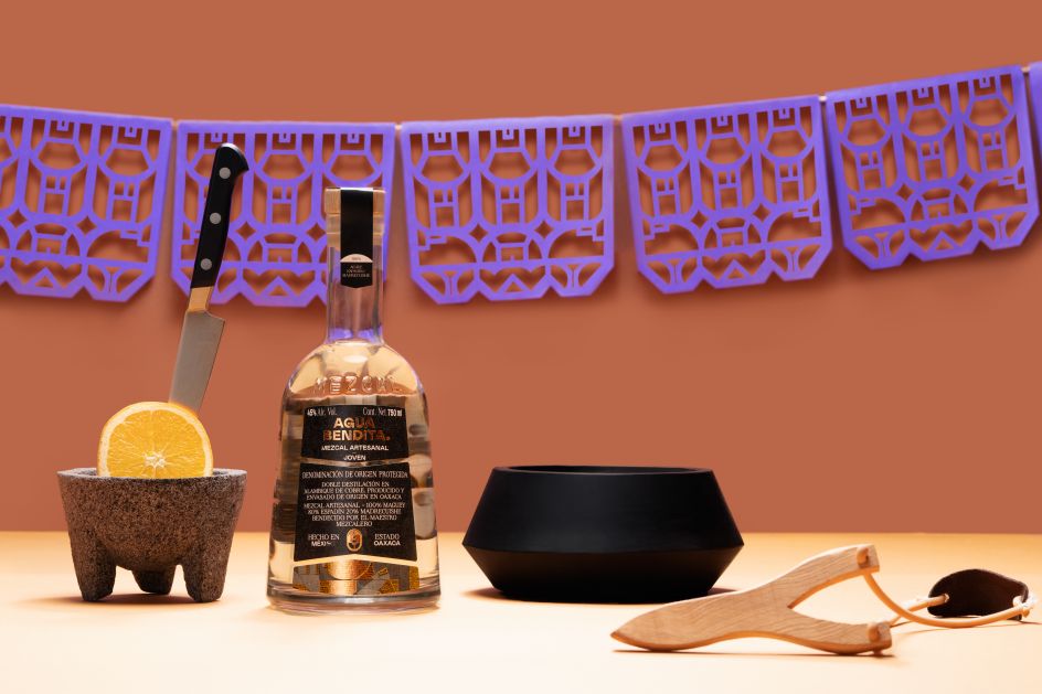
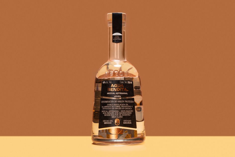
Mexico City-based design and branding studio Futura has created the branding and packaging for Agua Bendita, a mezcal brand made in Mexico.
Agua Bendita mezcal was founded as a drink "dedicated to those who defy traditional norms. So the brand positioning looks to appeal to "adventurous souls", says Futura, so the branding aims to underscore the idea of working against tradition.
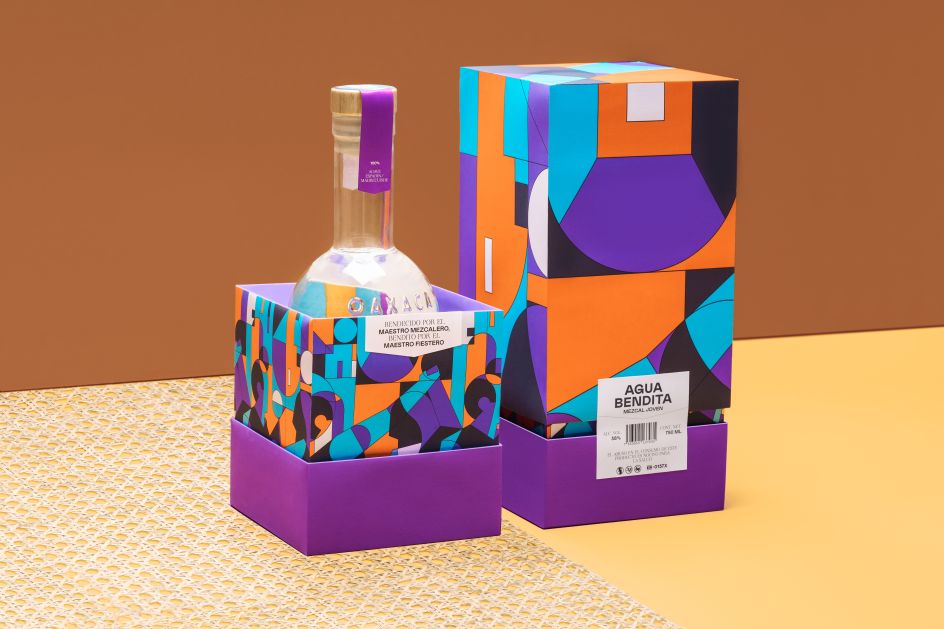
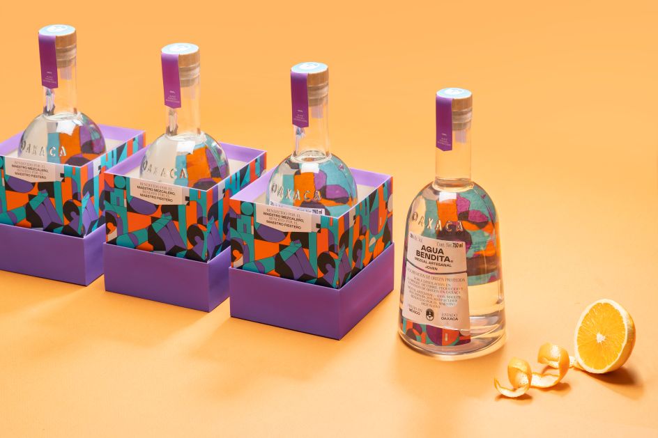
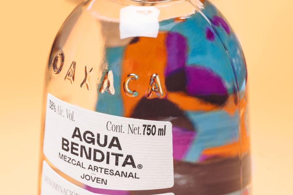
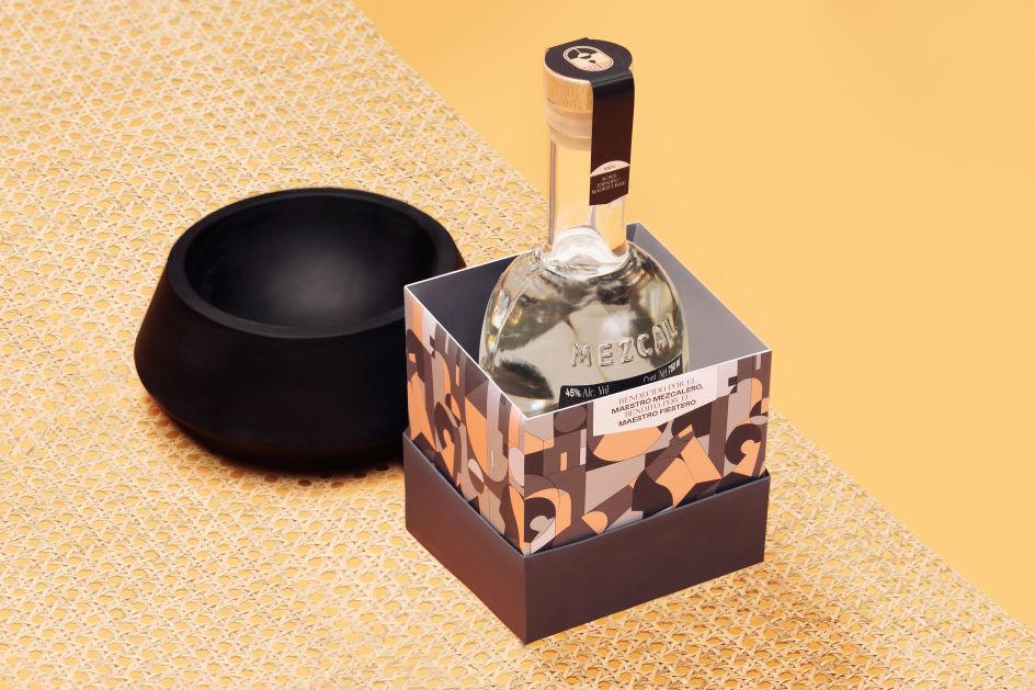
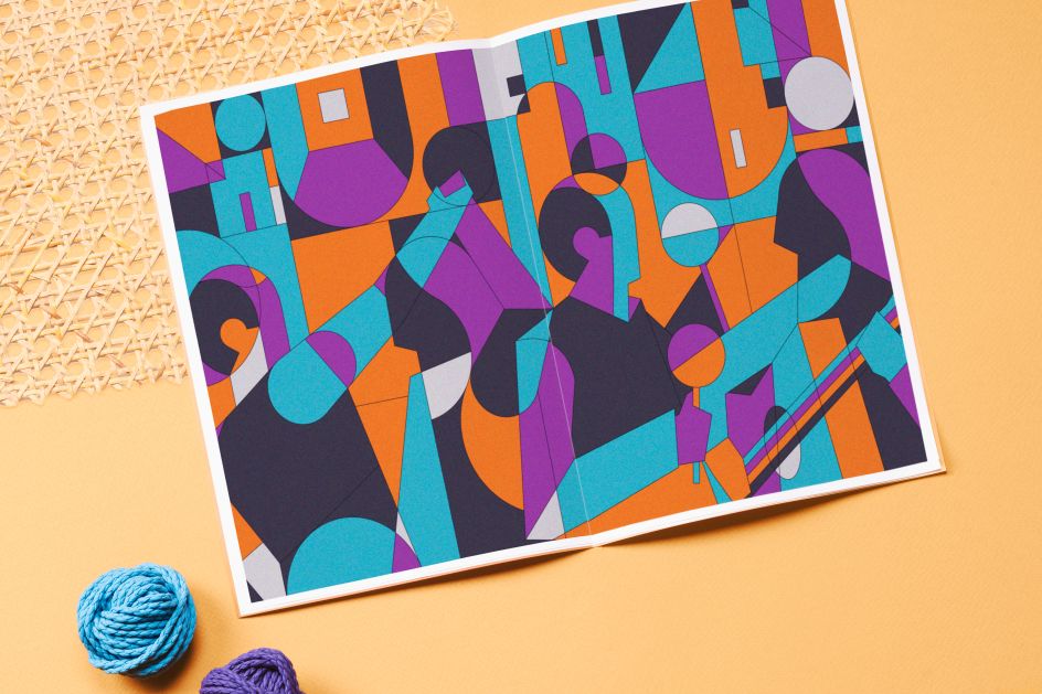
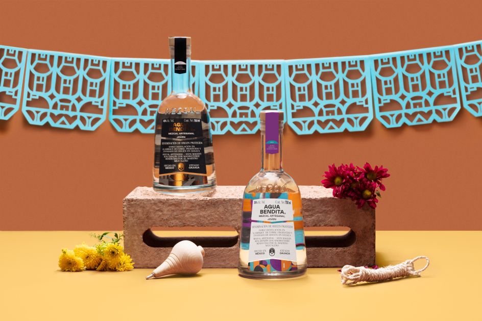
"We created a visual system that illustrates the values of the brand, breaking with the rules of traditional mezcal," continues Futura. The Agua Bendita designs have a playful feel, with one variation using vibrant purple, blue and orange in outer packaging through abstracted shapes formed into patterns that have multiple possibilities for variation.
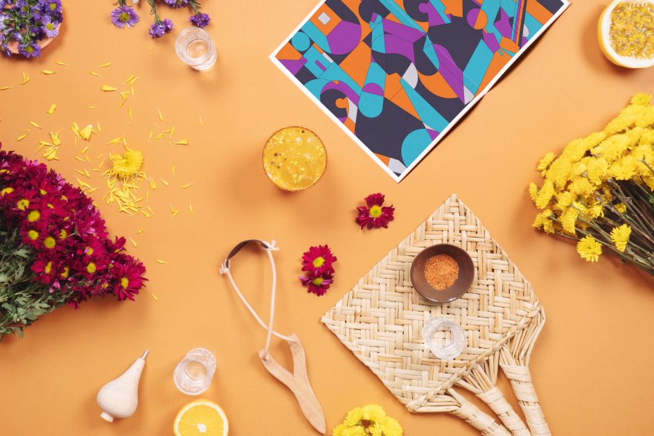
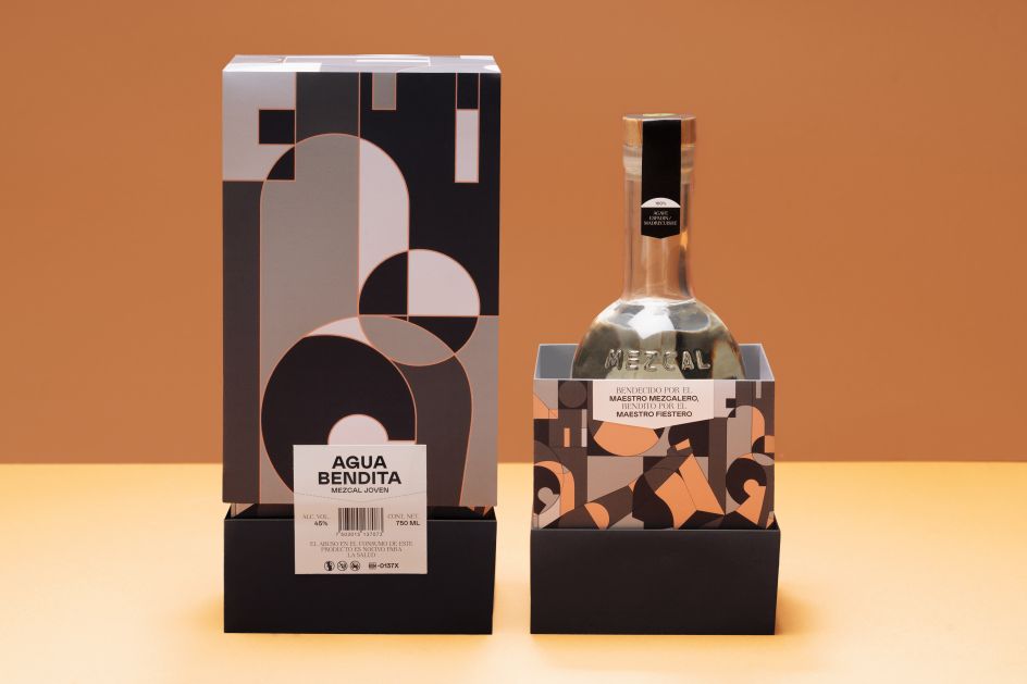
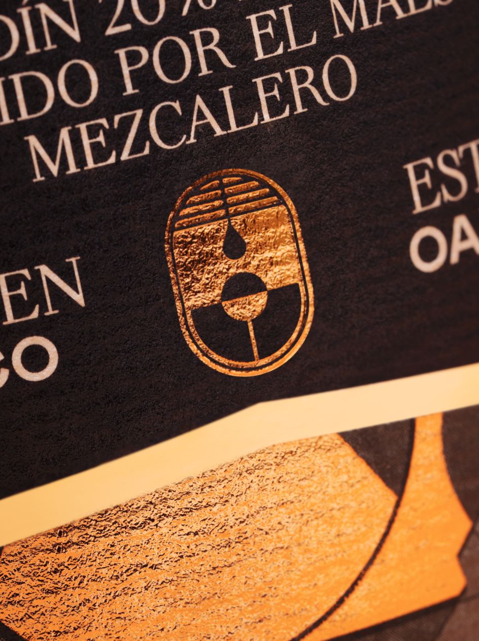
Another iteration pares it back with shades of grey and orange using the same patterned forms that are based on symbolism drawing from Mexican religious narratives. These "open a way to experimentation and celebration, because blessed are those who defy common and current norms," says Futura.
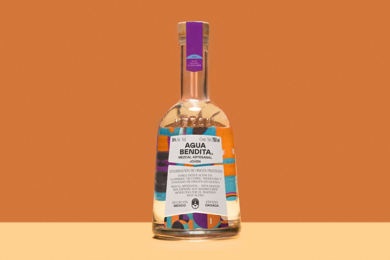
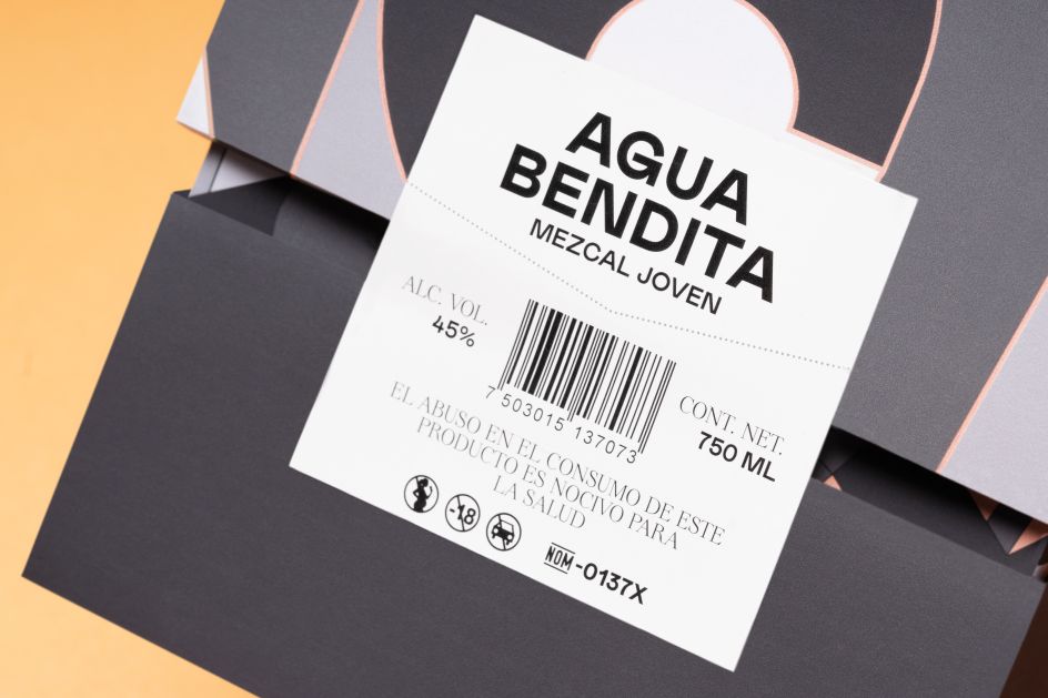
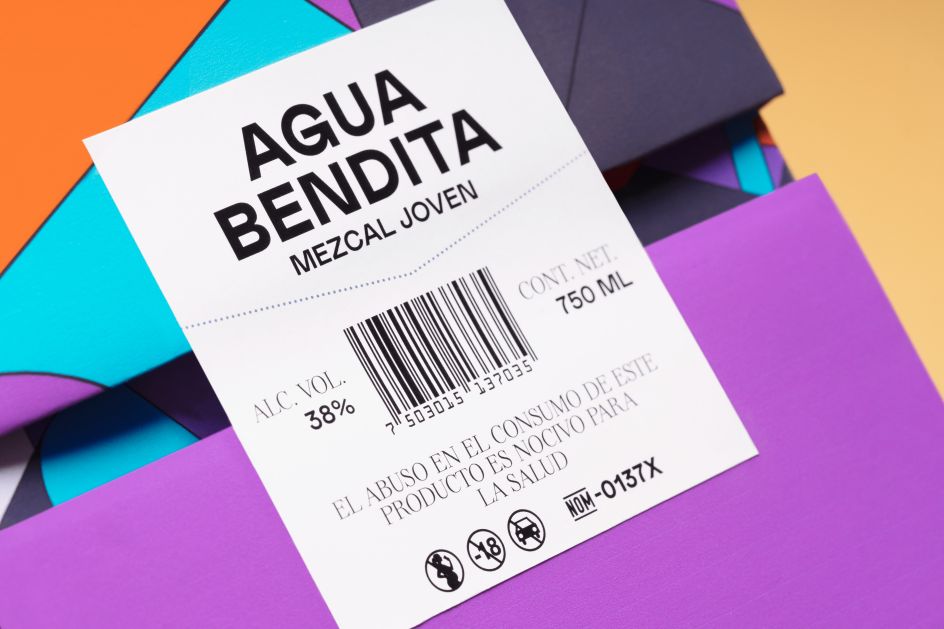
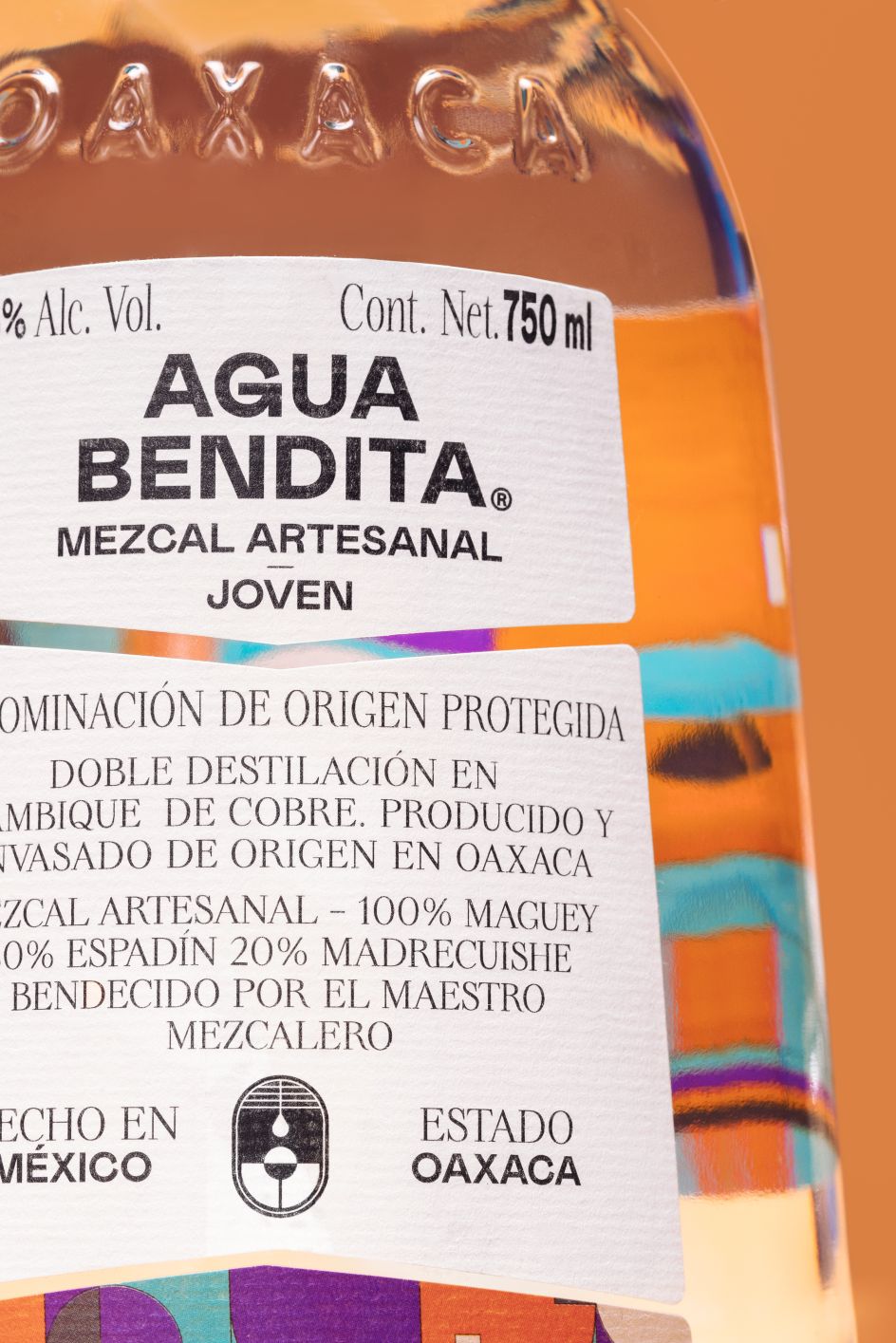
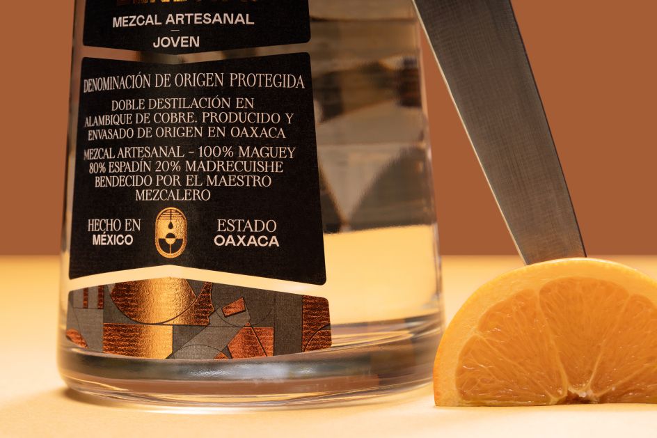
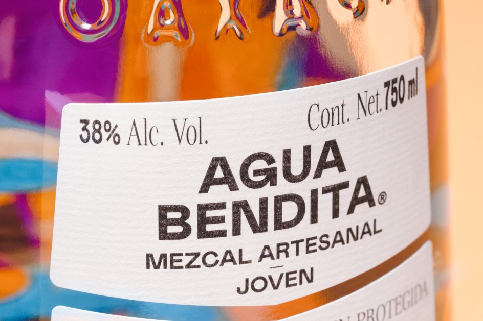
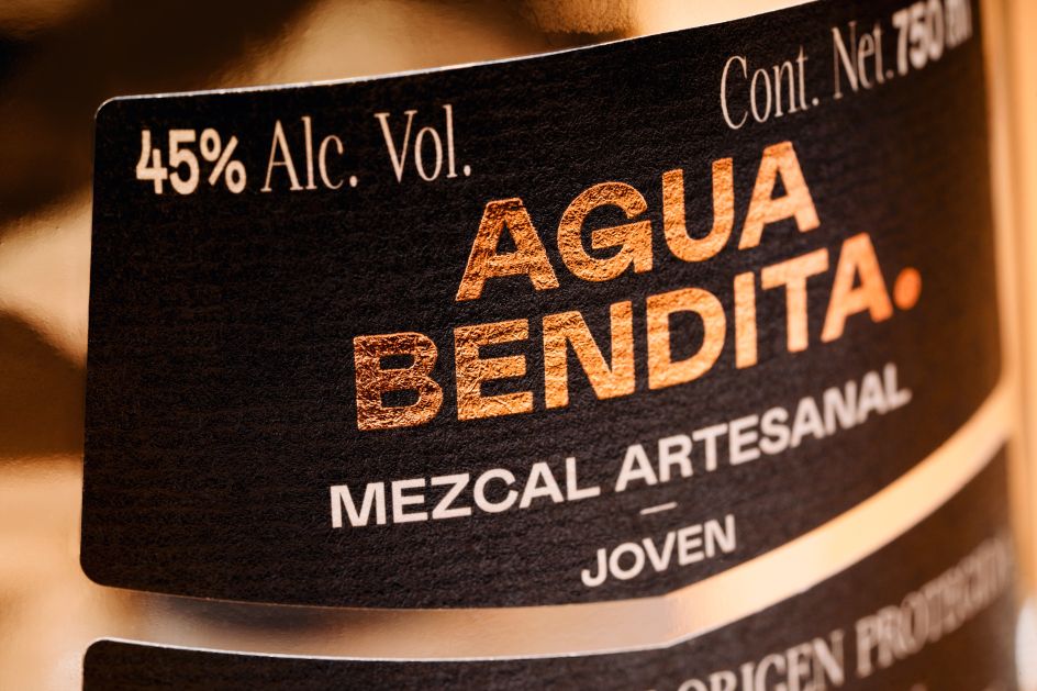
The labelling uses a simple typographic approach, giving the overall branding a sense of balance despite its defiant insistence on rule-breaking. The wordmark uses a bold, quirky sans serif; with further text in a lighter all-caps serif that's equally off-beat.
The structural packaging, too, mixes modernity and classic style; using a bell-like shape and embossed type to create a sense of solid, confident sophistication and innovation.
Editor's Picks


Trending

Podcasts


Editor's Picks
Further Reading