A new book designed by Span pays homage to lowrider culture
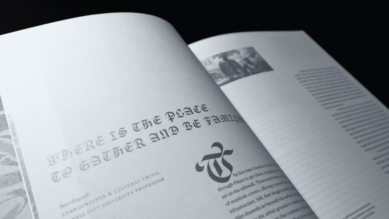
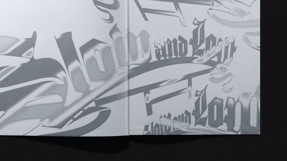
Slow & Low uses a blackletter typeface from Sharp Type called Respira, which resonates with the aesthetics of both lowrider and Chicano cultures.
Chicago-based studio Span has designed a retrospective book of Chicago's Lowrider community titled Slow & Low, featuring custom lettering and photographic compositions that "evoke a film-like cadence".
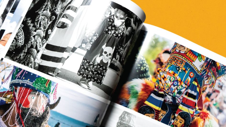
Lowrider culture emerged in the 1940s, created by Mexican-American veterans whose customised, lowered-body cars became an extension of their personalities. Lowrider car clubs were prominent during the mid-20th century and remain a part of Chicano, Mexican, Aztec, and classic car culture.
Slow & Low was originally founded in 2011 as an annual Chicago street festival but has since grown to a high-profile event with over 10,000 attendees. Navy Pier – one of the largest tourist destinations in the Midwest – has hosted the festival for the past two years, as people come from far and wide to celebrate Lowrider culture in a tour-de-force of gravity-defying, candy-coloured rebuilt classic cars while also enjoying Chicano, Mexican, and Aztec art and performances.
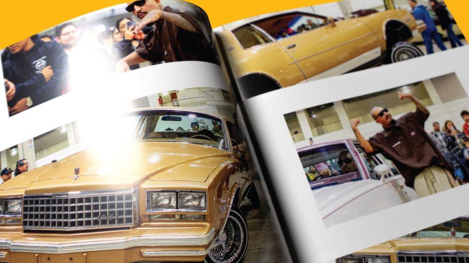
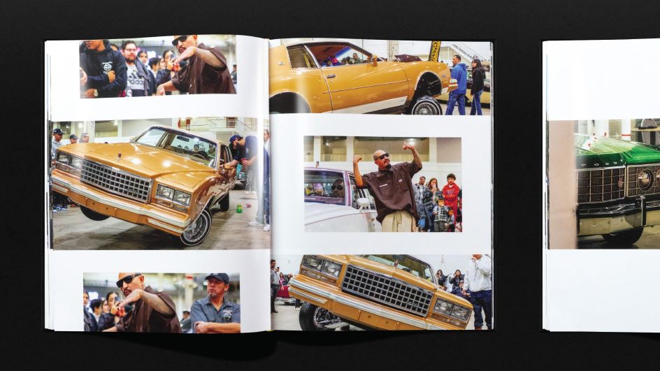
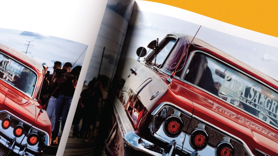
Although lowrider culture is closely linked with its birthplace - Los Angeles, California – vibrant hubs of lowrider communities have emerged in Tokyo, Jakarta, and São Paulo. Slow & Low wanted to create this new book to pay homage to members within the Chicago lowrider community while sharing their presence and stories with communities across the globe. The publication showcases a photographic archive documenting twelve years of Chicago's Lowrider community and a culture of creativity and defiance through the lens of Slow & Low festivals.

Span associate partner Nick Adam grew up in Chicago in the 1990s, among "subcultures of punk, raves and graffiti", as did Slow & Low co-founders Lauren M. Pacheco and Peter Kepha. "Being part of these diverse communities of expression fosters cultural competency and mutual trust", says Adam. "While we have known each other for fifteen years, it was two years ago Pacheco and Kepha approached me at Span to discuss the potential for collaboration in a manner that honours the identity of the lowrider community."
Collaborating with Slow & Low was particularly exciting for Adam, as he feels that subcultures are "frequently overlooked or misrepresented" and that design has the power to "level playing fields, amplify voices, and create artefacts that become part of history". The unfortunate reality is that many cultures and individuals lack access to design, which can lead to historical narratives being skewed in favour of those with the means to preserve their stories.
At the beginning of the process, Slow & Low shared twelve years' worth of photos from their events, taken by fourteen different photographers. Initial discussions focussed on a "desire to diverge from the conventional aesthetic commonly found in car culture and photo books", according to Adam.
He believed that "simply presenting one beautiful image at a time would be insufficient" and that the book had to be able to "surpass traditional norms and delve into a deeper cultural narrative". It had to represent the faith, family, and friendships foundational to lowrider culture.
To create a photo book unique in both content and design, Span ensured that every decision was rooted in the cultural context of lowriding. The Slow & Low book cover and the festival's visual identity use a blackletter typeface from Sharp Type called Respira, which the studio meticulously customised to optimise its use.
"Blackletter was a natural choice, resonating with the aesthetics of both lowrider and Chicano cultures", Adam explains. "This affinity stems from their deep-rooted connection to faith-based traditions, where blackletter is frequently utilised in scriptures or on artefacts."
Blackletter holds significant importance in Chicago's visual culture for similar reasons, which is evident in contemporary symbols such as the White Sox logo, which evolved to become one of the most iconic visual identities in hip-hop and lifestyle aesthetics.
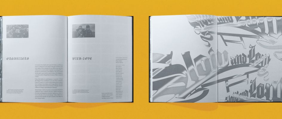
The body of the book is set in Canela, a typeface designed by Miguel Reyes at Commercial Type, chosen by Span for its contrast and delicate flairs. Adam describes it as having "flamboyance and grace, reminiscent of a lowrider," sitting between serif and sans serif and defying traditional classifications.
"In conventional book design and editorial work, columns typically align to the top, known as hanglines; however, in a nod to the ethos of lowriders, where lowness is a measurable achievement, paragraphs in the Slow & Low book align as low as possible at the bottom of the page", he adds.
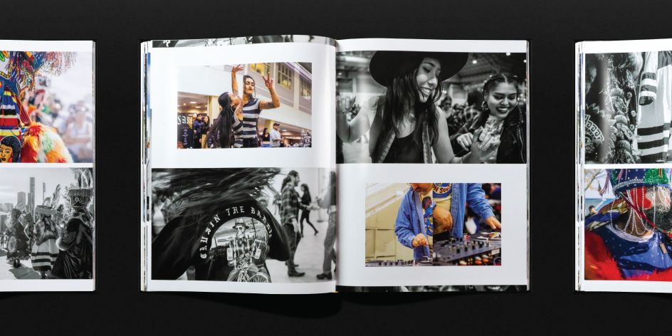
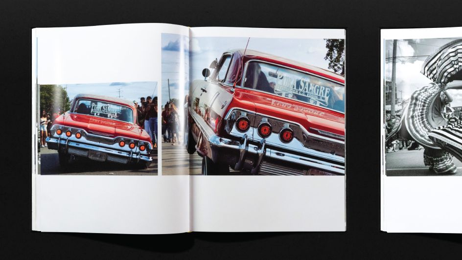
The columns also embody a sense of undulation, mirroring the bouncing movement of a lowrider, as does the book's grid, which Span used for the layout of photos. Adam explains how the "intricate page sequencing system strikes a balance between variation and repetition", highlighting shifts in perspective and establishing contextual relationships.
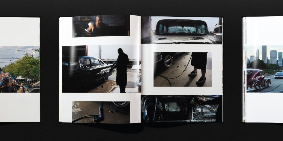
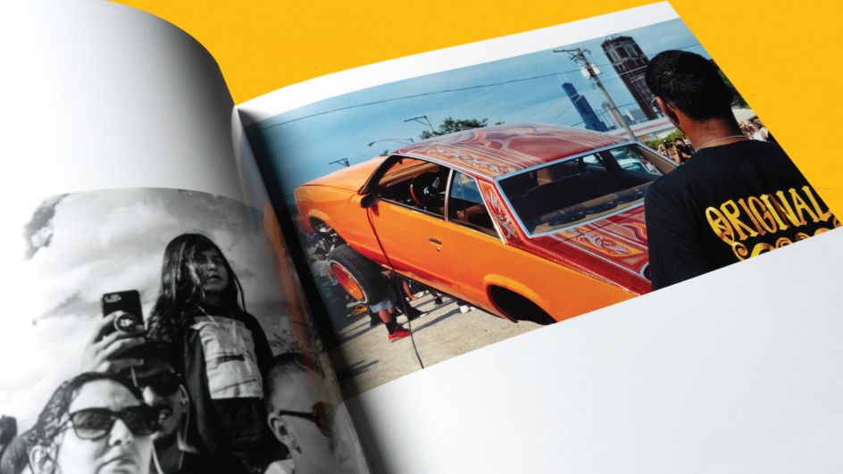
"As the reader progresses from page to page, the photographic compositions evoke a film-like cadence. Through zooming and varying angles, viewers are immersed in a sensory journey, akin to the experience of watching lowriders cruising down the block", he says.
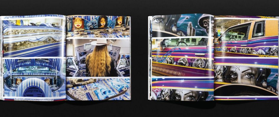
The book's front and back covers use metallic silver ink with a luminescent quality that resembles the shine of lowrider cars and their chrome work. Span intentionally employed a one-colour printing process for these sections to reduce printing costs while enhancing quality.
The full-colour pages are printed on glossy sheets, and each photograph has a spot gloss coating, intensifying the vibrancy and depth of the colours and evoking "the vivid, candy-coloured aesthetics of lowrider paint", says Adam. "The cover is rendered in black and white, reflecting a nuanced understanding of the lowrider community. This choice fosters inclusivity and respect by avoiding favouritism towards any specific colour palette embraced by individual car clubs."
Editor's Picks


Trending


](https://www.creativeboom.com/upload/articles/86/862919952c0ad18439004228895a431dc6e45ffc_732.jpg)


Editor's Picks
Further Reading