Erik Spiekermann on breathing new life into unfinished fonts, not working for assholes and how nothing comes for free
Erik Spiekermann is undoubtedly one of the best-known typographers and designers in the world. With his notable identities for Audi, Volkswagen and Bosch, and his hugely successful redesign of The Economist, his influence on contemporary graphic design is undisputed.

All images courtesy of Adobe
Loved and feared in equal measure, he is an honorary professor at the University of the Arts Bremen and ArtCenter College of Design and an outspoken figure and design critic. He is also founder of global branding firm MetaDesign and FontShop. His two of his typefaces, FF Meta and ITC Officina, are considered to be modern classics.
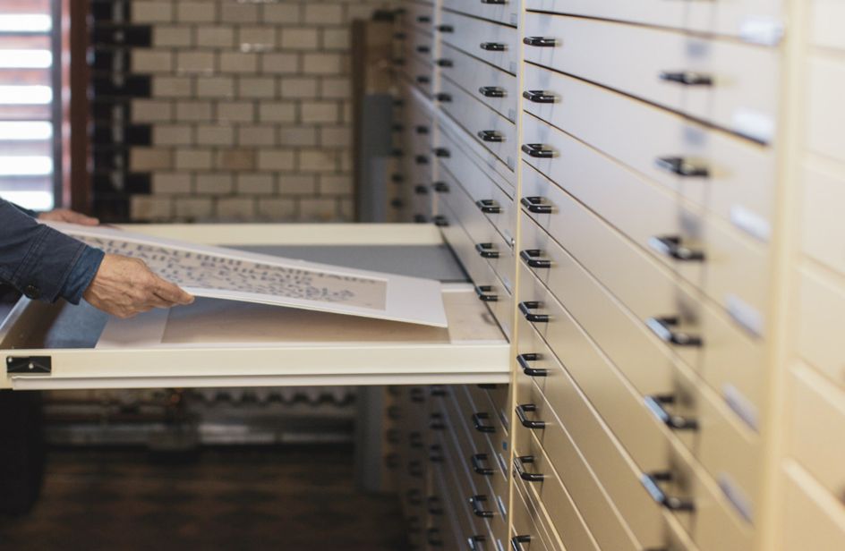
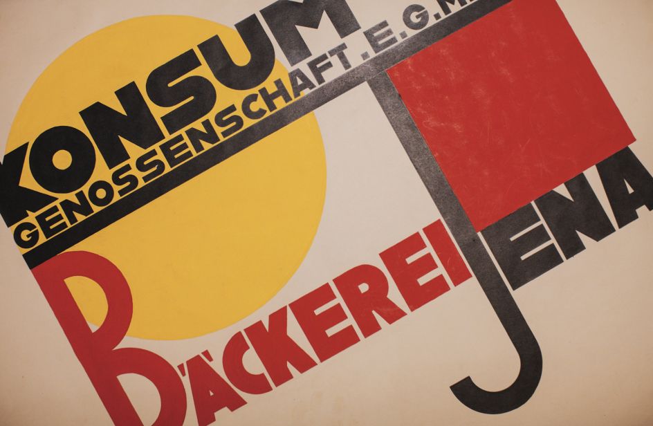
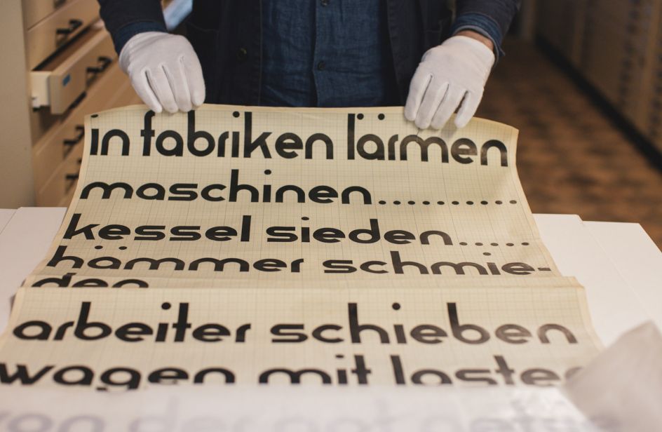
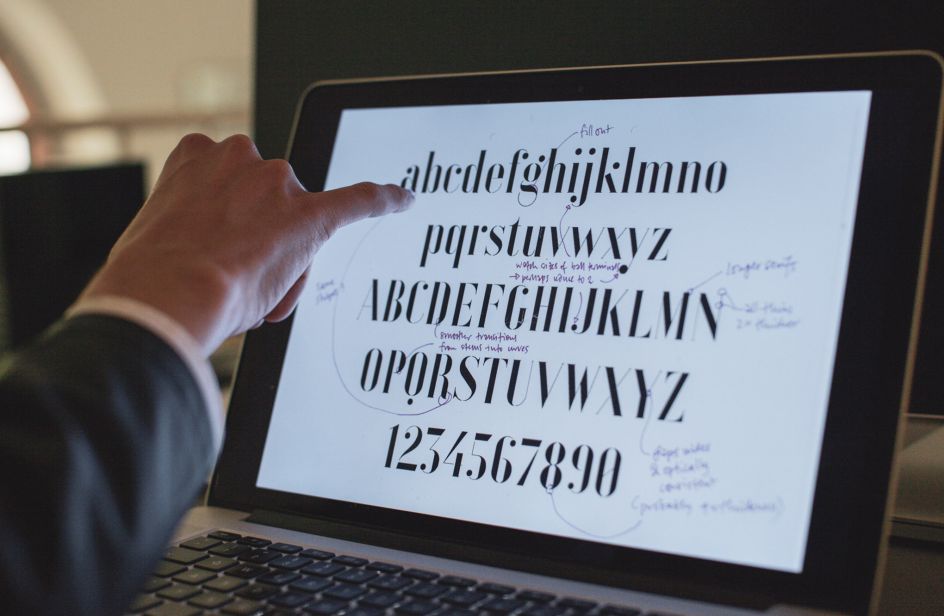
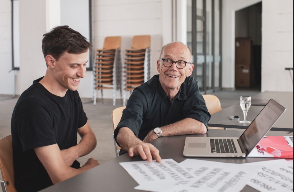
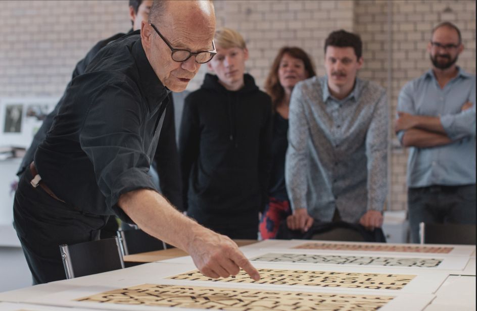
It seemed perfectly natural, then, for Adobe to call on Spiekermann to help breath life into some unfinished fonts from legendary Bauhaus design masters, lost for nearly 100 years. The Hidden Treasures Bauhaus Dessau is a remarkable project in which century old, unfinished typography sketches and letter fragments were discovered and completed to inspire a new generation of artist.
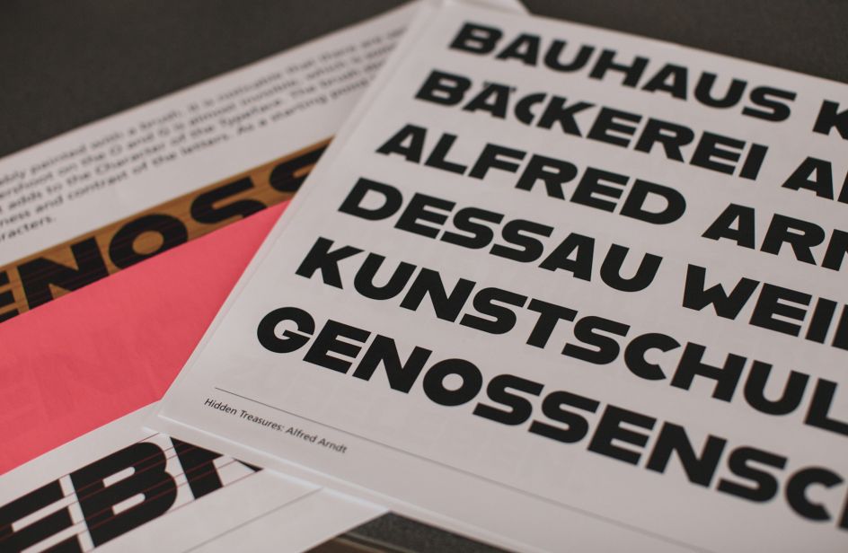
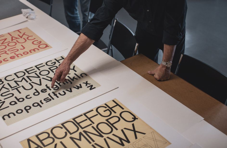
Bauhaus Dessau, the world-famous school of design, was closed in 1932 by the National Socialist Party leaving behind unfinished masterpieces, created by legendary designers; Xanti Schawinsky, Joost Schmidt, Carl Marx, Alfred Arndt and Reinhold Rossig. In collaboration with the Bauhaus Dessau Foundation, Adobe set out to complete and digitise the unfinished work into font sets to enable people to use the historic alphabets.
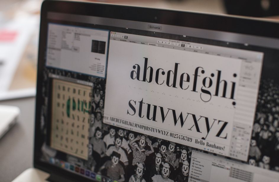
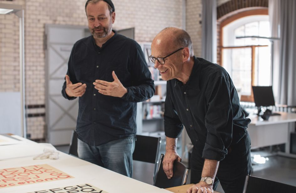
Spiekermann headed the process of turning the fragments into completed Typekit font sets, leading an international team of typography professionals and design students to calculate detailed probabilities of the shapes in an effort to deduce how the Masters originally planned to finish their designs.
Using this data, the team used Adobe Illustrator CC to complete and digitise the font sets – which are available to download for use in Typekit with the remaining fonts made available over the coming months. We spoke to Spiekermann about this and a little more.
How did you go about transforming these discoveries into complete font sets?
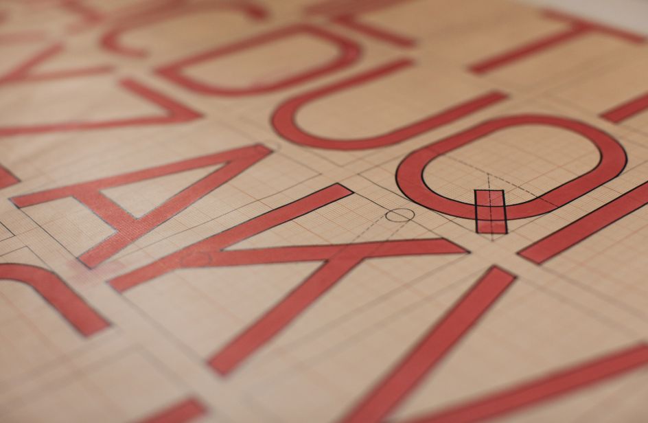
Some (most) of the Bauhaus exercises were about fitting the Roman alphabet into a geometric grid. We understood that this method will not yield legible type, so knew that we had to deviate quite a bit at times.
Sometimes, we had to deal with optical issues like the thickening of strokes where two meet, diagonals that appear thicker than vertical strokes (they have to be thinner to look the same). In other instances, we had to ignore some of the attempts to make legible letters rather than geometric shapes inspired by letterforms.
The sketches were all quite naive when it came to these issues. We wondered what the students might have done, had they had access to these digital tools. But we had to stay in the background and not impose our taste or will onto those original ideas. A type designer needs to be modest and not show off how good he or she is and what tricks they have up their sleeve.
Do you have a favourite set out of the bunch? Can you tell us why?
I do, but I’m not telling, that would be unfair.
Did you run into any brick walls? What research did you carry out to complete the sets?
No walls. No research. we’re all type designers and know what it takes to get from early sketch to finished font.
How do these font sets compare to what is being created today?
They’re made with the same tools, so technically there is no difference. And lots of people have had a hand at emulating the Bauhaus "style".
What can we learn from these masters of the past?
Designers have the unique talent to visualise their ideas. Sometimes sketches can be beautiful in their own right, even if they weren’t intended as art and even if they were never turned into a useful product.
Many font sets have become free and more accessible because of resources like Google Fonts. Is this a good thing, in your opinion?
If you install a Google font on your server, Google knows everything about the documents you make with those fonts. There is no such thing as a free product and certainly no free fonts unless they’re stolen. Why do you think Google would give away anything?
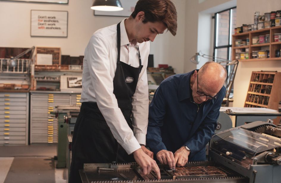
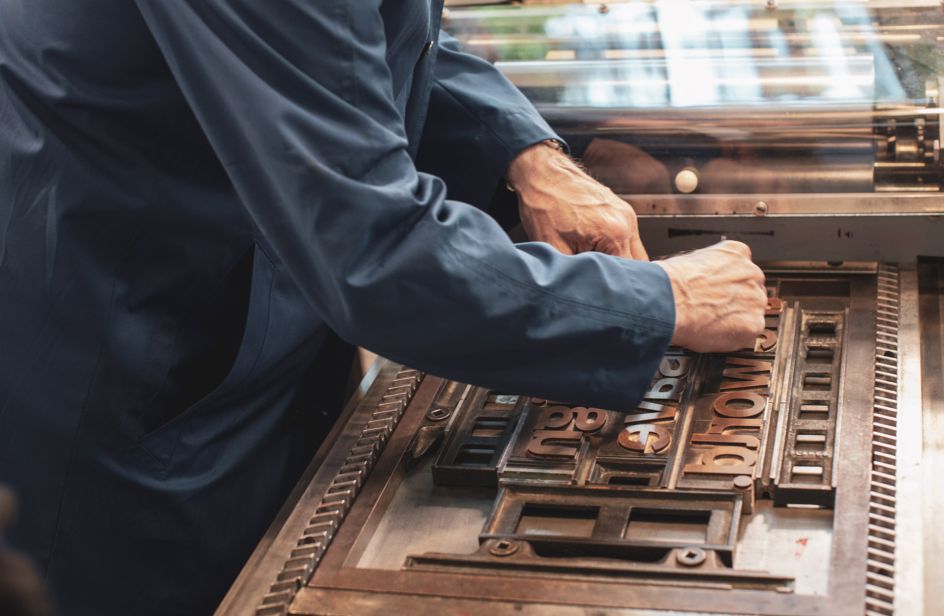
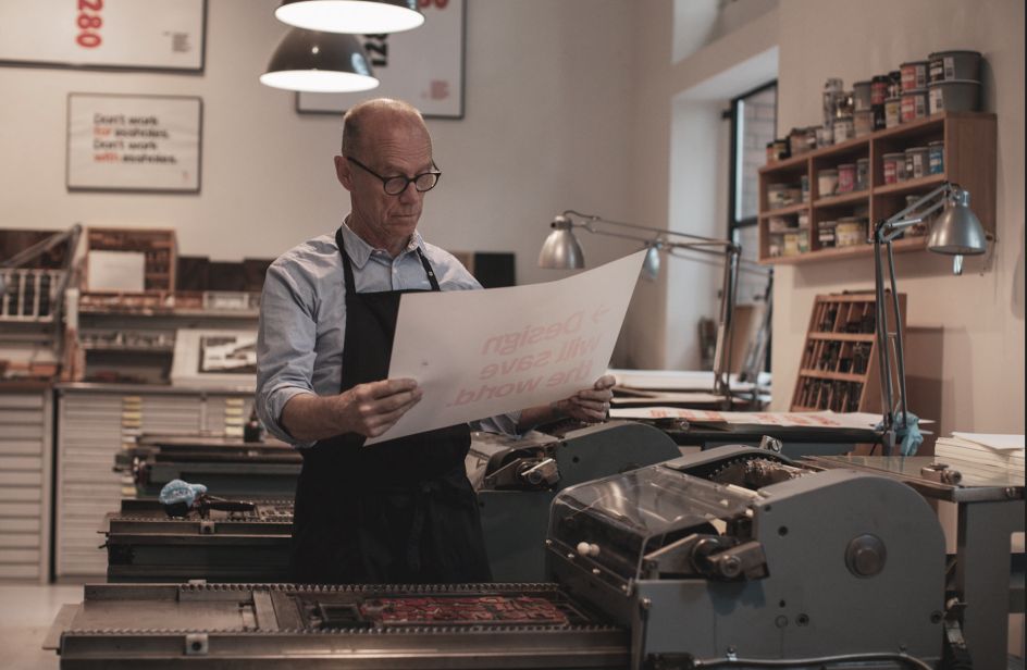
You've done your fair share of traditional letterpress in recent years. How important is it to hold on to past technologies?
My aim is to preserve the knowledge because it is part of our history and culture. The machines will outlast all of us but very few people know how to use them.
Setting type, making type, printing letterpress makes you aware of limitations. Constraints are useful. We have 16.7 million colours on our screens and a few 100k fonts available. That is frightening.
Having fewer choices is refreshing. So is slowing down. It’s like making your own food rather than eating from a cardboard box. It’s also quite romantic to make something by hand that didn’t exist before.
Could more be done at university to encourage designers to use traditional letterpress?
Yes. Schools are now looking to buy equipment that they threw away 15 years ago.
Is there any more modern technology that you like to use?
We built ourselves a laser setter that makes plates for letterpress printing directly from our data, without negatives or anything else. These plates are thus digitally produced, but printed on Heidelberg presses from the '20s or '50s. We also have laser cutters, a CNC router, a Risograph, etc. We practise Post-Digital Printing. Our motto is Preservation through Production. We certainly are no Luddites.
With such a successful career so far is there anything you feel you haven't achieved?
Lots.
Is there any work you've seen lately that has made you smile?
Those five typefaces that the students made so quickly and in such good spirits.
You've always advised that we should never work with assholes. What other pearls of wisdom can you share with our audience?
Never work "for" assholes either.
What's currently bugging you about the industry? What would you like to see change?
We used to demand that our clients would have a strategy before they commissioned design work, (I spent a few decades doing branding work for brands like Audi, VW, Bosch, German Railways, Silicon Valley Bank, et al). Now everybody and their mother spends months and millions doing design thinking and strategy like mini McKinseys.
But, in the end, it all looks the same. Their exclusive fonts are all Helvetica derivatives, blue is the house colour and the websites all reflect the latest tools used. You can tell whether they were made with Rails or Squarespace or WordPress etc. I want design back to make things easy to use as well as beautiful to behold.
Find out more about Adobe Hidden Treasures and download the completed fonts to use in Typekit for your next projects. Our special thanks to Adobe and Erik Spiekermann.


 using <a href="https://www.ohnotype.co/fonts/obviously" target="_blank">Obviously</a> by Oh No Type Co., Art Director, Brand & Creative—Spotify](https://www.creativeboom.com/upload/articles/6e/6ed31eddc26fa563f213fc76d6993dab9231ffe4_732.jpg)
 by Tüpokompanii](https://www.creativeboom.com/upload/articles/58/58684538770fb5b428dc1882f7a732f153500153_732.jpg)


