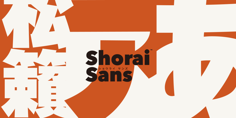
Shorai Sans: new Monotype font creates harmony between Latin and Japanese letterforms
Global brands that use Latin and Japanese letterforms can now achieve greater consistency thanks to Shorai Sans, a new type family from world-renowned type studio Monotype.
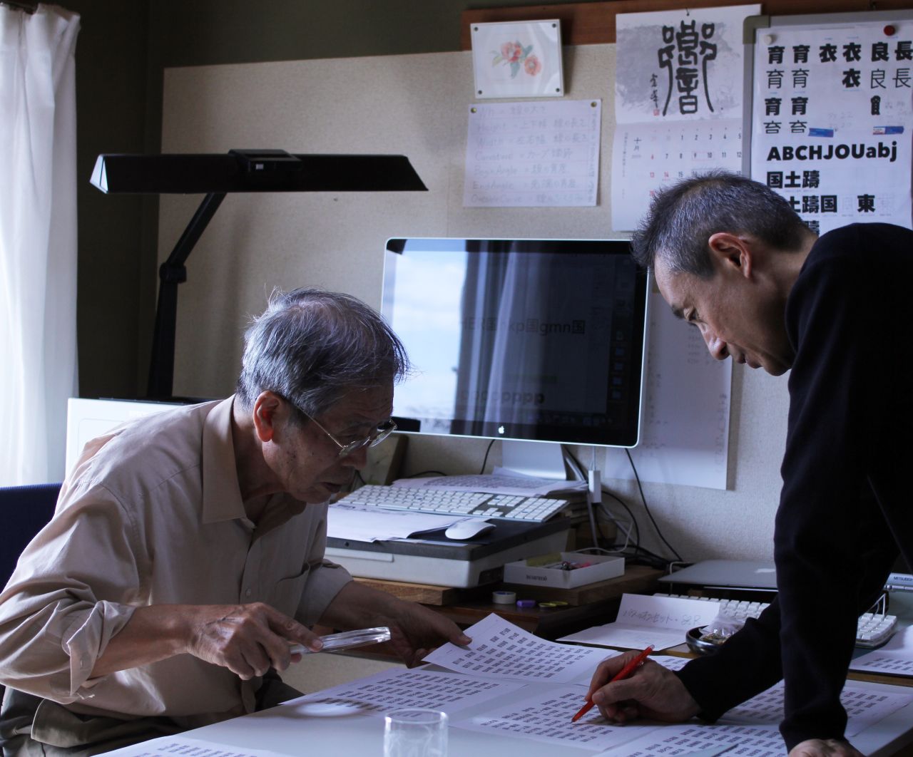
Creative Type Director Akira Kobayashi, Type Designer Ryota Doi, and typography legend Yukihiro Nakamura. Image courtesy of Monotype and the designers.
Designed by Creative Type Director Akira Kobayashi, Type Designer Ryota Doi, and typography legend Yukihiro Nakamura, the set expands on Monotype's previous Japanese range, Tazugane Gothic.
Taking its name from the Japanese word 'Matsukaze', which means 'the sound of the wind blowing through pine trees' and the noise a boiling kettle makes in an accompanying tea ceremony, Shorai Sans hints at the delicate balance this font strikes between traditional techniques and modern forms.
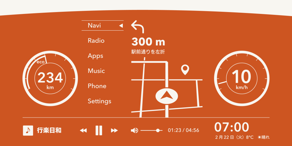
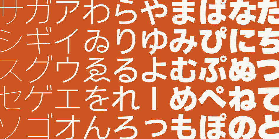
Geometric and well-balanced in appearance, Shorai Sans was deliberately designed to create excitement in the Japanese type industry. Targeting technology-based brands as well as pharmaceutical, healthcare and telecommunication companies, the type family will appeal to all sorts of professional services and audiences thanks to its crisp appearance and variety of line weights.
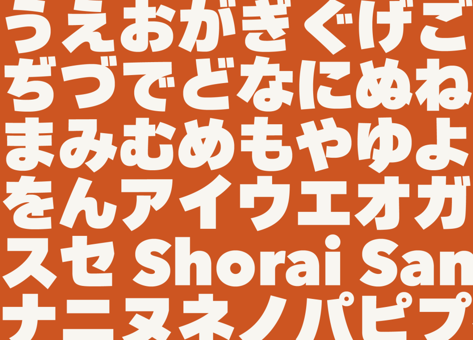
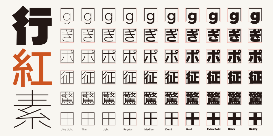
Another area in which Shorai Sans triumphs is the consistency it achieves between Japanese and Latin letterforms, which is no easy feat. According to Creative Type Director Akira Kobayashi, Japanese font characters generally consist of kanas, Kani and Latin glyphs. Japanese glyphs are designed almost full size on an em-square, whereas Latin characters do not fit these parameters as easily due to their different cases and extenders.
"Because of such structural differences, Western words tend to look much smaller than Japanese in a mixed composition," he tells Creative Boom. "There are two solutions to achieve a more even texture: the first would be drawing a set of Latin alphabet characters with extremely short descenders, and the second would be to combine scaled-up Latin glyphs so that many Western words match the size of Japanese ones."
The first solution is the choice usually taken by most type foundries in Japan, but Akira explains that shortened descenders on letters such as g, j, p, q and y make them less comfortable to read. "We chose the second solution, as we have seen more and more Western words or names used in Japanese text and have felt the high demand for Japanese fonts equipped with decent, legible Latin glyphs."
It wasn't an easy choice, though. The size and baseline of the enlarged Latin glyphs had to be carefully calculated in order to create a comfortable balance with Japanese lettering. "Since we have a huge library of classic Latin typefaces developed over the last 130 years, it is quite natural for us to start developing new Japanese designs inspired by our existing Western font, which had already stood the test of time," Akira adds.
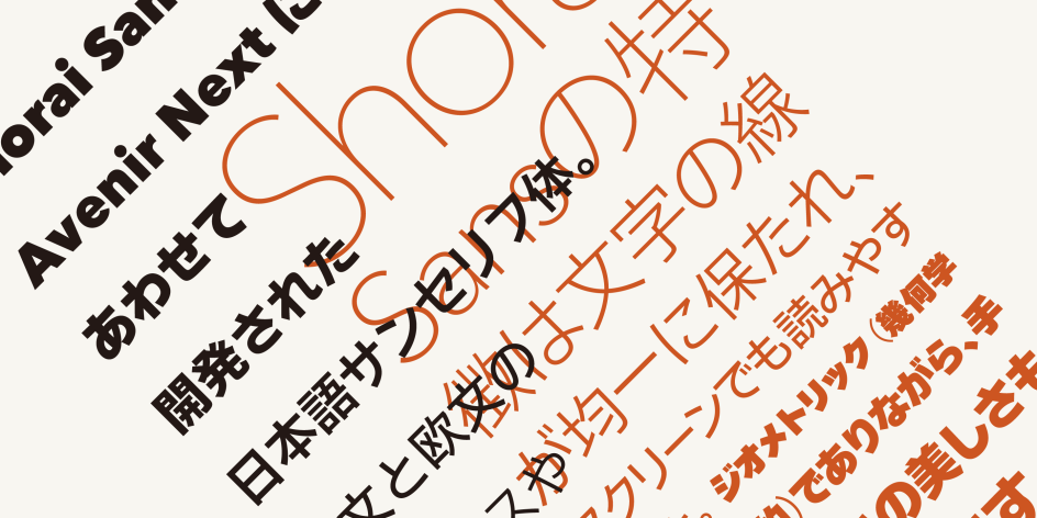
Speaking of existing fonts, Shorai Sans builds on Monotype's Tazugane Gothic, a humanist sans serif font that itself was based on Neue Frutiger. The typeface was a major success and won the 2018 Good Design Award, so it made sense to use it as a starting point. "We decided that our second Japanese type would also be a sans serif," explains Akira. "but this time, we based it on Avenir Next, as we constantly receive requests from customers—especially those in the automotive industries and tech-based companies—for a clean, geometric-looking Japanese typeface."
Tazugane Gothic was launched in 2017 and is part of a series of typefaces that have helped the type foundry gain recognition as a producer of top-quality Chinese, Japanese and Korean script fonts. Generally, these types of fonts include Latin glyphs. However, Akira felt that they fell below the standard of CJK characters. "As a foundry with a long history in Latin type design, we felt the need of types with decent Latin glyphs, which can be useful for a wider audience."
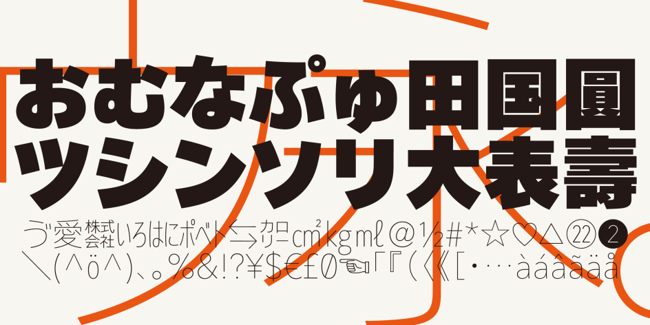
Categorised as 'geometric sans' with a certain warmth to it, the design of kanas in Shorai Sans was originally based around using straight lines as much as possible. "But during development, we found that kanas with very subtle curves were closer to the concept of Avenir," Akira reveals.
Another cultural difference to consider when designing a font that spans languages is the order in which the characters are written. "When we develop a humanist or a traditional-looking Japanese type, we might need to consider the order of the strokes as it mainly affects the appearance of a flowing movement of kana letters, but in this case, we were free from them it," says Akira.
However, the most notable challenge facing the creative team behind Shorai Sans was finding a way to design complex Japanese glyphs that could match the stroke thickness of Avenir Next Heavy. "We had never seen a Japanese sans serif with such massive stroke thicknesses, except for headline fonts," says Akira.
"That's one of the reasons why we asked Mr Yukihiro Nakamura to collaborate on the project. He was a legendary type designer in Japan, known for his achievements on super-thin Japanese rounded sans as well as ultra-heavy sans serif typefaces. As we expected, he provided us with conscientious advice based on his sense of balance which he acquired during his long experience as a sign painter and letterer in the 1960s."
Among the many strengths of Shorai Sans, Akira claims that its characteristic design feature will be the unique treatment inspired by the calligraphic "slurring of strokes." He explains: "When you look at conventional Japanese sans, you'll notice that almost all the stroke beginnings and endings are visible, even in the boldest weight. It creates complex, almost ragged, letterforms.
"We wanted to find a better solution. After many trials and struggles, we found an innovative design treatment—merge some stroke endings into adjacent strokes to achieve massive letterforms without looking too fussy. That was the most challenging but stimulating part of the development."
Shorai Sans is available now for both Eastern and Western audiences to enjoy.
Editor's Picks


Trending


Editor's Picks
Further Reading