Pedro Arilla and Craig Black create a new display stencil typeface inspired by the Renaissance period
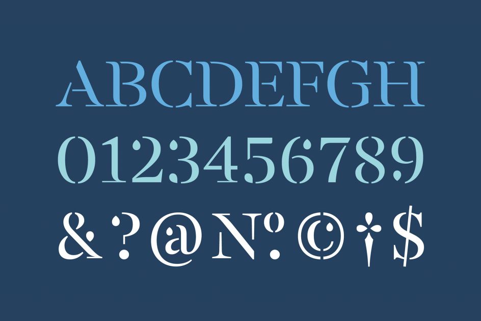
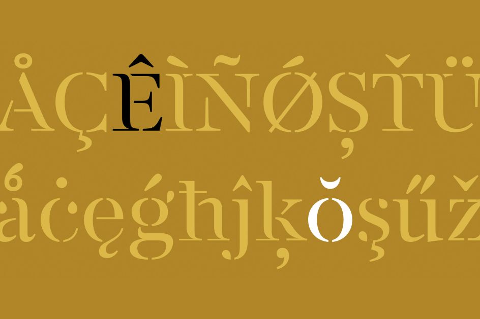
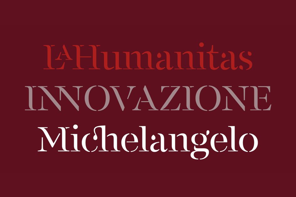
Monotype has just released FS Renaissance, a new display stencil typeface developed by creative type director Pedro Arilla, in collaboration with lettering artist and designer Craig Black.
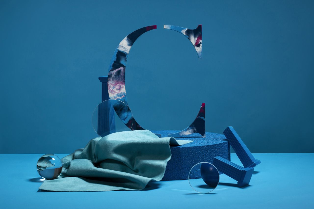
A single style font, it explores "the intersection between art and design" with each letter crafted as a "standalone piece of art while working harmoniously together as a functioning typeface".
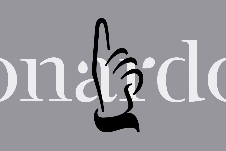
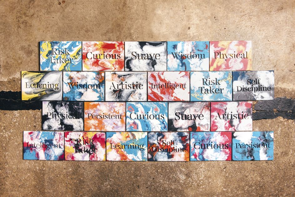
The initial idea for the project came from Craig who had been working on a typeface inspired by the Renaissance period symbolised by flourishing progress in the arts, sciences, learning, and philosophy. He was particularly interested in the so-called 'Renaissance Man/Woman', a term coined in reference to some of the most talented artists, inventors, scientists, and thinkers who were the drivers of the period: such as Leonardo Da Vinci, who was known as a painter but was also a scientist, engineer, and mathematician.
Craig approached Fontsmith (now part of the Monotype Studio) about a collaboration to take his idea to the next level and create a fully functioning typeface. "When I first saw Craig's design it was love at first sight," says Pedro. "I knew Craig's work pretty well and even though I was expecting to be surprised, I didn't see this coming.
"There is something magnificent about it, when I look at it I can see a real fluidity, the letters look like they are dancing with the light. FS Renaissance is a display typeface with elegant contours and an ageless demeanour. Paraphrasing Napoleon: from the heights of these letter-shapes, five typographic centuries look down on us."
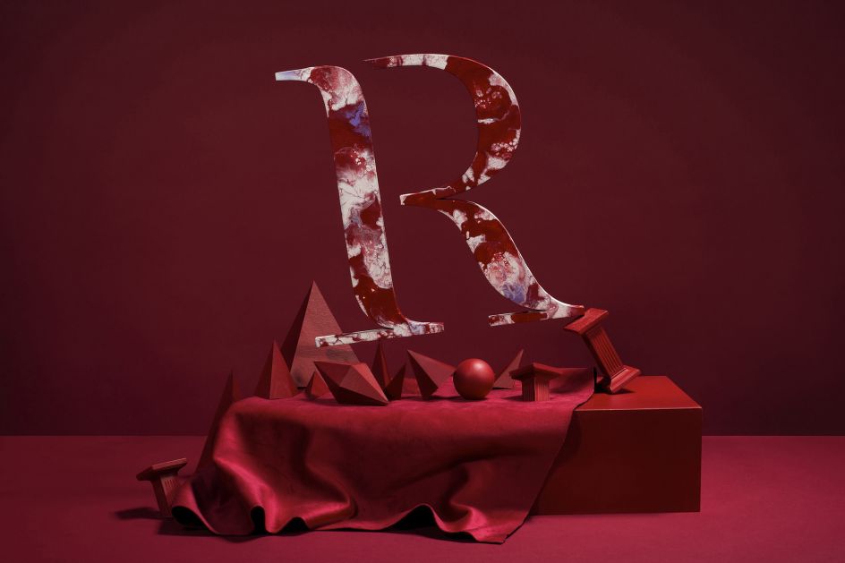
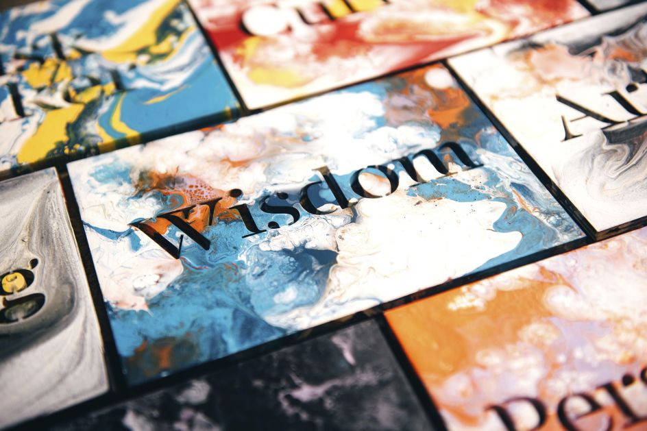
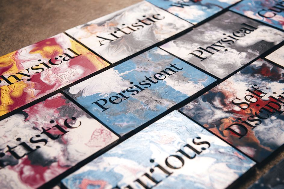
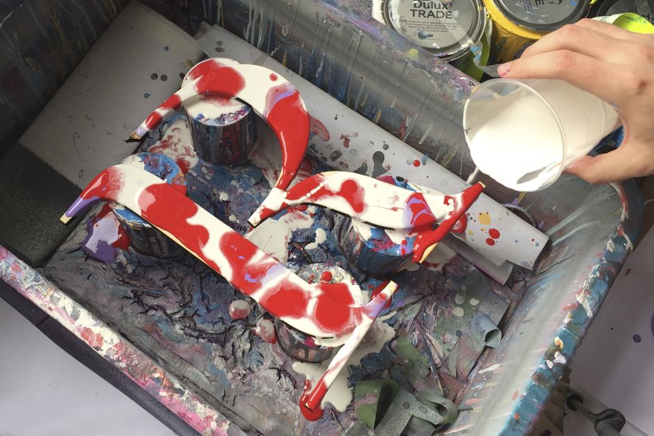
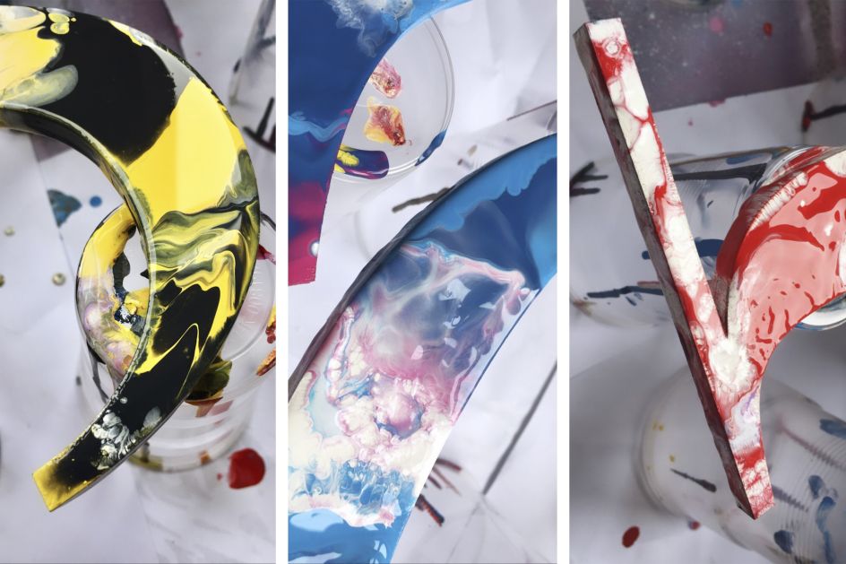
FS Renaissance is not a traditional stencil design: the cuts are not rigid but interactions that are handcrafted between each element, emphasising the idea of a typeface as a piece of art or sculpture.
"Being a modern-day Renaissance man doesn't mean you have to be an accomplished poet or master sculptor,” adds Craig. "Rather, it means being as open to the world as possible and embracing all opportunities as they come your way. It means keeping your mind sharp and your body in good shape, for the mind needs a healthy body to achieve its full potential.
"It means learning as much as you possibly can. It means travelling and seeing the world, experiencing its people, and learning its language. It means not being afraid to be who you are and feel comfortable in your own skin. These characteristics influence my own nature and I wanted to represent this through a typeface, therefore, FS Renaissance was created."
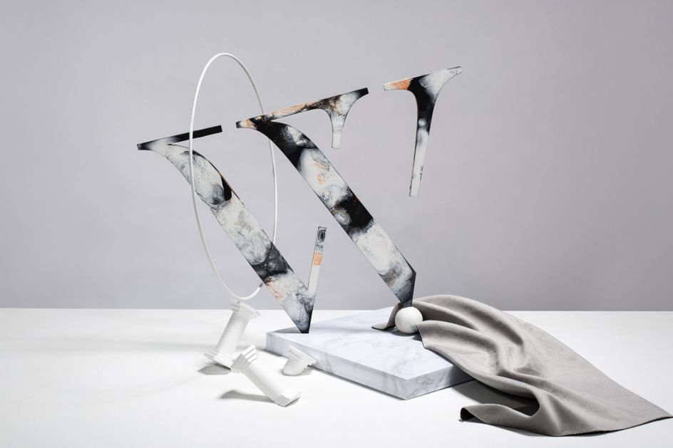
To celebrate the launch of the new font, Craig has created a series of handmade typographic sculptures that were photographed by Susan Castillo. The images encapsulate the spirit of the project, showcasing the letterforms as pieces of physical art. Find out more: craigblackdesign.com.

Editor's Picks


Trending


Editor's Picks
Further Reading