More meaning, less caffeine: Megan Perkins on inspiration outside of design and the changes she wants to see in the creative industry
A champion of culture, creativity, innovation and women, Tasmanian multi-disciplinary creative Megan Perkins grounds the work she does in comprehensive research, universal appeal, contextual understanding and, most significantly, collaboration – all of which is applied with unbridled energy, optimism and joy, the tone of which unmistakably exudes from the work she creates.
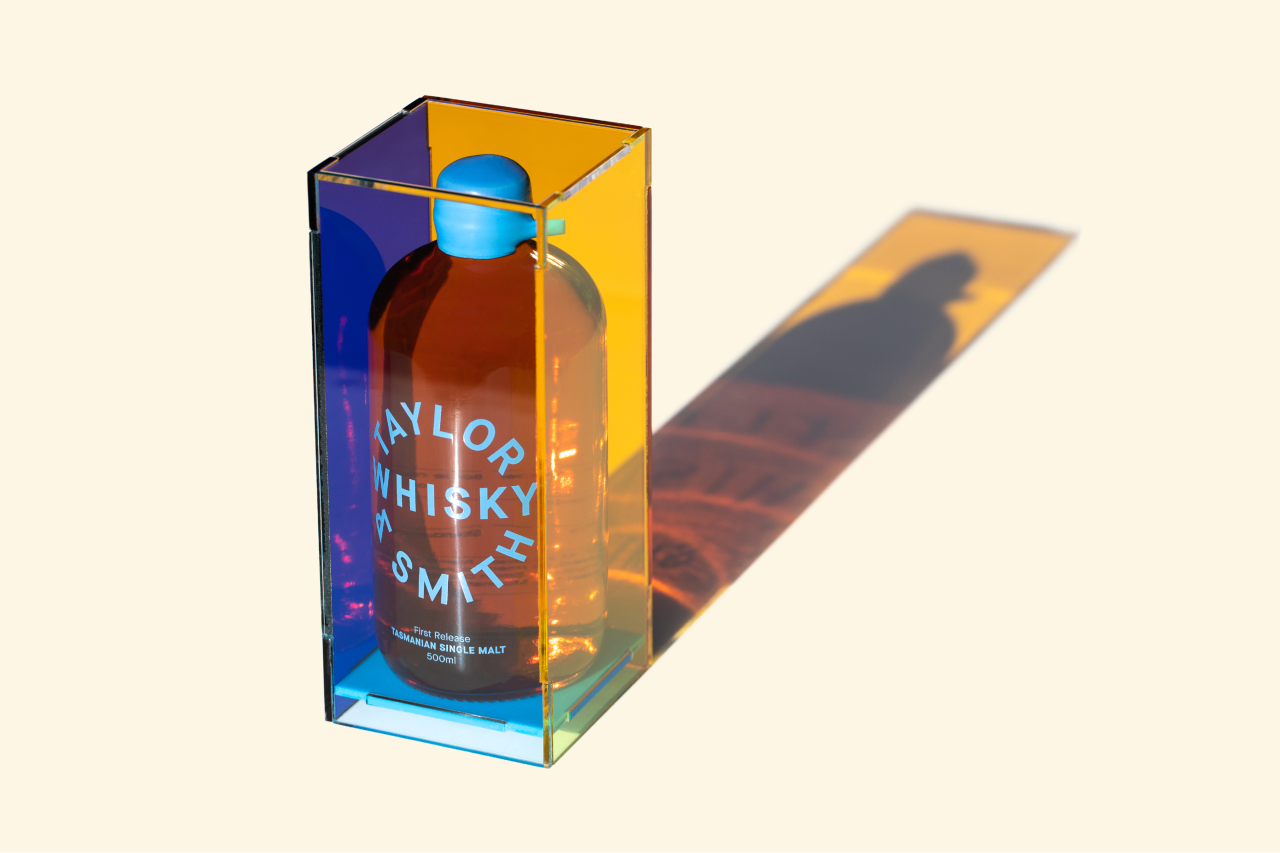
Taylor & Smith Whisky Packaging & Launch Campaign | Direction & Design: Megan Perkins | Photo: Jesse Hunniford
"My clients tend towards cultural institutions and events and consumer products," Megan tells us. "I'm interested in the power of design to unify communities and convey a sense of place," she adds – further contributing to the wider community herself through her professional jewellery practice and other self-initiated projects that Megan runs alongside her design pursuit.
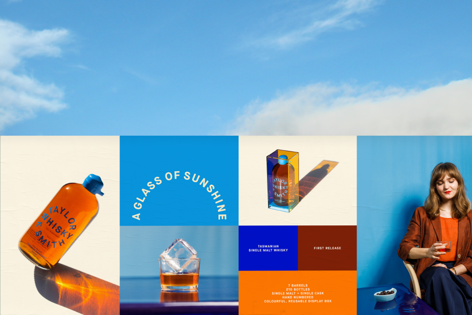
Taylor & Smith Whisky Packaging & Launch Campaign | Direction & Design: Megan Perkins | Photo: Jesse Hunniford | Brand Ambassador: Sam George-Allen
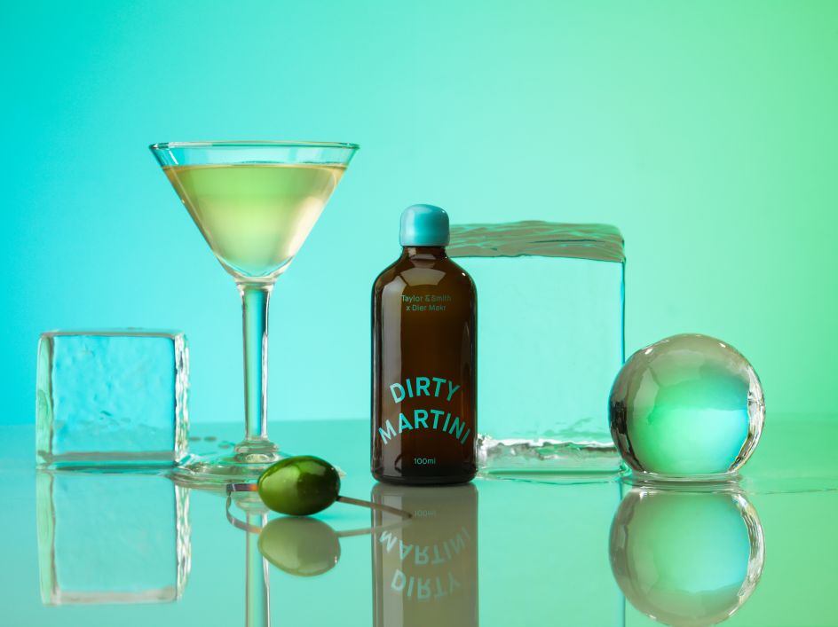
Taylor & Smith Dirty Martini: branding, packaging, art direction and launch campaign for Taylor & Smith’s bottled cocktail range | Direction & Design: Megan Perkins | Photo: Jesse Hunniford
This drive to discover is a primary interest of Megan's and a significant source of inspiration, whether that is speaking to new people, visiting new places, or the experience of art and appreciation of the commonplace. "I soak up experiences like a sponge," she explains, "inspiration and insights can come from anywhere, and I never know when they will reveal their value to me," she adds. In addition to this, Megan advocates for influence external to the obvious. "I tend to prefer inspiration from outside of the design industry," Megan tells us, "and listen to a lot of books on philosophy, psychology, universal symbolism, archetype and mythology."
It's here that we find the source of Megan's strength. Her vast knowledge of the industry and those within it, coupled with her eagerness and openness to not remain ignorant to the wider world, result in beautifully bold, profoundly punchy and incredibly inevitable work. Rich in colour, character and typographic playfully, Megan explains, "it is important to me to achieve a level of primacy with my branding," refining what she does until it is as graphically strong as possible.
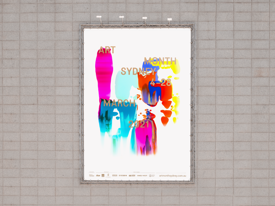
Art Month Sydney 2021 Billboard design | Direction, Design, Screen printing: Megan Perkins
This is no more evidential than in her remarkable identity for Taylor & Smith Distilling Co. – a Tasmanian whisky distillery requiring a rebrand to set them apart in the ever more populated spirit market. "I couldn't quite believe how dry and stale the branding and packaging was in this space," Megan recalls during the research of the rebrand. "I realised that women were drinking whisky in much larger numbers than you would anticipate from the cliched heritage and masculine positioning of whisky/whiskey brands," she adds, swiftly exploring graphic solutions that were more appealing to a wider audience, and were more distinct and memorable in the process.
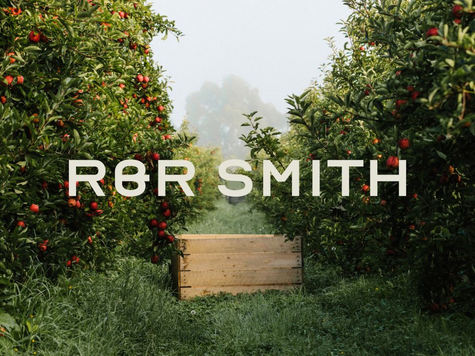
R&R Smith Apples Logotype and hero graphic (2020) | Direction & Design: Megan Perkins | Photo: Sam Shelley
Showcasing the contextual iridescent colouring and qualities of Tasmania through the chosen colour palette and application, Megan explains that through their identity, they sought to "provide a more feminine, creative approach and a new contemporary perspective of a place." The result is truly unique and shows how extraordinary design can be when the concept is made clear, finding an understanding of a brand's core values and nailing their exploration, expression, and execution. Nervous of how it would be received, in the end, it was worth the risk. Having recently been awarded First Prize in Dark Spirits at the Dieline Awards; demonstrating the success of going against the grain, and portraying meaning in the work you produce – no matter how simple the message.
"Depth of concept is still crucially important, but design without immediacy risks getting lost in the noise," she adds. "My approach is an important balance between immediacy and the ambience," Megan recalls, resulting in "conceptual depth, and semiotic associations that sustain engagement, build connection, encourage loyalty, create meaning and contribute to culture."
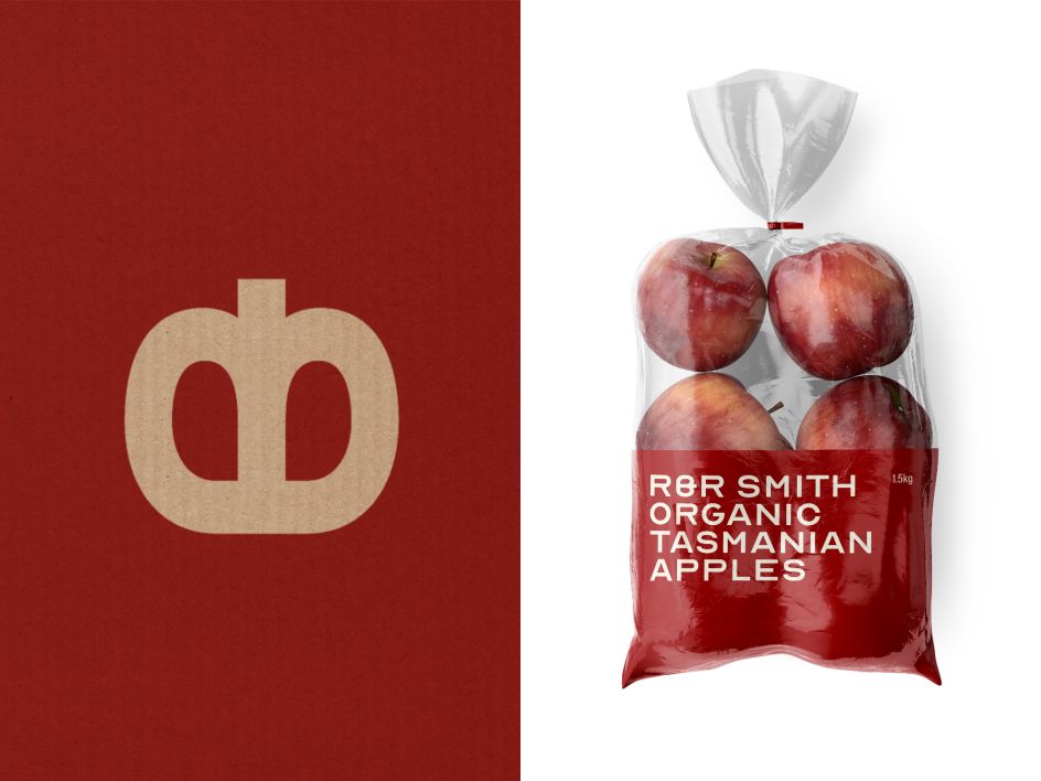
R&R Smith Apples Logo and apple packaging bag (2020) | Direction & Design: Megan Perkins
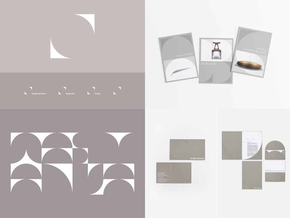
Brand Marks, custom typeface, brochure and stationery design | Megan Perkins: Creative Direction, Concept & Design | Nick Rudenno: Variable Typeface Build & Animated Elements
With this in mind, Megan refuses to work with clients that hold values misaligned with their own. "I aim to achieve sustainability and longevity with my solutions and to support my community by using local creatives where possible," she explains, "I always explore opportunities for innovation if the project allows."
Discussing Australia's creative industry, Megan recalls the uncertainty and creative deadlock it's facing. "Australia has a crisis of identity, and a crisis of confidence, especially in the way we brand and design for culture," she explains, adding, "I would love to see more of Australia's distinct character and place reflected in Australian graphic design," seemingly in a perpetual rhythm of seeking inspiration from international communities rather than their own.
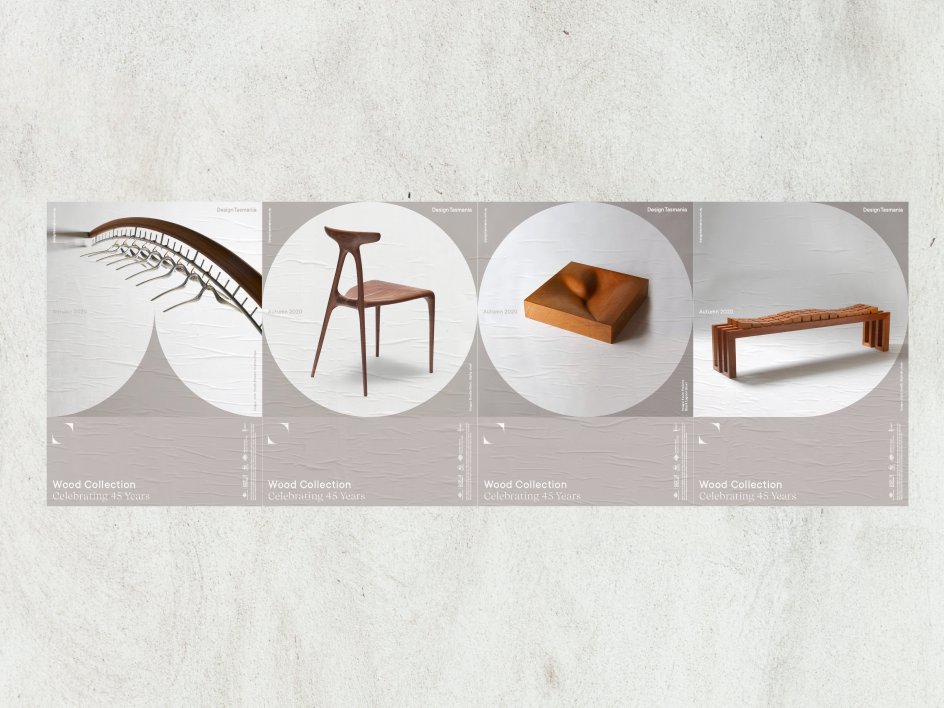
Design Tasmania Brand Marks, custom typeface, brochure and stationery design | Megan Perkins: Creative Direction, Concept & Design | Nick Rudenno: Variable Typeface Build & Animated Elements
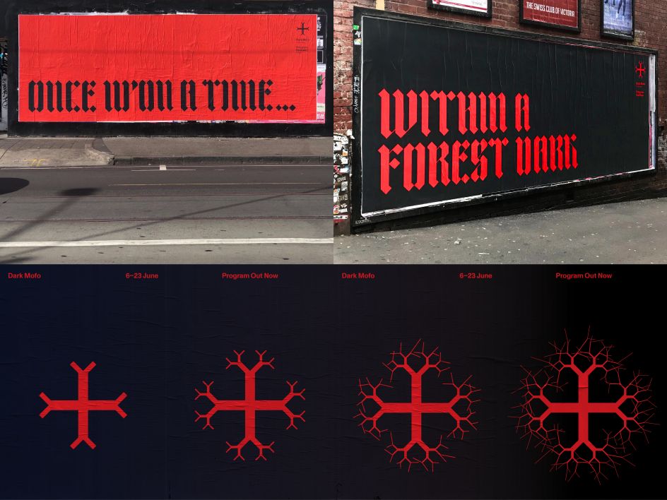
Dark Mofo Festival | Work undertaken for DarkLab | Festival Creative Director: Leigh Carmichael |Brand Identity | Art Director + Design Lead: Megan Perkins | Designer: James Freebairn | Supporting Designers: Bellen Ramos, Beth Gregory, Mel Huang | Typefaces: Customised version of TpDuro: TwoPoints.Net | Monument Grotesk: Dinamo Foundry | Copywriter: Luke Hortle | Lead Developer/Animator: Daniel Reid | Supporting Developers: Omar Marshaal, Will Christian | Videographer: Juan Melara, Eva Otsing | Photographers: Rémi Chauvin, Jesse Hunniford
"I'd also love to see a stronger focus on creating meaning and personality," Megan tells us, noting the changes she wants to see in the industry. "And less of a preoccupation with aesthetics and the perfect grid system," believing the former to be the provider of greater value to the community. "Meaning is what makes work powerful," she succinctly notes, "and has the potential to influence and create cultural change."
Making a handy list, Megan explains the changes necessary in progressing the creative industry, concluding there should be more: Women in leadership, pay parity, risk-taking, broad perspectives, individual personality, originality, charging for value – not time, work/life balance, experimentation, collaboration, and meaning. And less: hierarchy, conforming, minimalism, competitions, and caffeine.
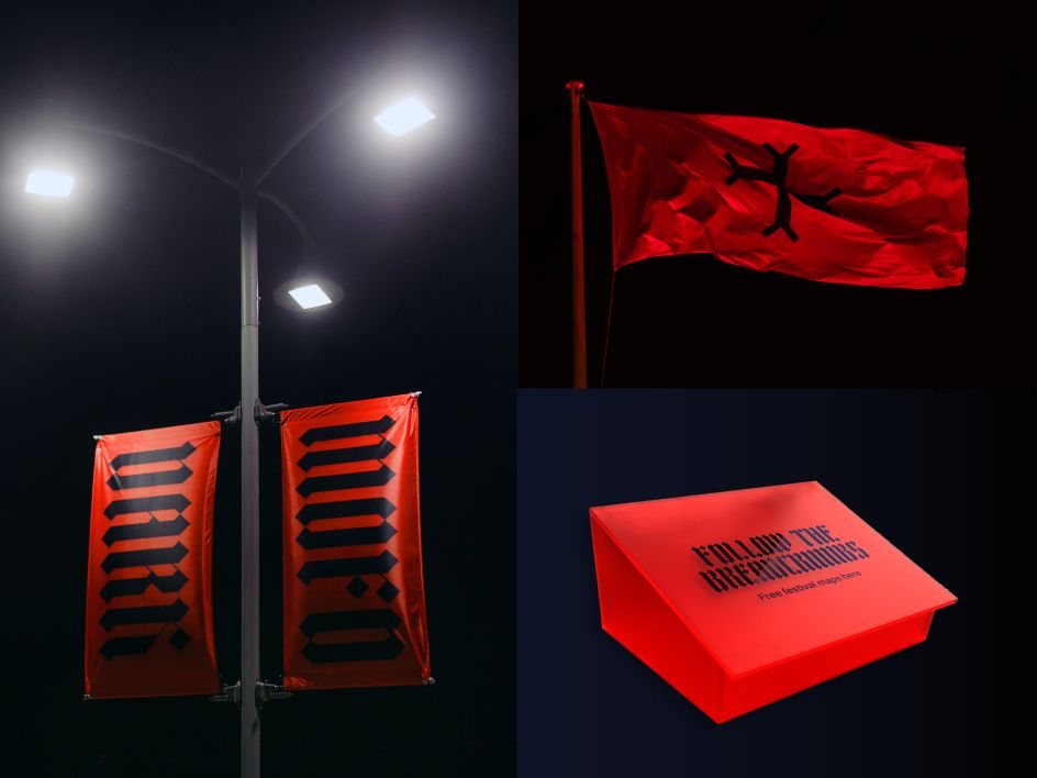
Dark Mofo Festival | Work undertaken for DarkLab | Festival Creative Director: Leigh Carmichael |Brand Identity | Art Director + Design Lead: Megan Perkins | Designer: James Freebairn | Supporting Designers: Bellen Ramos, Beth Gregory, Mel Huang | Typefaces: Customised version of TpDuro: TwoPoints.Net | Monument Grotesk: Dinamo Foundry | Copywriter: Luke Hortle | Lead Developer/Animator: Daniel Reid | Supporting Developers: Omar Marshaal, Will Christian | Videographer: Juan Melara, Eva Otsing | Photographers: Rémi Chauvin, Jesse Hunniford
Editor's Picks


Trending


Editor's Picks
Further Reading