Drums please for Snare, a jazzy vertically variable display type with its own story
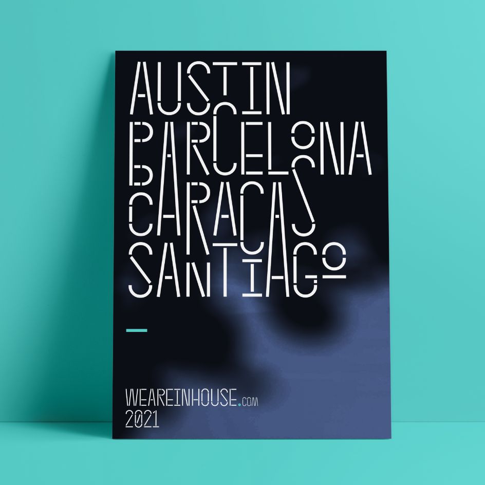
A drumroll-please typeface named Snare has just been unleashed by In-House International. It's a vertically variable display type that, like all of the Austin, Texas studio's typefaces, is very graphical and deeply personal.
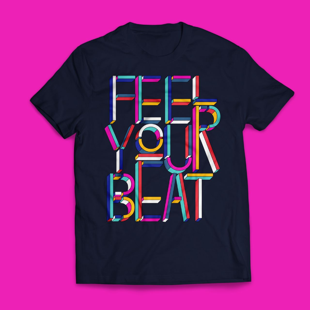
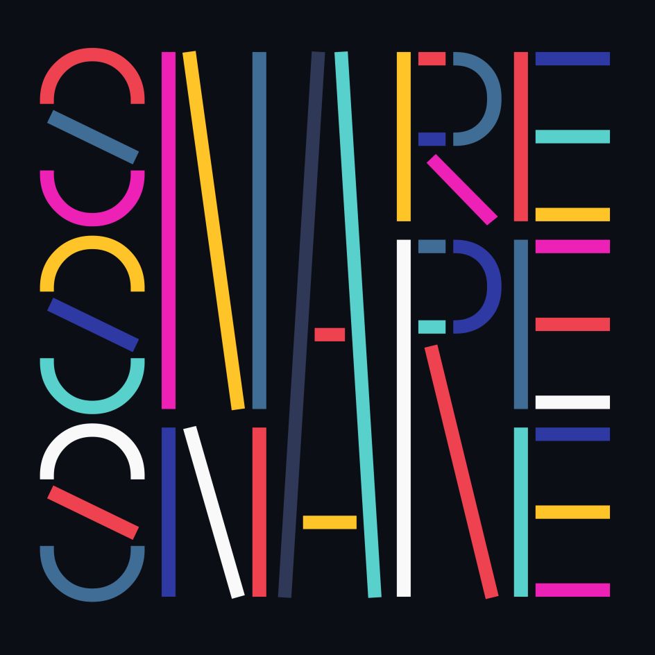
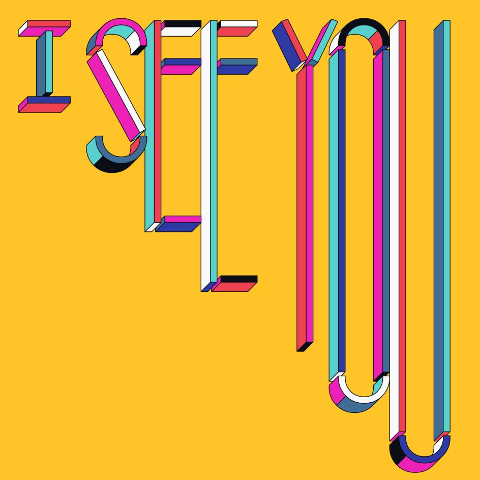
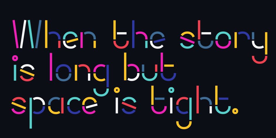
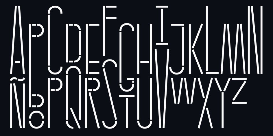
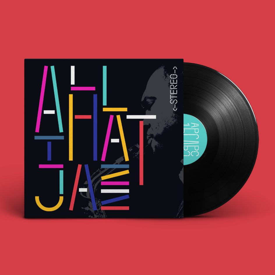
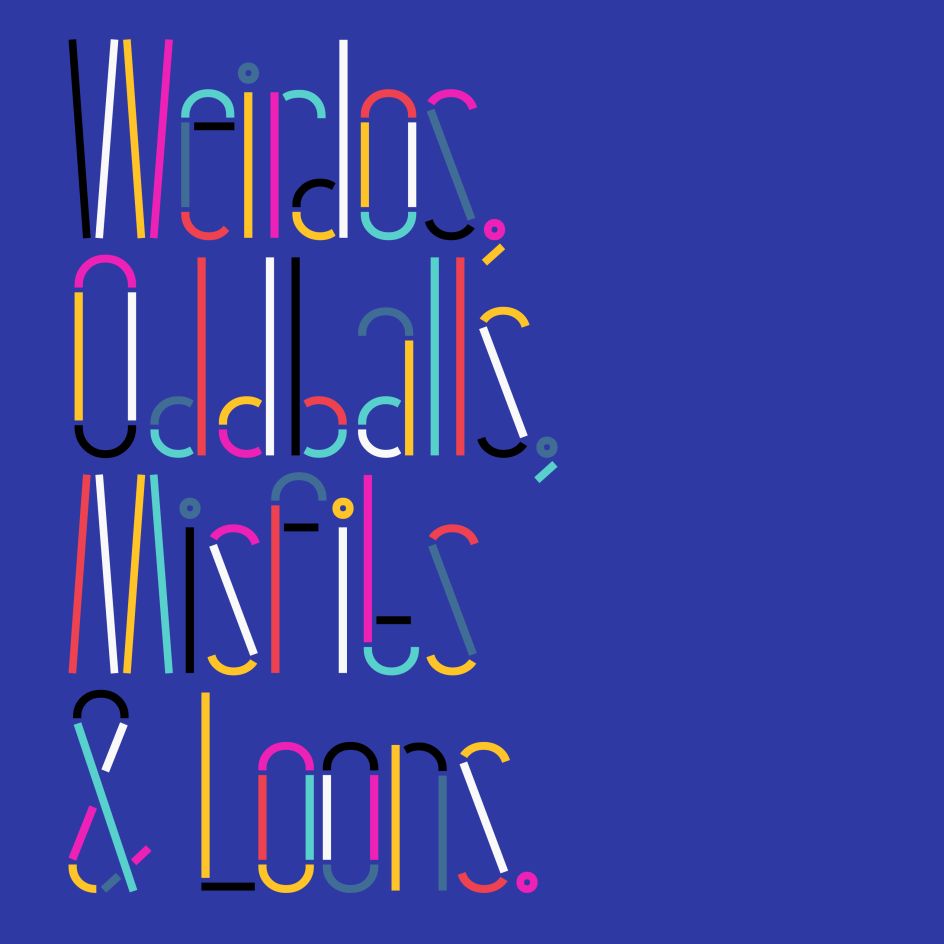
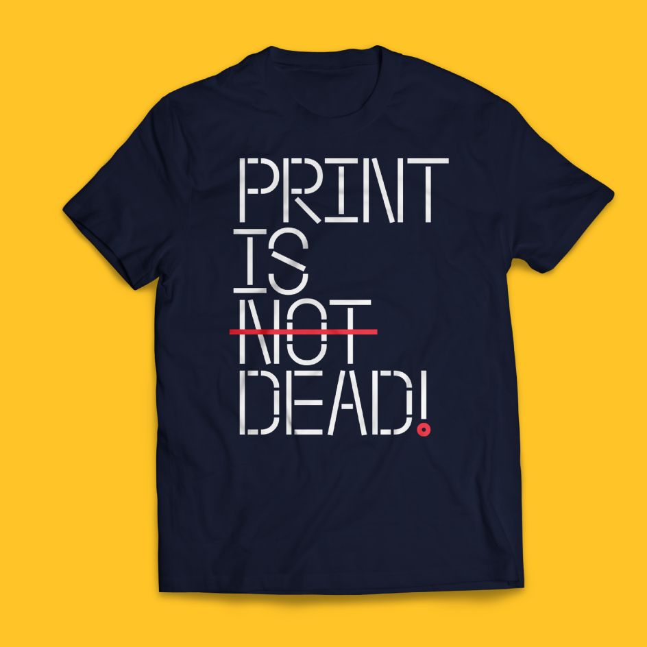
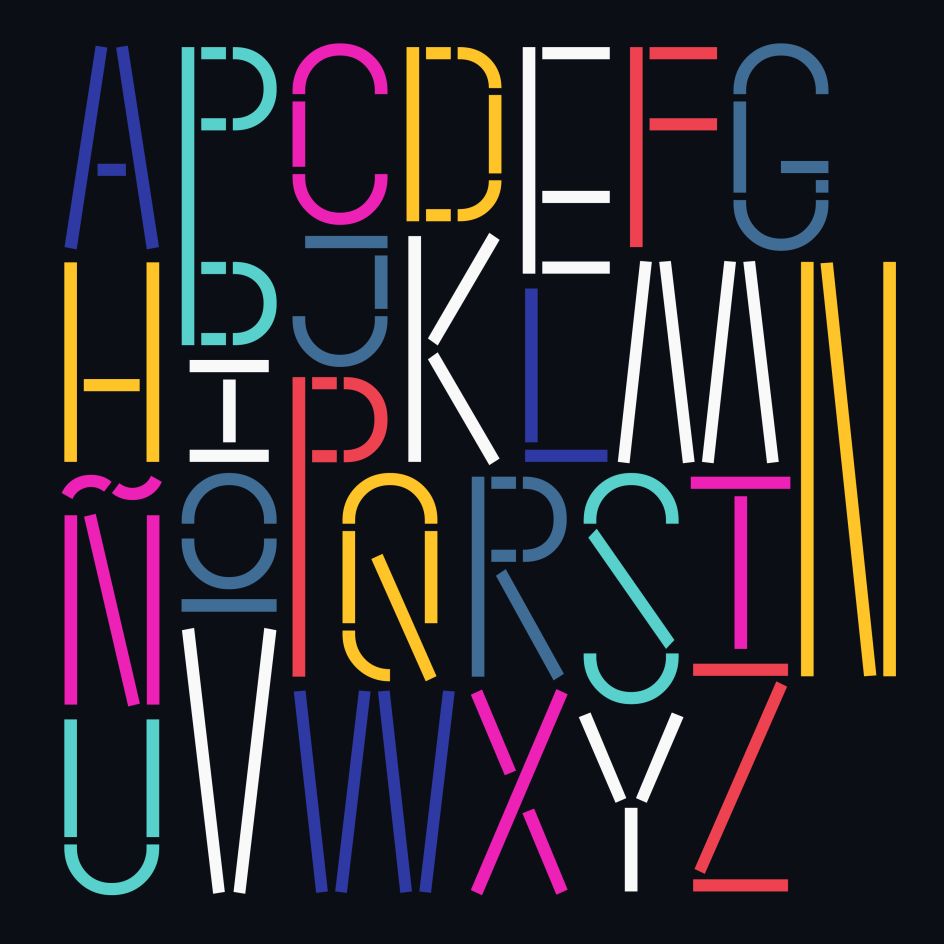
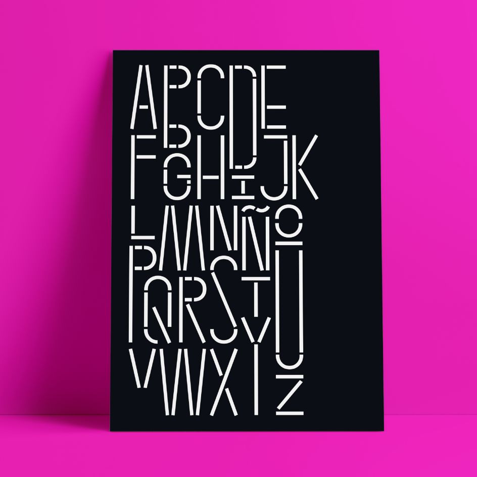
Snare is a "jazzy little display type" that presents like a stencil but behaves in its own way. Featuring angled section breaks and variable heights, it keeps each character's footprint steady as its heights change, revealing unique crossbars, periscoping capitals and deep-sinking descenders. "Because each character follows its own rules, the more each word grows, the more it shows the beautiful rhythm of variety," says Chief Creative Michu Benaim Steiner. Or you can also stretch individual characters to shape the contours of your words.
Beyond just being playful, fun to dress in different colours, and particularly useful for tight spaces, Snare's "lanky verticals and nervous energy" reflect the time it was created: during a pandemic. "Snare brings up the drumroll-expectant heartbeat of our uncertainty and the wish that when we can all meet again, our newfound weirdnesses will find a home in the world," adds Michu.
The Snare font family was designed at In-House International by Alexander Wright and In-House International, and programmed by Rodrigo Fuenzalida. It includes two variants – regular and unicase – and comes in ten standard weights ("which are just really heights") for each set (.otf) and as two variable (.ttf) type sets. You can grab it now via YouWorkForThem and MyFonts.


Editor's Picks


Trending


Editor's Picks
Further Reading