Elmwood reinvents The Week's iconic red masthead as part of a new brand experience
London-based design consultancy Elmwood has today unveiled a striking new set of visuals for global news title The Week in order to help it cut through the online noise and connect with readers.
As far as magazine mastheads go, few are more iconic than the red bar sported by weekly news magazine The Week. Founded in 1995, The Week is a condensed summary of what has happened in the world over the last seven days and is mainly comprised of news stories and opinion columns from other publications. And in all that time, it's relied on the red masthead to lure in readers.
But in an increasingly competitive newsstand, offline and digital, The Week needs to adapt to stand out. Enter Elmwood, who has created a "more holistic and more memorable brand world experience" to help the publication compete across its online touchpoints.
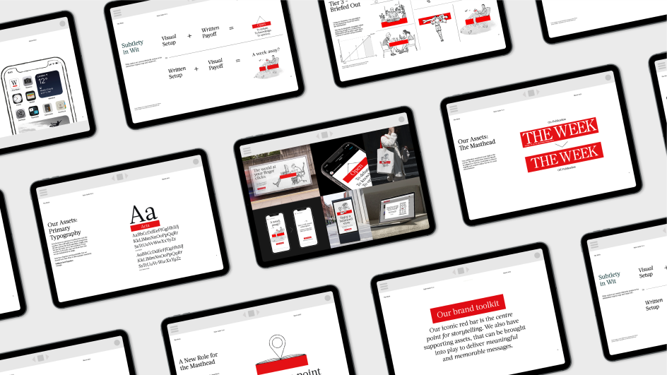
Spearheading this new brand experience is a reinvention of that distinctive red masthead. Having proved its worth on the cover, it is now elevated to The Week's primary design asset. This means it will form the basis of the overall design system, thanks partly to its flexibility and ease of use.
From today, readers can expect to see elements of that recognisable red bar in passages of running copy in order to provide clarity. It can also be transformed into a cartoon speech bubble that creates a quick tactical accent and knits the whole look and feel of the page together.
Even at a glance, you'll know which publication you're reading, thanks to that distinctive colour cropping up. It's the sort of design premium that other publications would die for.
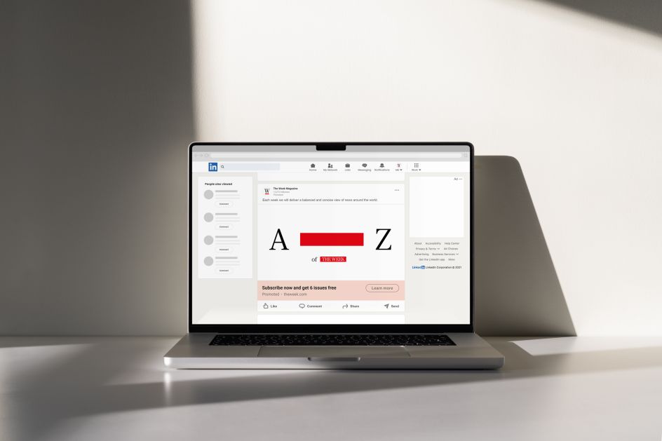
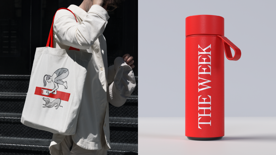
Audiences will notice this brand world system not only in The Weeks' digital current affairs coverage but across its other key digital assets such as social media profiles, sales copy, careers pages and promotional billboard messaging.
Andrew Lawrence, Global Executive Creative Director at Elmwood, explains why they followed this route: "The Week red masthead is so unique and versatile. We quickly realised that, in design terms, this potent symbol is hiding in plain sight.
"By heightening it into a key asset that cleverly interacts with copy, photography and illustrations, we recognised that we could hardwire The Week's motto, 'Enjoy a different view'. And we could do so in a manner that is infused with simplicity and a human touch to expand the magazine's reach."
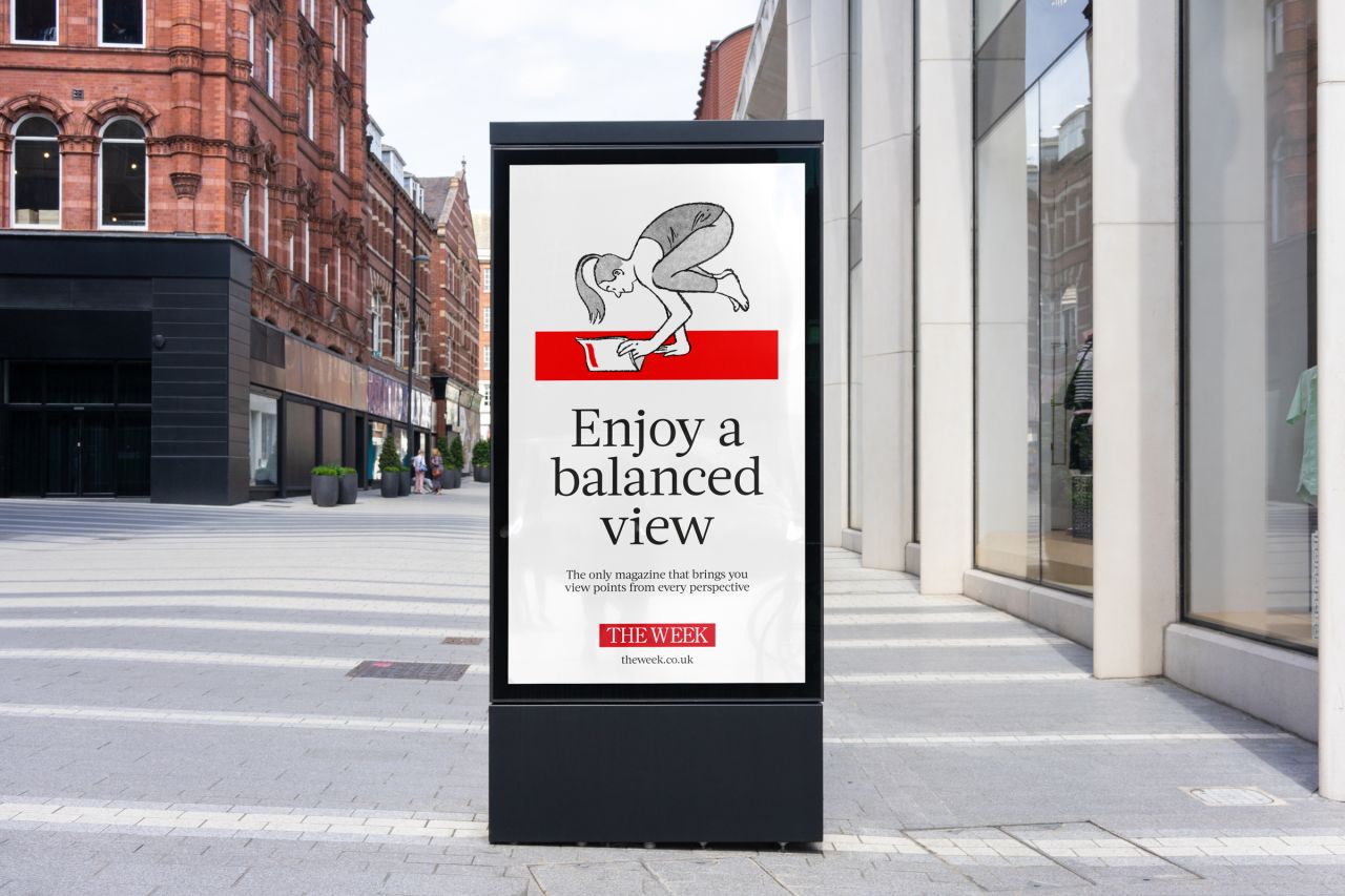
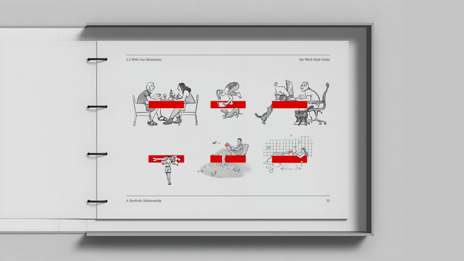
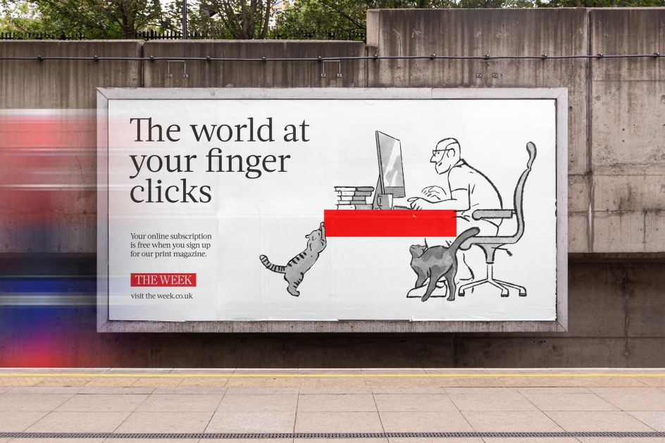
One of the most eye-catching examples of this new masthead in action can be seen in the accompanying illustrations by Tokyo-based artist Luis Mendo. A veteran of editorial illustration, Luis' simple black line art perfectly matches The Week's red bar. In his drawings, it becomes a beach towel, yoga mat, pencil and more as his characters interact with the magazine in their spare time.
These illustrations introduce a gentle wit and sense of warmth into the brand experience, inviting the readers to interact with The Week just like their doodle counterparts. And if you look closely, that red bar also works effectively as the masthead itself in miniature.
It's a testament to the strength of the original design that it can work in this context and underlines how right Elmwood was to lead with it.
Andrew adds: "The assets we've created enable The Week to connect with its readers on a more meaningful level, blending its measured news voice with moments of visual wit.
"This, in turn, echoes Elmwood's own belief that the best brands of tomorrow will be built on cultural tension; in this case, between human connection and relatability; and the balance that comes from succinct, non-biased news".
Ed Craggs, Head of Marketing at The Week, adds: "There is so much noise in how news is delivered these days. Elmwood's simple, scalable approach provides a powerful tool to cut through the clamour. Stylistically, their design system echoes The Week's own skill for balanced yet quietly charismatic storytelling."
Editor's Picks


Trending


Editor's Picks
Further Reading
 unites vegans and meat lovers with tasty new identity for a plant-based food startup](https://www.creativeboom.com/upload/articles/fe/fe52890414f664bcc985e763dd2a52e863cee31c_732.jpg)
