Gretel's identity for Tend puts the emotion and well-being into modern banking
New York studio Gretel has named and launched the identity for next-generation personal finance platform, Tend – one that cultivates a sense of "financial well-being", champions a "new approach to banking" and "doesn't feel like a bank because it isn't".
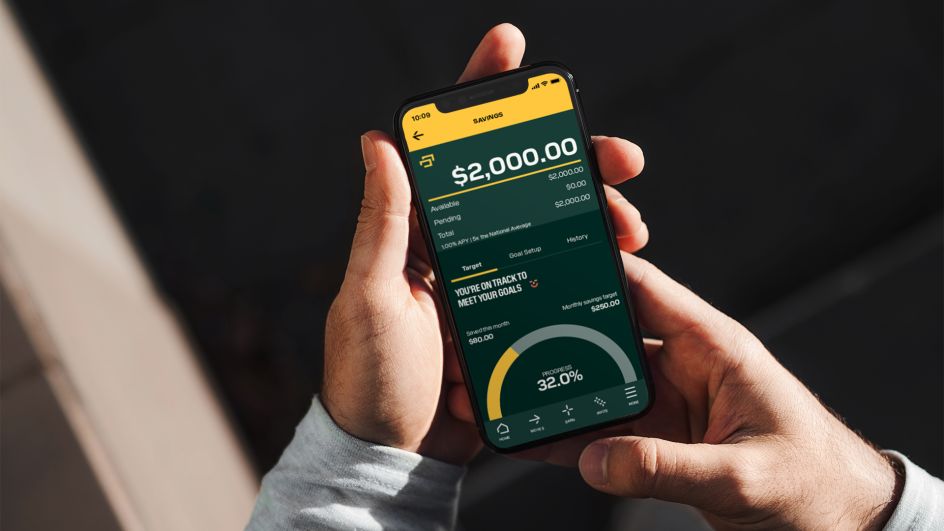
Officially launched in the United States and Mexico, Tend offers a membership model that combines financial technology with social interaction to make accessing, moving and growing people's money "easier, faster and more human". Its brand identity by Gretel breaks the mould of traditional banking services, while positioning Tend as trustworthy and inspiring.
"Banking is emotional," says Gretel's Strategy Director, Daniel Edmundson, "Research shows fear, shame and anger are the most common emotions surrounding money and that negative connotations and undertones control the category as a whole. From the start, the tenor of Tend needed to be centred on optimism and a more inclusive approach."
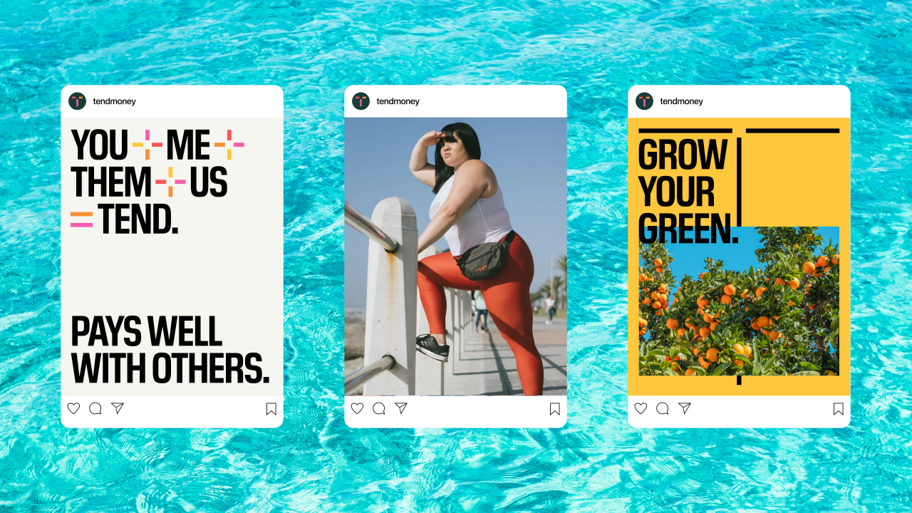
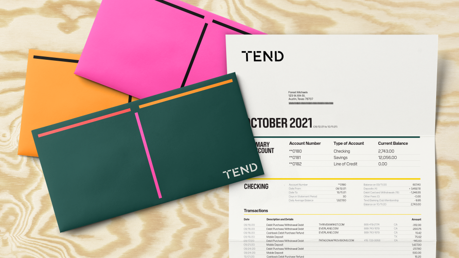
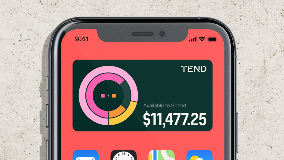
Gretel drew on Tend's vision around community, co-creation, and financial rewards with the resulting design being colourful, confident with warm and bright colours throughout and bold yet friendly typography. It's a stark contrast to the usual blues, greens and blacks that dominate the fin-tech sector.
"This idea makes the pursuit achievable by anybody with any amount of money," says Tend CEO James Dunavent, "even small financial rewards can go a long way to improve your life, and over time permanently tilt into the positive spectrum."
You could say this sense of well-being can be summed up in the brand's name. "The name Tend is particularly special," says Gretel's Edmundson. "It's perfectly in line with the brand's purpose and voice. It's active and intentional, warm and inviting, it implies caring for something other than oneself and nods to a general sense of growth and progress."
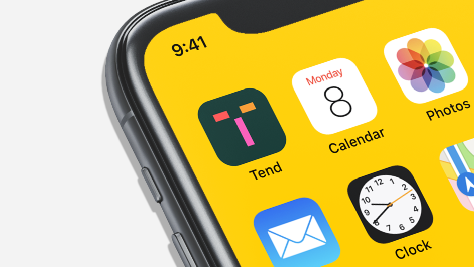
The community-driven aspect of the platform also inspired the entire design system by Gretel. It uses three simple lines assembled in a T formation as a metaphor for the community that Tend is building: "Tend brings people together to collectively make the most of their financial lives by joining," adds Edmundson. "The T can connect with other lines infinitely: this is a visual representation of Tend's growing, interwoven network of members."


Andrea Trabucco-Campos, creative director at Gretel, adds: "We did not shy away from a strong visual and linguistic personality to ensure Tend didn't feel immediately like a bank, because it isn't. The core ideas powering the identity are growth and connection. The growth that happens when you join a community of like-minded, honest people that are willing to listen and respond to your needs and engage in a conversation."
Gretel's identity for Tend has rolled out from the app UI and the website design to debit cards and marketing assets ranging from printed matter to digital advertising, from illustration to photographic commissions.


](https://www.creativeboom.com/upload/articles/86/862919952c0ad18439004228895a431dc6e45ffc_732.jpg)