Teacake Design arranges an elegant brand identity for 'Yorkshire's finest flower fettler'
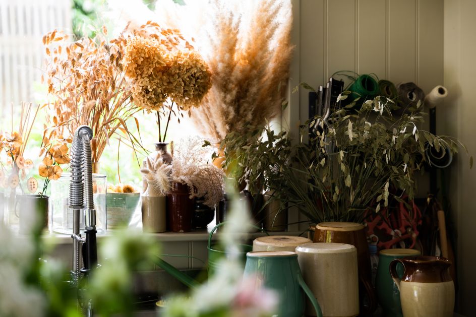
Robert Walmsley of Manchester's Teacake Design has created an elegant brand identity for Simply by Arrangement, a Yorkshire florist, to reflect its high-quality craftsmanship and target audience.
](https://www.creativeboom.com/upload/articles/b0/b021423c7008b2d2b4435063a6b88bdc30b296e7_1280.jpg)
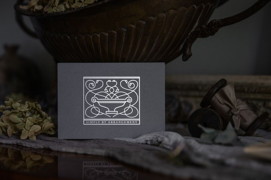
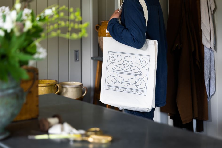
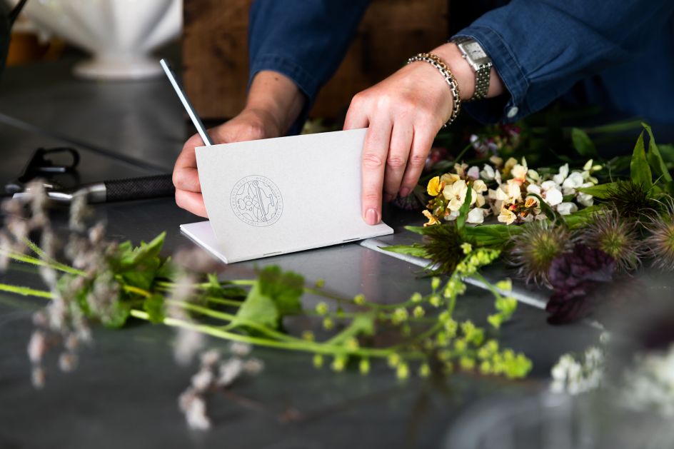
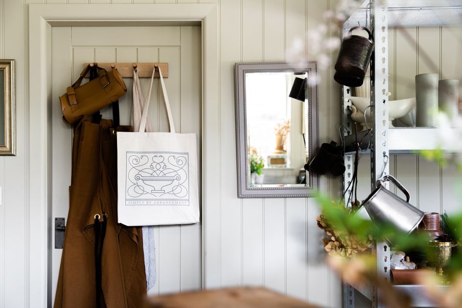
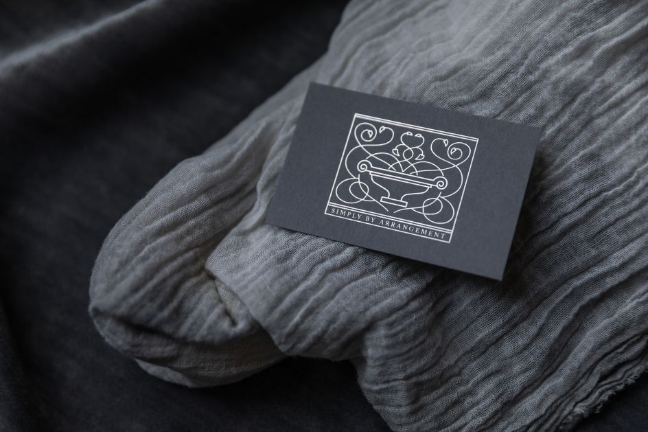
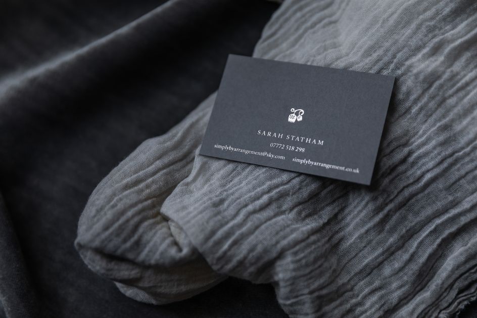
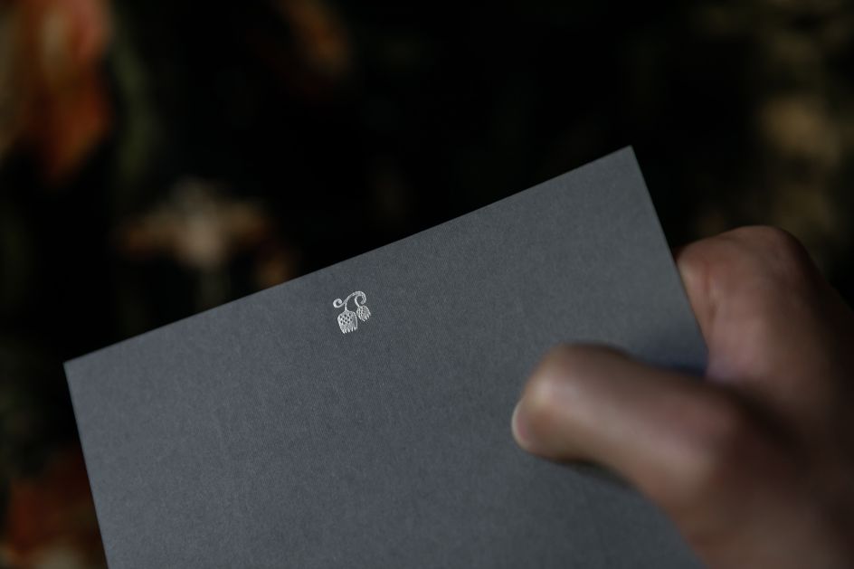
Photography of work shot on location by Alex De Palma
"Simply by Arrangement’s mission is to bring beautiful seasonal flowers to the north of England and beyond," says Robert. "Its founder, Sarah, describes herself as 'Yorkshire’s finest flower fettler' and her floral designs are full of texture movement and life – almost as if they're still growing.
"This is echoed in the illustrated main logo which represents an abundance of vine leaves and tendrils. Sarah sources and collects vessels to complement the flowers and her most treasured one is featured in the logo to add a personal touch. A second logo features Sarah’s favourite flowering fritillary a soft and gentle delicate flower reflecting her sympathetic understanding and empathy with nature."
The paper used throughout is uncoated and tactile with a colour palette of neutral grey allowing the natural beauty of the flowers to take centre stage. Traditional foil block printing and the use of a classic English typeface add to the timeless elegance of the design. Beautiful work.
Editor's Picks


Trending


Editor's Picks
Further Reading