Studio Blackburn creates a new visual identity for global trend forecasting agency, TrendBible
Studio Blackburn has created a new visual identity for global trend forecasting agency TrendBible. Founded more than 12 years ago, it was in need of a visual update, and Studio Blackburn was brought in to deliver a new strategy and brand designs that could work across multiple applications.
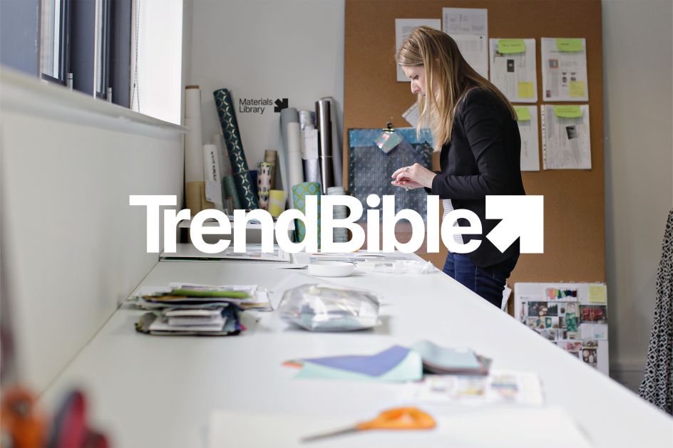
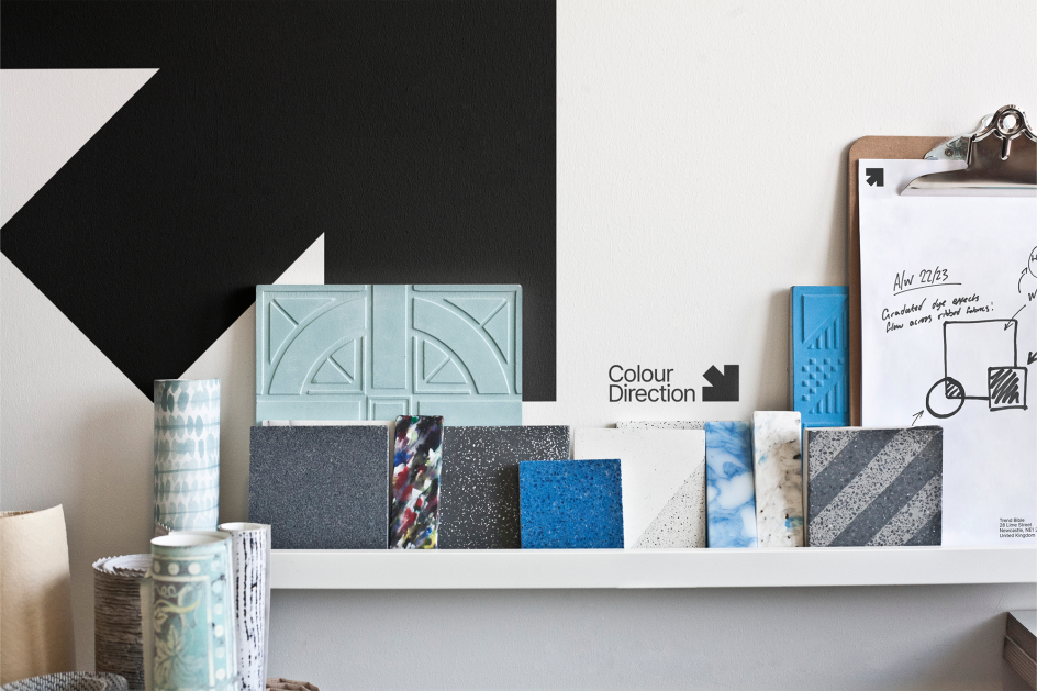
The studio first undertook a series of in-depth interviews to understand how the company operated across the key areas of trend analysis (home interiors, baby and kids, and gifting). Together with extensive desk research, these interviews informed a brand strategy, which in turn informed the new brand identity.
The rebrand "needed to allow space to showcase the constantly shifting trends without visually clashing or competing with them," says Mark Jones, design director, Studio Blackburn.

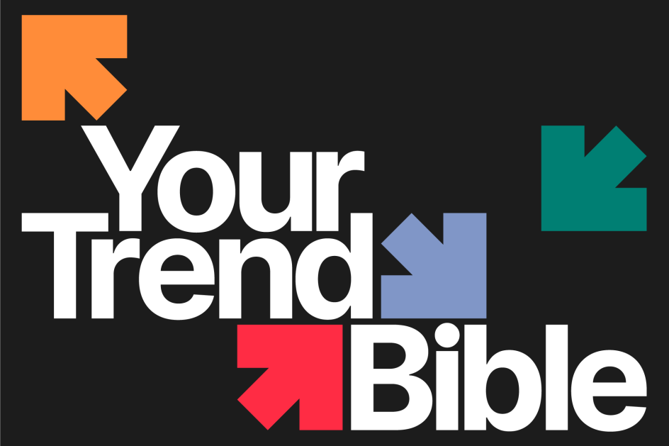
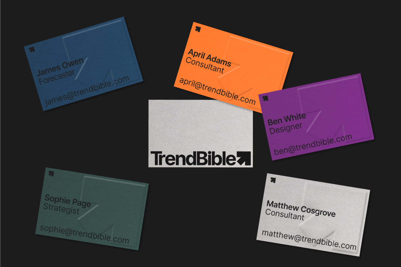
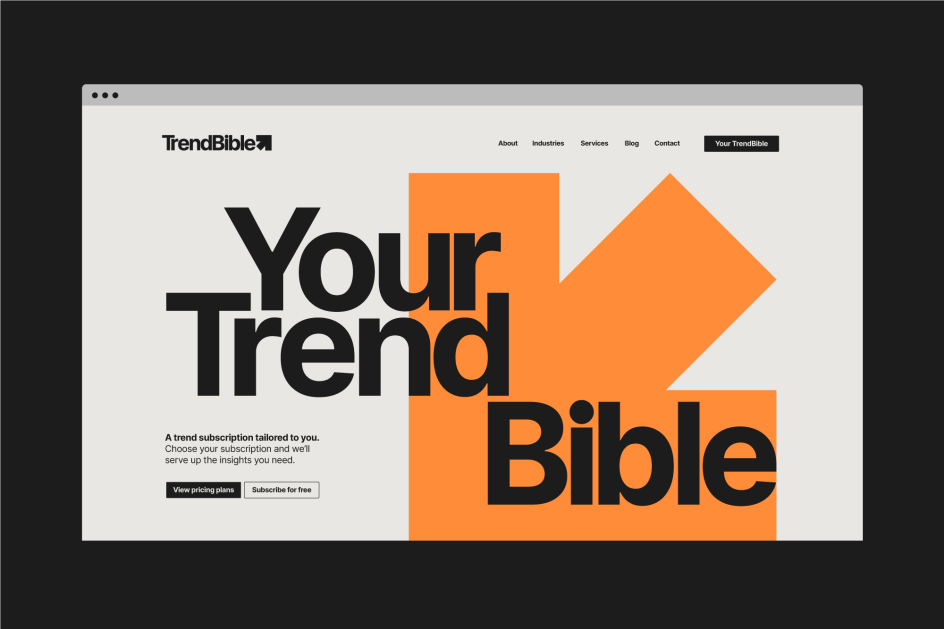
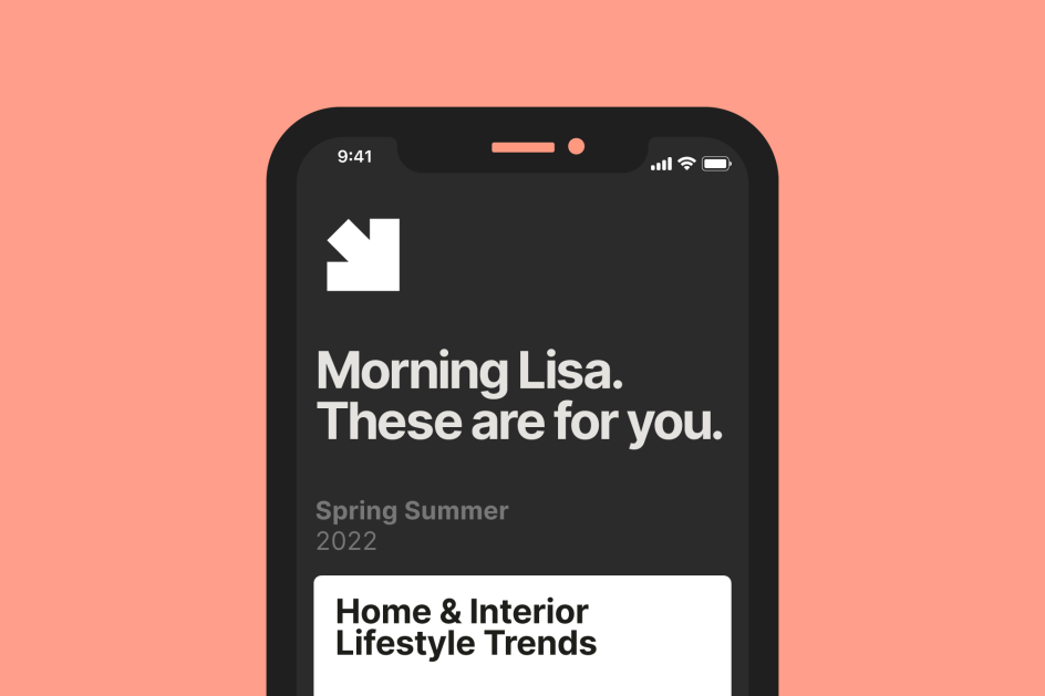
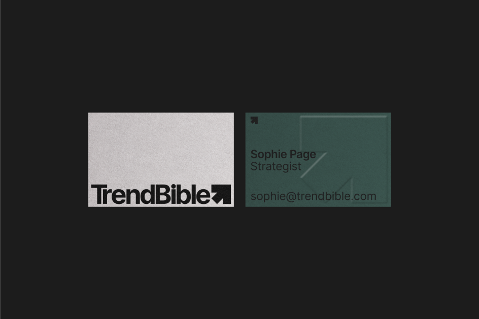
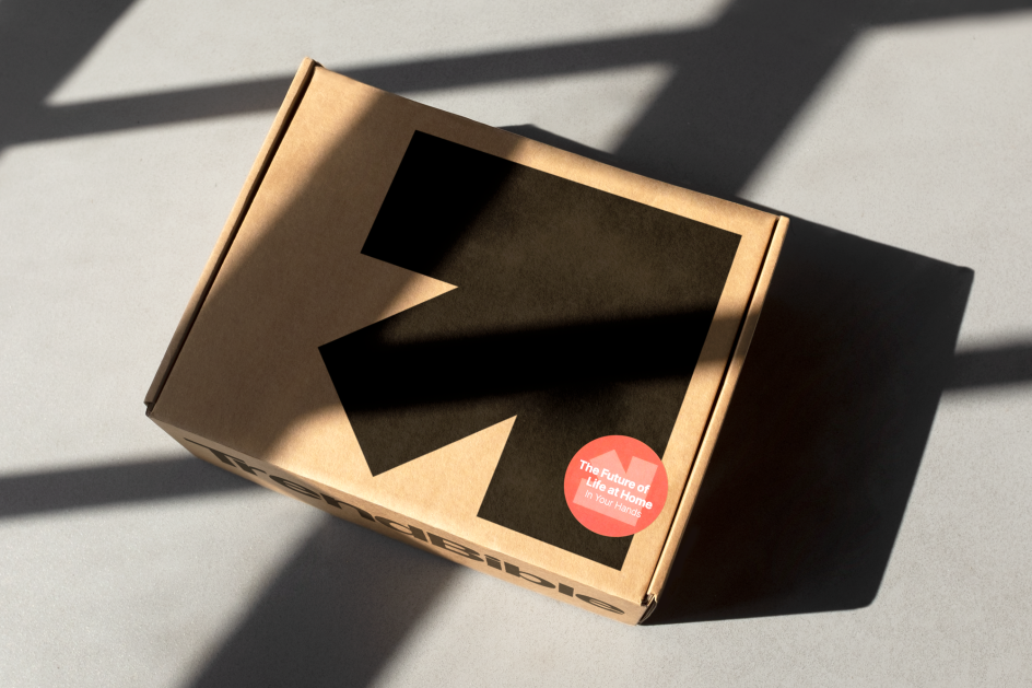
As such, the identity has no fixed colour palette, with different tones brought in through imagery to allow the palette to adapt to seasonal trends. According to Studio Blackburn, a simple wordmark is used alongside a new bold arrow graphic that acts as "a representation of the ever-changing landscape of trend forecasting".
The arrow can be used as a standalone symbol or as a logo lock-up device to house imagery within different compositions on a grid. Studio Blackburn also animated the arrow so that it can become an enlarged cursor in online applications. The new site design and build were created by Made by Bloom.
The site acts as a platform to promote the work TrendBible does and houses its new trend subscription platform, Your TrendBible. The platform also houses the Trend Books, which were previously only available in physical formats.
Editor's Picks


Trending


](https://www.creativeboom.com/upload/articles/86/862919952c0ad18439004228895a431dc6e45ffc_732.jpg)
Podcasts


Editor's Picks
Further Reading