Straight Forward Design brings Opal Fruits back to life after more than two decades
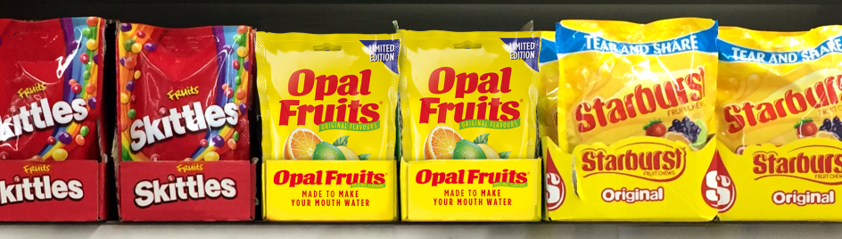
If you're old enough to remember the real name for Starburst, then you'll be delighted at this next bit of news. Opal Fruits will be hitting the shelves again for the first time in 22 years, thanks to a nostalgic overhaul by London-based Straight Forward Design.
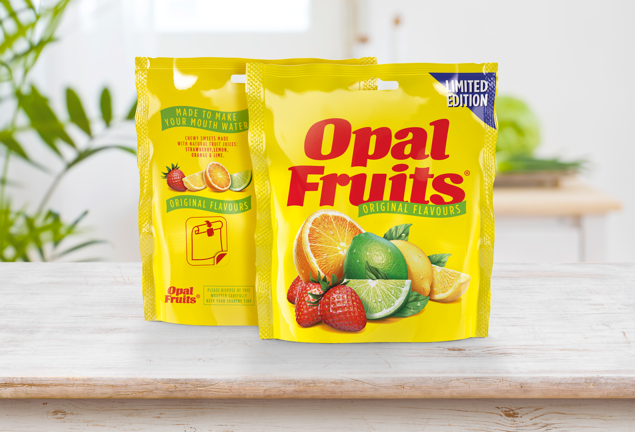
Quite right, too. Opal Fruits were first launched in the UK in 1960 but were aligned with the global brand name, Starburst, in 1998 (we shake our fists!). Since then, there has been an increasing appetite for retro sweets – and a growing campaign on social media to bring back the popular fruity chews.
The agency's work shows how brands can successfully use nostalgia to draw on consumer emotions and reconnect by being completely authentic.
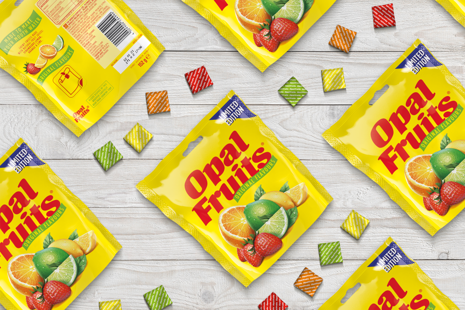
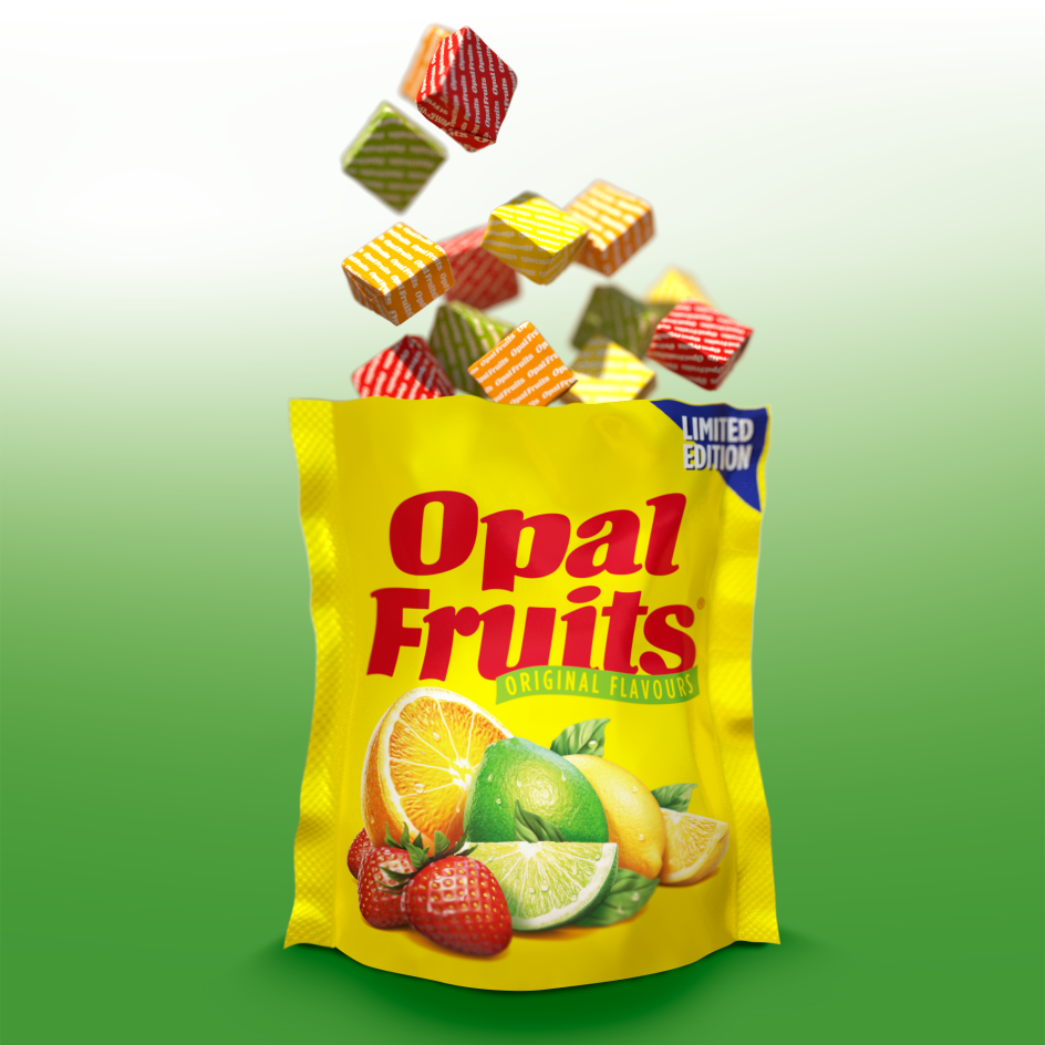
Not only does the latest identity take us back to sweeter times, but the flavours do, too, with just the original four in the line-up: strawberry, orange, lemon and lime.
Mike Foster, creative director and founder at Straight Forward Design, says: "When much-loved brands like Opal Fruits disappear they leave people wanting. People miss them, and bringing them back carries a certain weight of responsibility. You’ve got to do it properly if you are going to fully reconnect with the original consumers as well as draw in new ones."
But it's not as simple as digging into the archives and pulling out an old master of the design. "For starters, in this digital age, there were no packaging artworks for Opal Fruits, so we started working from old TV commercials and print ads," Mike continues. "We quickly realised, though, that the most important archive existed in people’s memories. So to ensure that we made a meaningful connection, we asked people what Opal Fruits meant to them."
Opal Fruits went through several iterations in its 38-year history, however, including the years when it transitioned to Starburst, so different people remember different things.
"Nostalgia is interesting because perceived and actual memories are two different things, and people are drawn to one particular iteration. The task for the designer is to marry all these factors and come up with an identity that works for today and is universally reminiscent of the past," adds Mike.
To honour the production values of the original brand and ensure an authentic result, the agency collaborated with typographer David Bateman and illustrator Simon Critchley.
"Mars doesn't own Opal Fruits," says Mike. "The people who love them do. To get the design right, we needed to immerse in the archive to find the right solution to transport people back to their youth. It also creates an opportunity for Mars to reach new consumers as parents introduce their kids to the sweets they loved in their youth."
The limited-edition packs will be available exclusively from Poundland from early March, and B&M, Home Bargains, Iceland, Savers and The Range from early May.
Editor's Picks


Trending


](https://www.creativeboom.com/upload/articles/86/862919952c0ad18439004228895a431dc6e45ffc_732.jpg)
Podcasts


Editor's Picks
Further Reading