Snask creates new 'people first' branding for Schuh
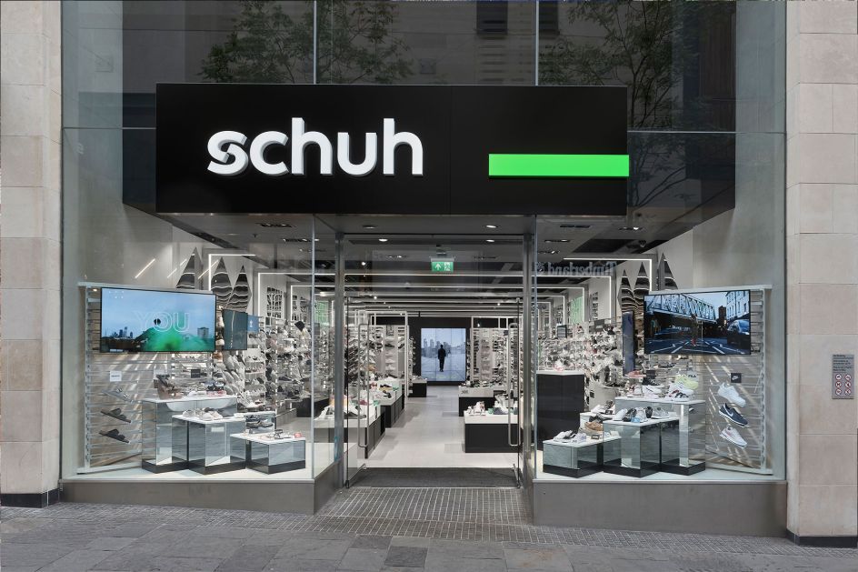
Schuh has long felt like something of a high street staple in the UK. The retailer, which has been around since 1981, now has more than 130 stores across the UK, Ireland, and Germany with each store selling more than 80 brands including Converse, Vans, Nike, Adidas as well as its own Schuh label.
For some time, however, the brand had begun to "drift away", says Snask, the Swedish studio which has just rebranded the company.
Tasked with creating a new "brand platform" for Schuh and modernising its visual identity and tone of voice, Snack initially formed the brand strategy through research, including interviews and workshops. "We found out that their USP had shifted from stocking cool products into the excellent service their people gave customers," says Snask.
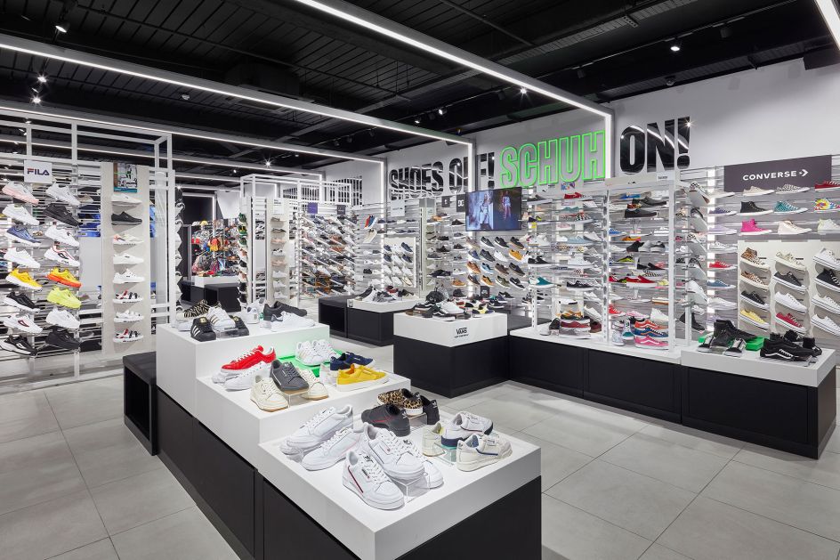
As such, the studio altered the brand's communication from focusing on talking about products to talking about the company's values "and the people behind the brand as well as the people in the shoes, the customers".
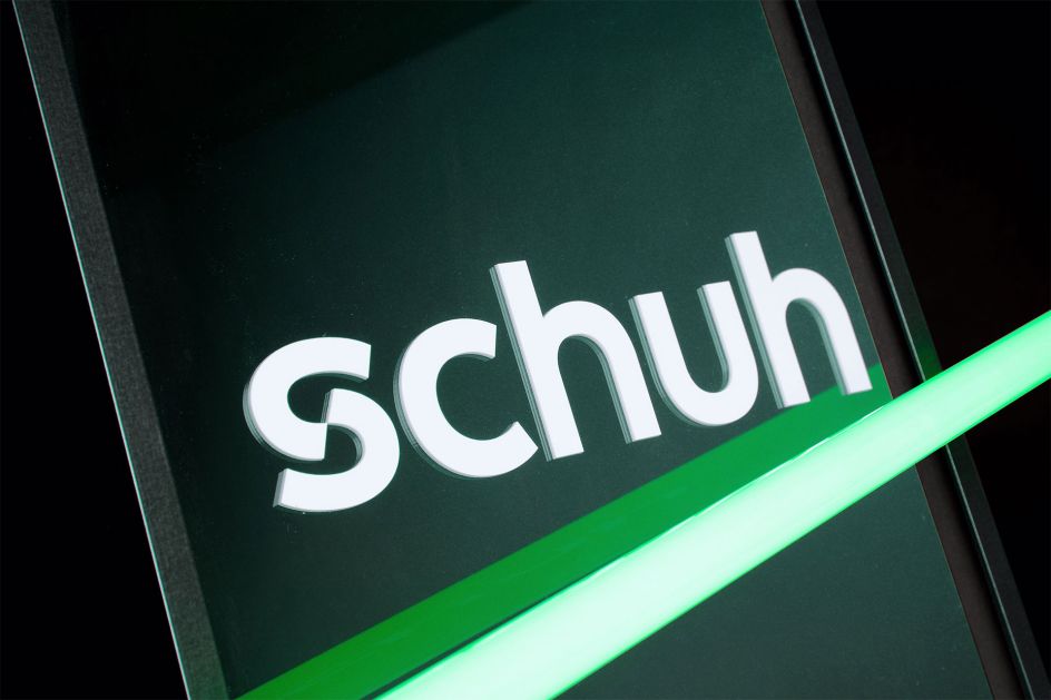
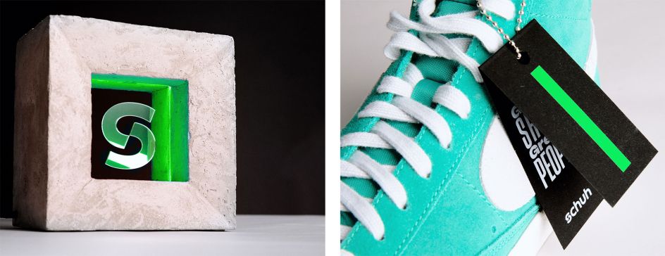
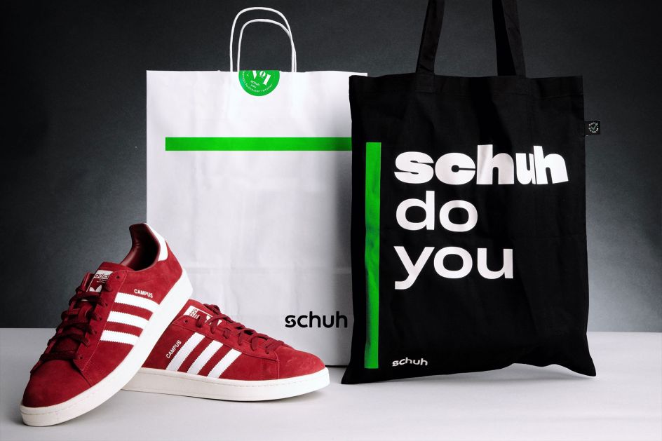
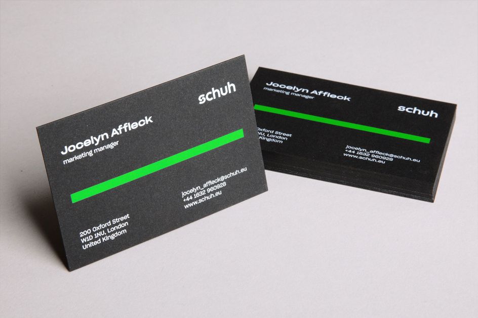
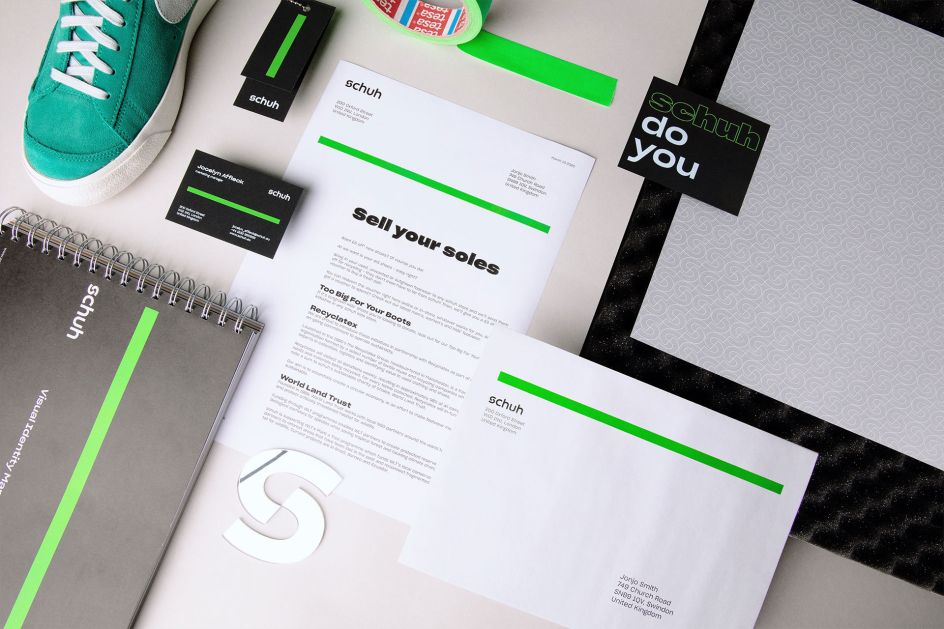
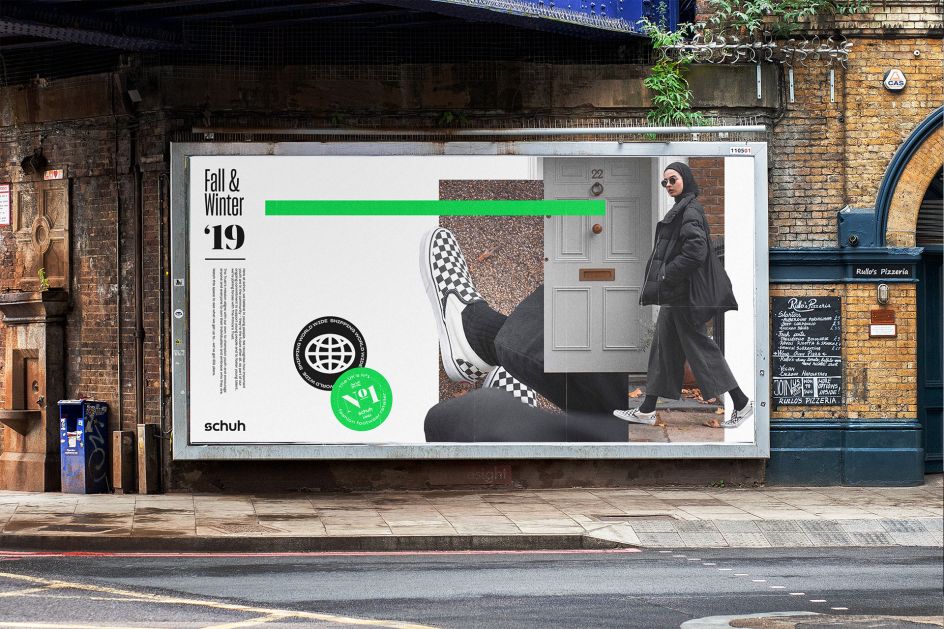
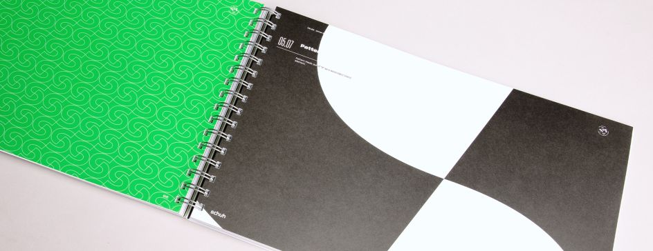
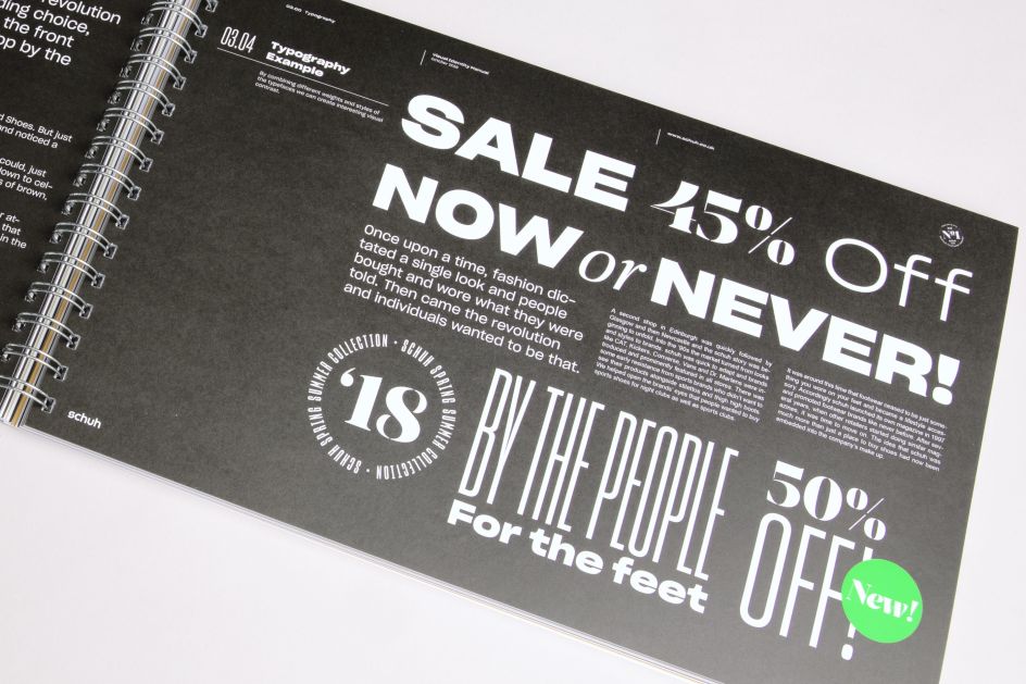
Visually, the former logotype was given a refresh and intensified the distinctive Schuh green to give it a more modern feel. Alongside this, Snask introduced a new, more versatile colour palette as well as an entirely new typeface to increase the branding's flexibility.
"We added a green stripe to serve as a brand symbol across all channels," Snask adds. "The new store fits already started to roll out at the new brand launch and "people first" has always been in Schuh's veins it's just that now it's finally shown."
Editor's Picks


Trending


](https://www.creativeboom.com/upload/articles/86/862919952c0ad18439004228895a431dc6e45ffc_732.jpg)
Podcasts


Editor's Picks
Further Reading


, Andrius Vizbaras, Created Motion Design Professional Graduate](https://www.creativeboom.com/upload/articles/06/06d4e8586689f31ec257d948b6d25240a0d16bb8_732.png)