ONY rebrands Future London Academy with Michael Wolff and Oliver St John
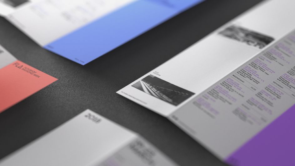
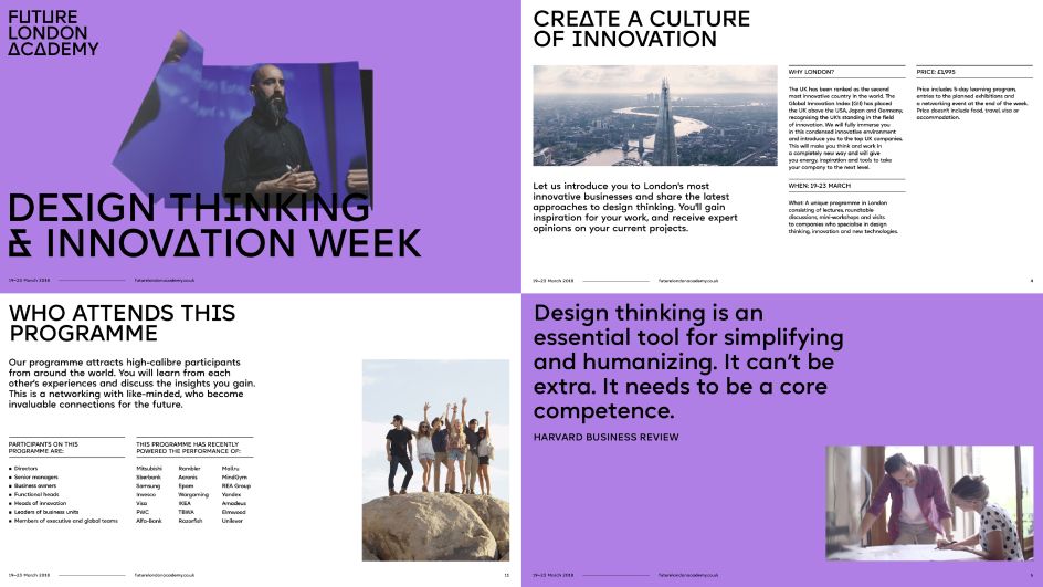
Future London Academy creates "immersive learning experiences for creatives and innovators from around the world". Its unusual approach to education includes talks, workshops, studio visits and round-table discussions with some of the leading visionaries in the field (Facebook and IDEO to name but a few). Students also explore London, meet fellow innovators and visit London’s cultural spots.
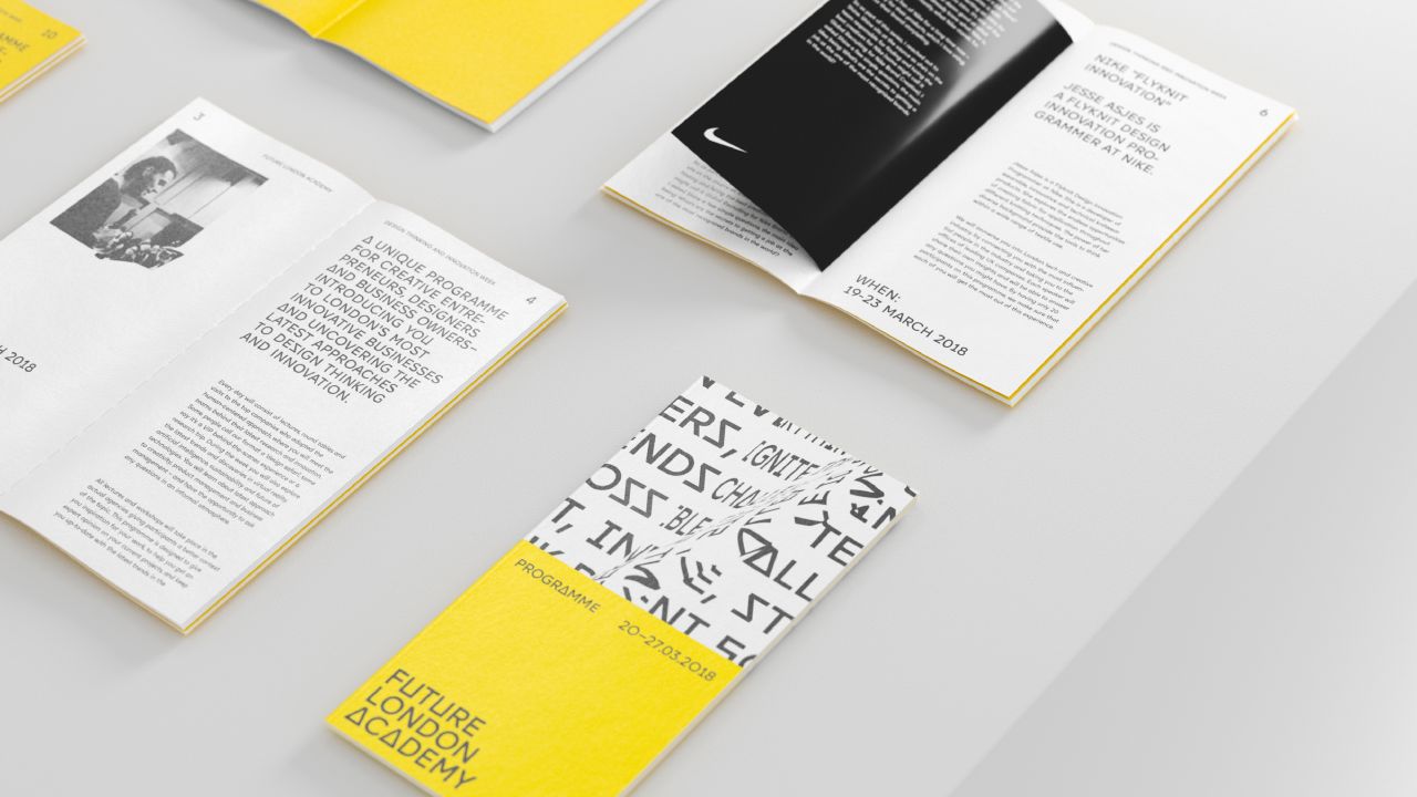
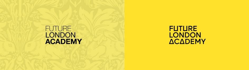
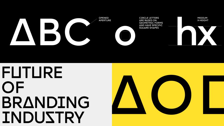
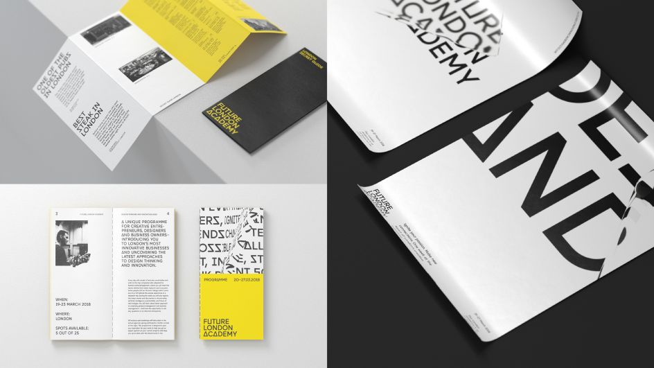
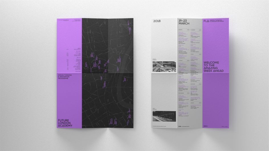
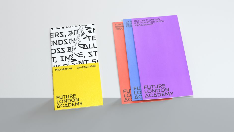
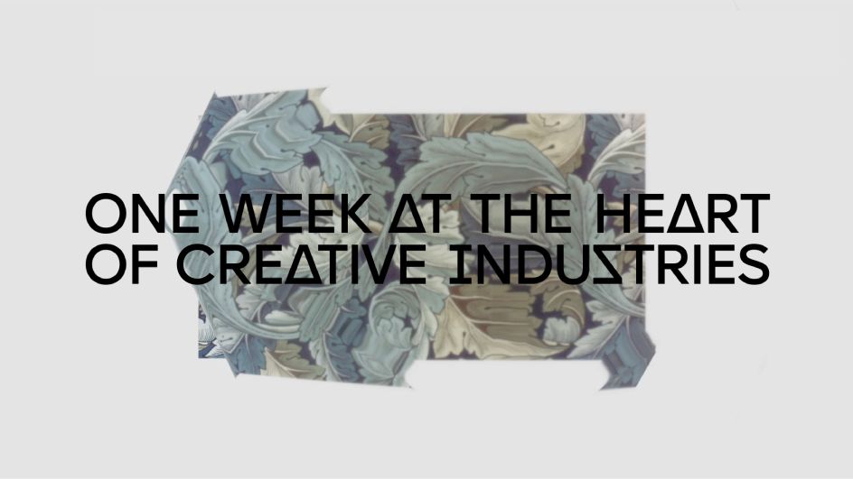
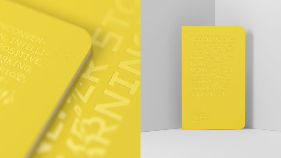
So when it needed to rebrand, it called upon the talents of Moscow-based agency ONY working in collaboration with consultants Michael Wolff, founder of Wolff Olins, and Oliver St John – designer from NB studio. Starting the process with analysing three words: "Future London Academy", ONY considered the original branding to be very "London-y" but not really "Future-y". It was decided that the yellow theme would remain but the typography would get an overhaul.
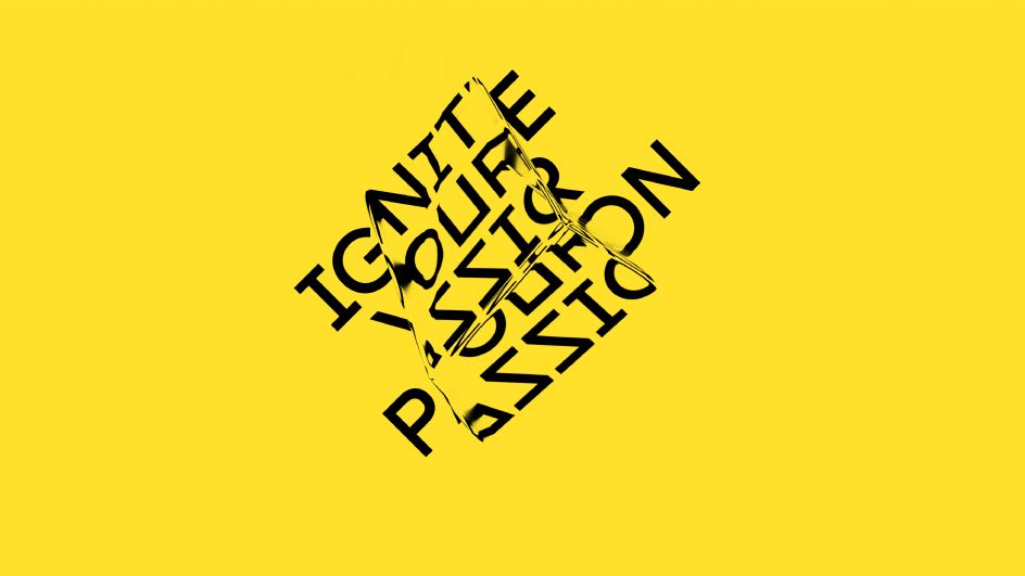
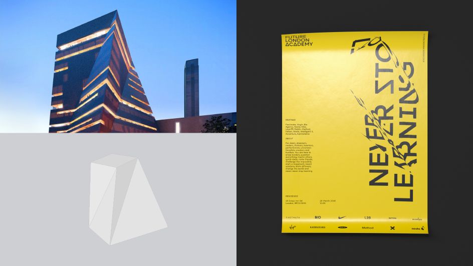
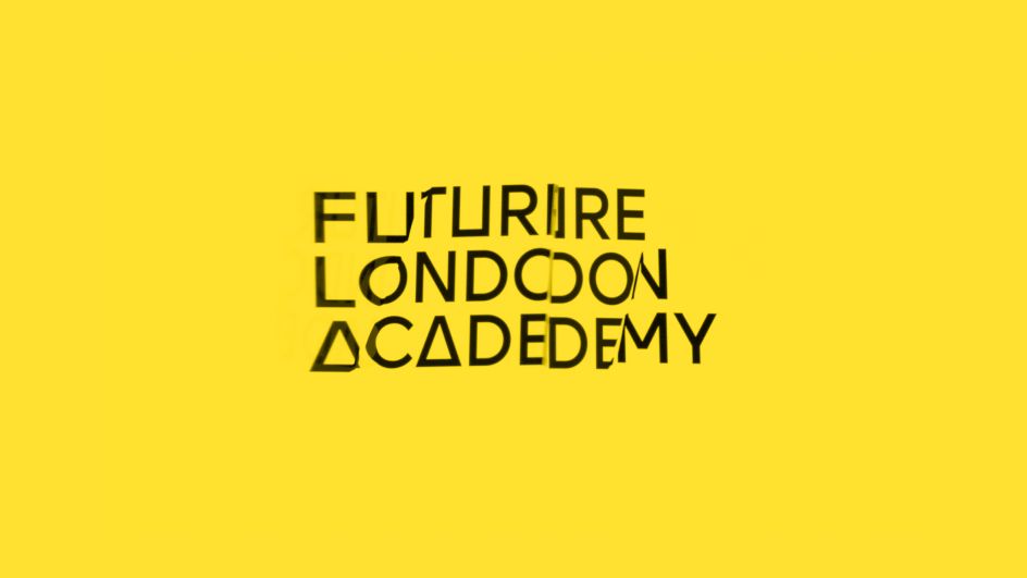
The typography was refracted by objects from London architecture: "We took models of the main architectural and cultural symbols of the city which echo the idea of Future London Academy – knowledge through the lens of London," ONY explains.
"In terms of the technical side: a 3D model of a building was layered on to an image or a text to get a refraction. It can be interacted with by turning the model right and left. The library of 3D objects can always be extended – this gives the brand an unlimited way to experiment and express itself."
"One interesting rhythmic feature that appealed to our attention was a triangle, that appears in the architecture of the city," ONY adds. "Mostly, it is a module structure, as seen with London’s Gherkin. Connecting the geometry of the city with the plastics of the font, the triangle became the first origin of the visual decision. The second element became refraction, that was inspired by geometry of the London’s architecture and Harry Potter's mystical impression of London. As a result, abstract visuals took shape involving brave and bold solutions."
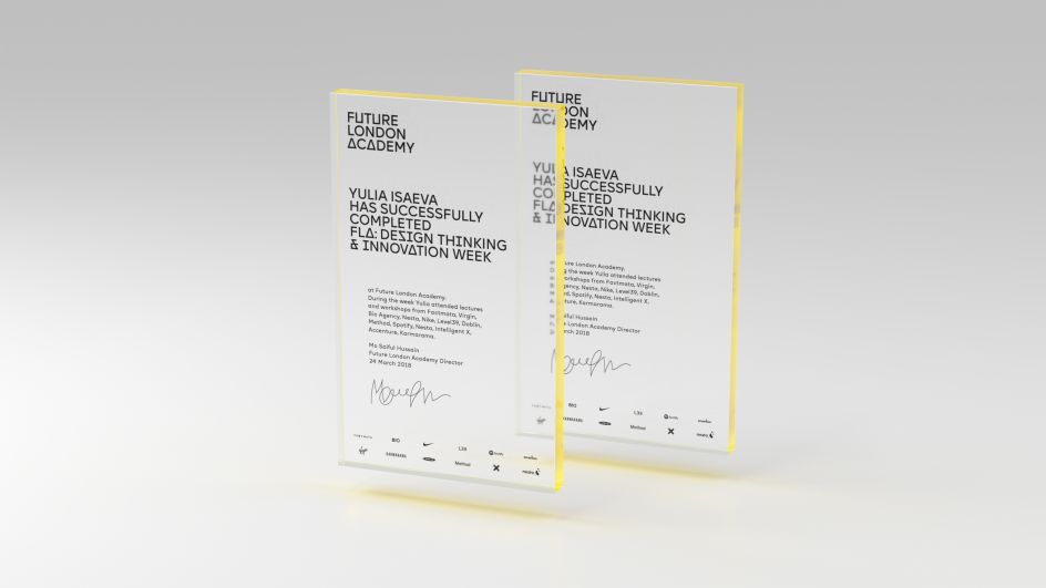
Alongside the bespoke typography, ONY created a minimalist version of the Academy's coat of arms: "It kept the original structure but completely lost the visual redundancy that is irrelevant nowadays (you won’t see the Gryphons in the picture although they are there). The inquisitive viewer can recognise the shape of gryphon wings at the top corners of the picture – they are encrypted in the diagonal lines. Also, there is a high-minded bending of the back of a mythical animal."


Editor's Picks


Trending


](https://www.creativeboom.com/upload/articles/86/862919952c0ad18439004228895a431dc6e45ffc_732.jpg)
Podcasts


Editor's Picks
Further Reading


](https://www.creativeboom.com/upload/articles/51/5167d0786e1f89a450fd8765ce1c3f9c5d4c43d2_732.jpg)