Edinburgh Park: Scotland's new cultural destination gets an exciting brand courtesy of dn&co
A brand new cultural destination is coming to Scotland in the shape of Edinburgh Park. And to help mark its launch, creative studio dn&co has been enlisted to create a brand strategy centred around its unique location and sustainability.
The choice to enlist dn&co is a canny one. The studio is a specialist in creating works centred around culture and place, so the Edinburgh Park project sounds like it was specially made for them. Pitched as a new sustainable urban quarter and cultural destination, Edinburgh Park will also act as a creative campus for Scotland.
Speaking of how the studio got involved with the project, Patrick Eley, creative director at dn&co, tells Creative Boom that they were invited by Kings Place developer Peter Millican. "The nicest, most erudite man you could hope to meet, Peter had the vision to create a place that was progressive yet human, and crucially, not done on the cheap," he explains.
"He is also an avid collector of large-scale art, and his plans for a sculpture trail across the estate really appealed to our fundamental belief in the need for places to have culture at their heart."
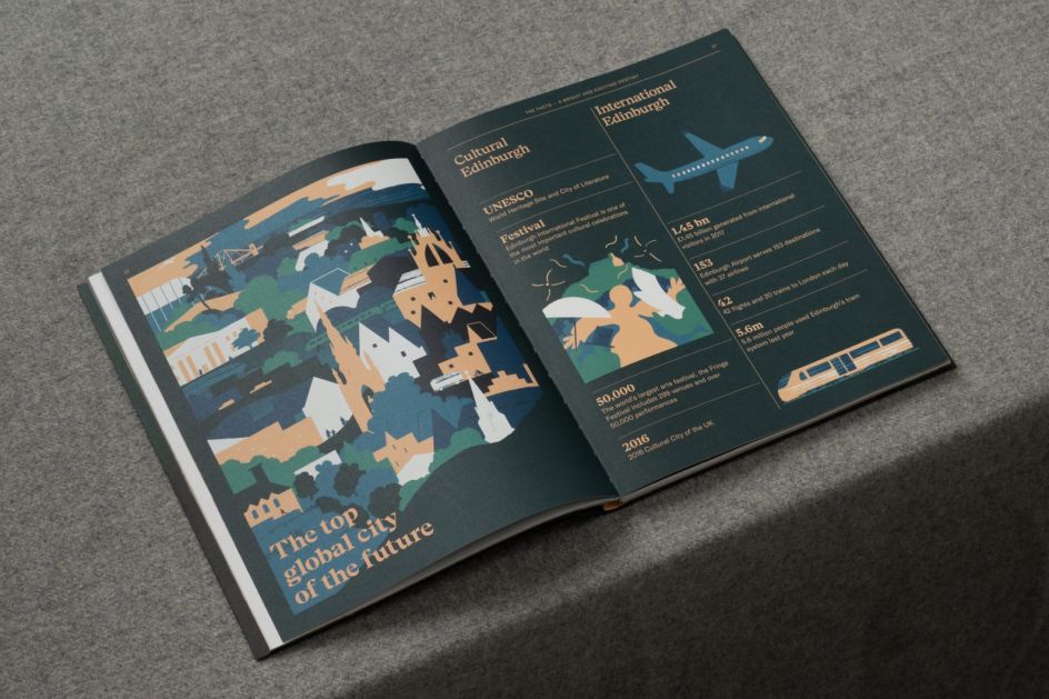
Conceived by real estate developers and investors Parabola, the park is touted as the most exciting new neighbourhood to emerge in the Scottish capital for decades. As well as bringing stunning architecture to the neighbourhood, Edinburgh Park will also provide inspirational workplaces, affordable homes, a civic square, a public lido, and even its own art programme. No mean fear for one of the world's more beautiful cities that is also home to cultural highlights, including the Fringe Festival.
In terms of why the project appealed to dn&co, Patrick adds: "As a studio, we love place — we want to help create places that mean something to people, that contribute positively to their lives and improve their wellbeing. Edinburgh Park allowed us to create a brand that stood for these values and at the same time radically change perceptions of a place, from a passing point to a destination. Exploring what the new town for a 21st century Edinburgh could look like, in a city that is already an exemplar of place creation, was a fascinating challenge."
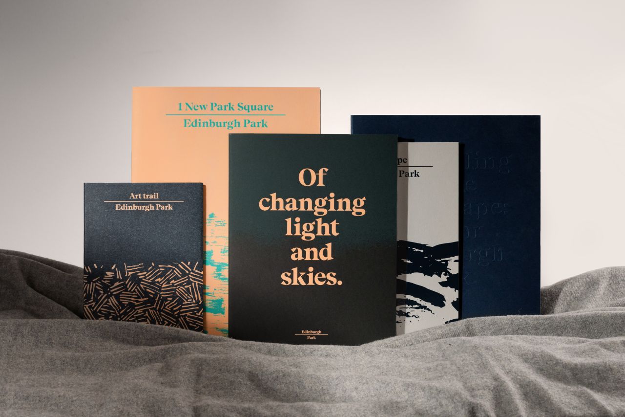
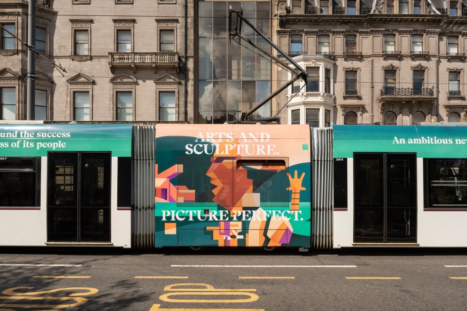
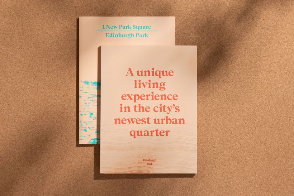
With its palette of delicate oranges, purples and greens, not to mention the use of contemporary and dignified typography, dn&co's brand for Edinburgh Park positions it as an exemplar for progressive placemaking. Which is fitting for the destination described as an "ambitious new community based around the success and happiness of its people."
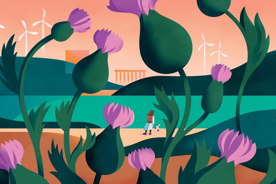
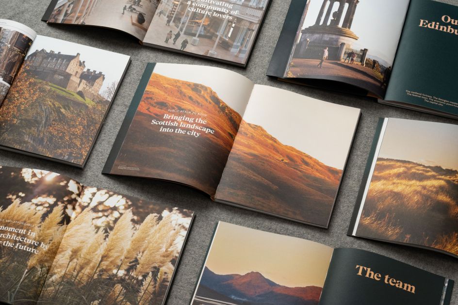
Celebrating as it does the unique location where world-class art and culture collides spectacularly with the natural beauty of the Pentland Hills. Edinburgh Park's visual language takes inspiration from the wide new horizons of the site. Hence, the soft colours feel like they are stretching off into the distance. Meanwhile, the characterful serif typeface sits above and below the horizon line to make a subtle yet distinct word marque.
"Edinburgh is a beautiful city – two architecturally distinct towns separated by a deep cleft, set within a craggy volcanic landscape in sight of the sea," Patrick explains. "There's a particular smell, a particular colour to the low glancing light and a particular texture to the stone. Alexander McCall Smith's words really struck to the heart of what this place feels like – those moments when you look out and across and see further than you thought you could.
"We wanted the visual language for Edinburgh Park to reflect that sense of possibility, openness and broad horizons. We started with creating a deliberate graphic horizon line with textures and patterns applied across printed matter and then developed this into a word marque. The simple rule device separates words and phrases and articulates the horizon line.
"It's paired with beautiful natural photography capturing the light and life of the city and its environs, while vibrant illustrations in rust, heather and forest greens create expressive and immersive worlds."
Capping off the brand design is the line "shifting light and changing skies", which was gifted by international author Alexander McCall-Smith from a quote about his home city, and now appears in neon on-site.
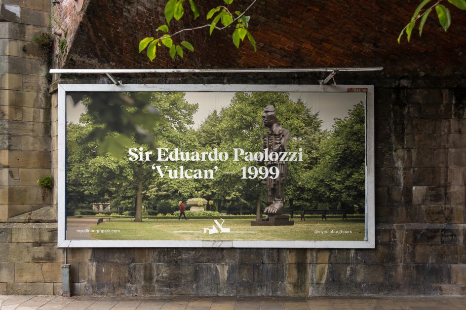
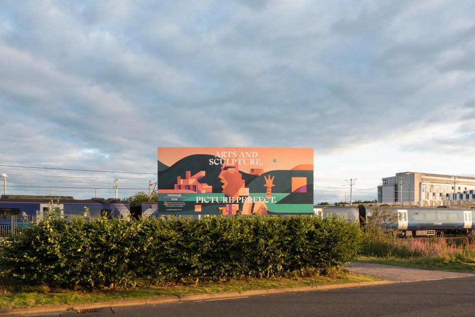
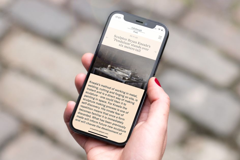
And for a new park, there's already a lot to see and do. There's the trail of world-class sculpture, and Parabola is working closely with photographers and poets-in-residence to document the project as it unfolds.
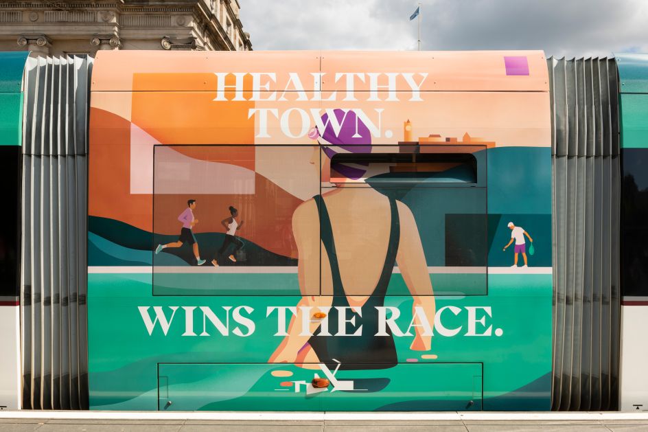
Appearing across brochures, websites, and advertising wraps throughout the city, dn&co's brand for Edinburgh Park results from close collaboration with photographer Steven Fisher and illustrator Petra Eriksson to create beautiful visuals that bring the identity to life.
Sustainability is also at the heart of the brand, which is communicated in innovative ways: "We created a campaign to communicate the promises that Edinburgh Park is making – of which 100% renewable energy is a key component - and wrapped the trams which wind through the city with these powerful messages.
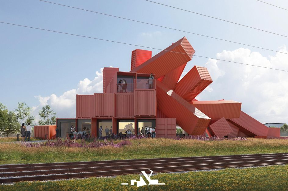
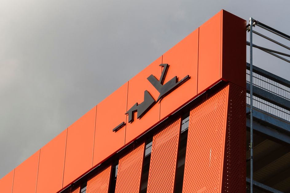
"Additionally, the secondary marque for Edinburgh Park is based on a spectacular landmark building by Scottish artist David Mach planned for the site. Made from recycled shipping containers that look to have been thrown to the ground by a giant hand, the building will act as the community hub for the area. The marque embodies the place's commitment to sustainability dramatically."
Editor's Picks


Trending


](https://www.creativeboom.com/upload/articles/86/862919952c0ad18439004228895a431dc6e45ffc_732.jpg)
Podcasts


Editor's Picks
Further Reading