Walking The Walk: Design Council brand refresh focuses on sustainability and accessibility
When the Design Council worked with OPX to refresh its own branding, a simplified design system and updated, graphic language were the most visible signs of change. But other changes under the hood may be more important, with the organisation opening up a conversation about more inclusive and sustainable design.
If you're an industry-leading body, you need to lead by example. And so the Design Council's refreshed visual identity has sustainability and accessibility at its heart.
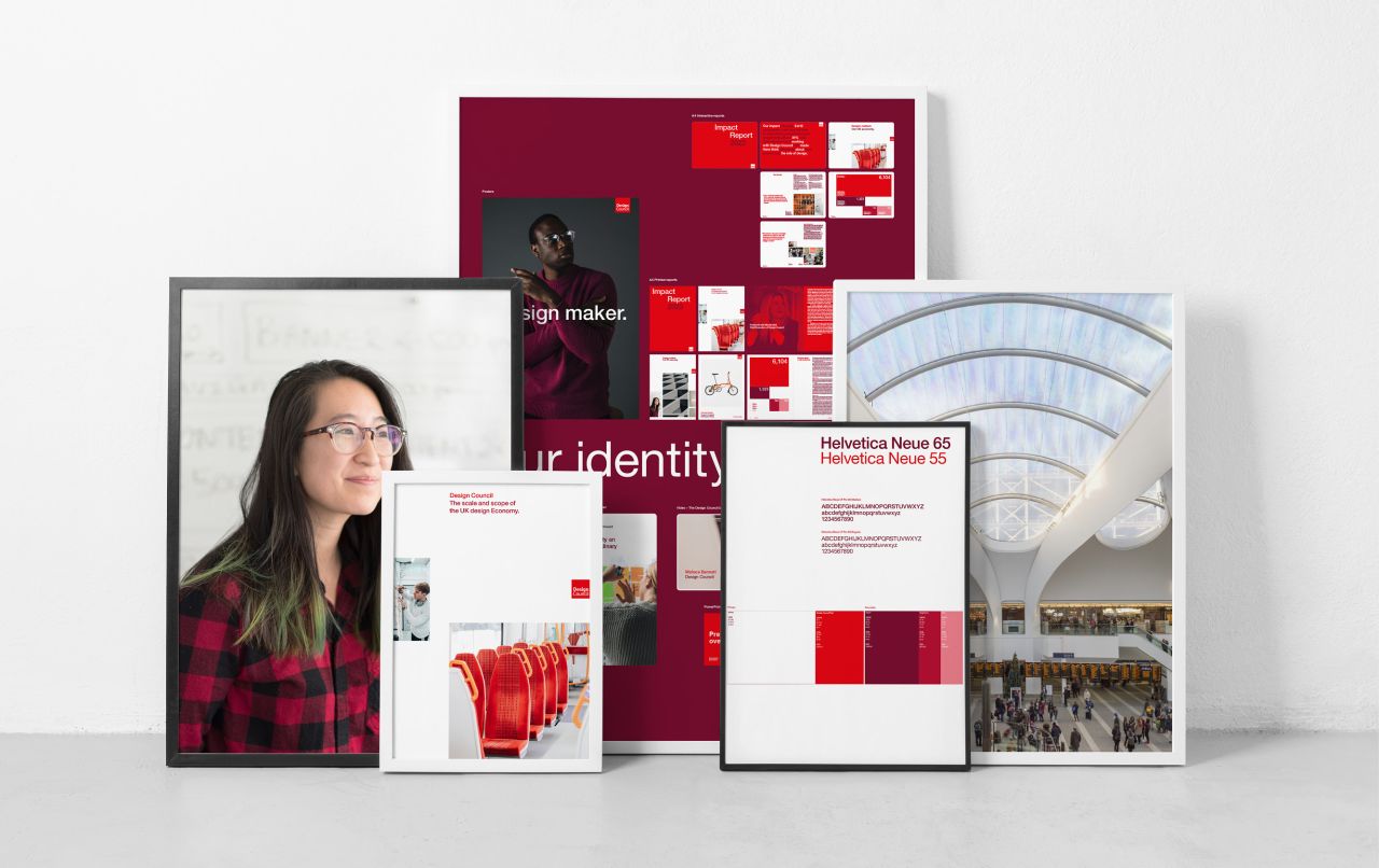
The organisation has been working with B-Corp-certified brand studio OPX to create a simplified design system and updated graphic language for its own branding, promoting the use of white space and applying a structured use of red to create signature moments.
The colour palette has been streamlined to replace black with a deep claret that brings depth and warmth. Carefully selected hero imagery is used to champion all disciplines of the design industry as well as UK communities and businesses.
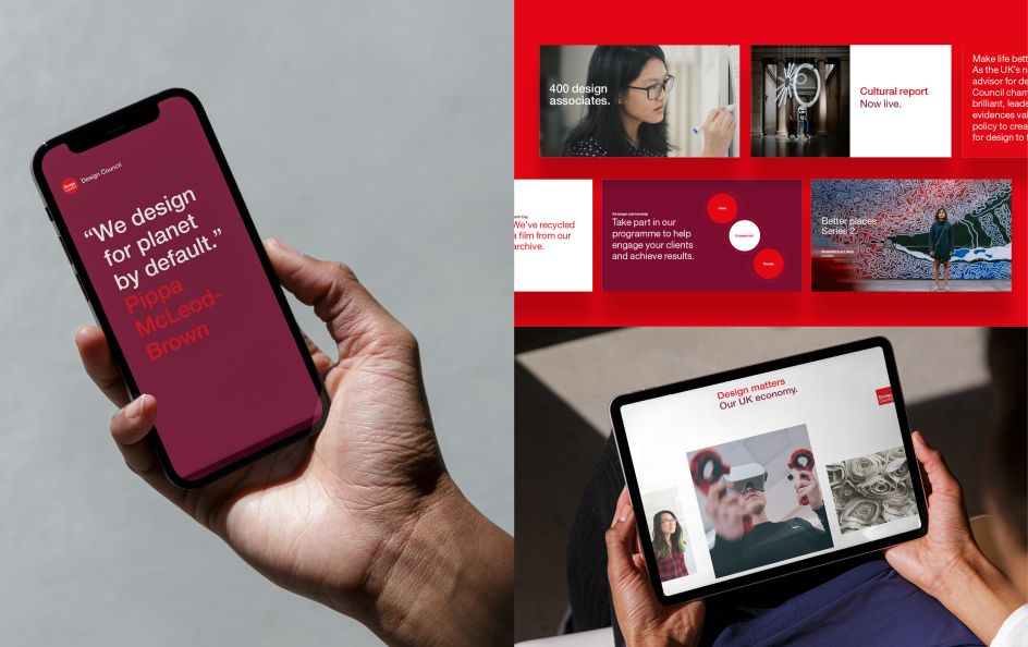
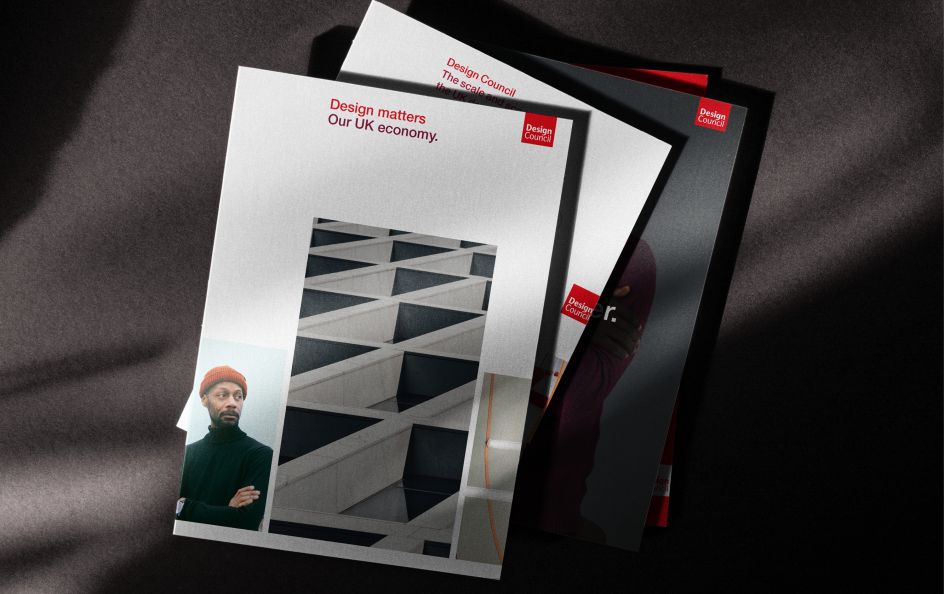
It's not a complete redesign, though. The distinctive red Design Council logo, created by Tayburn McIlroy Coates in 1996, remains unchanged. Its core red colour and Quay Sans typeface cement the clarity and consistency of the brand's identity.
New guidelines
Perhaps more important than the new brand assets are the new guidelines drawn up to ensure accessibility and sustainability are at the heart of the organisation's work.
Conducted in late 2022, the accessibility audit was based on the AA rating for WCAG 2.1 published in 2018. For non-digital applications, feedback was based on a translation of WCAG guidelines where appropriate, the Leserlich contrast calculator, and industry best practices. Mia Allers, design lead on gov.uk at the Government Digital Service, audited the new guidelines and provided recommendations about their physical and digital application.
Unlike accessibility standards, there wasn't a formal set of rules to follow when it came to the carbon impact. However, the sustainability audit considered broad considerations of how the brand may be applied to communication materials to keep the carbon impact of branding to a minimum.
"When you understand the impacts of what you do, you are more likely to design in a considered and strategic way," explains Mia Allers. "Conducting a sustainability and accessibility audit is just the start. And for the Design Council, it's a new approach I hope to see more brands adopt. Sustainability and accessibility guidelines will help steer the strategy of each piece of communication created from now on. It all comes down to clarity, usability and impact, which are foundational to good design."
The recommendations led to several adjustments to the new guidelines, including:
The addition of an off-white colour to use in digital applications, as white is the most energy-emitting colour.
Using cropping, a two-colour-only filter and saving a file in SVG format to reduce the size of images.
Helvetica Neue was selected for the signature typeface because serif fonts have been found to be harder for neurodiverse people to read.
Use of white space increases legibility and allows for printing directly onto white paper.
Introducing HTML versions of all PDF documents to be screen-reader friendly.
Guidance for not using red and colour combinations with type under a certain size to ensure legibility.
Use of consistent headings in presentations and reports to help with user navigation.
With the new guidelines in place, the Design Council hopes to start a dialogue with the design community to continue to learn and inspire others to incorporate people and the planet in their work.
Chance encounter
"This project is the result of a chance encounter in 2021 when we saw Design Council CEO Minnie Moll speak passionately about the organisation," says David Bennett, creative director of OPX Studio. "It got us thinking about what design means for everyone and led to a simplified visual language that we hope will help support the brilliant work they do. We welcome the opportunity to learn more about accessibility."
"It can be tempting to be too clever or too showy when designing for the Design Council," says Minnie Moll. "But OPX Studio has done exactly what we wanted. The brief was for a refresh rather than a rebrand, and the small but important changes that were made have created a canvas for our communications that feels fresher, warmer and cleaner."
"Our new mission makes walking the walk an imperative, and conducting a sustainability and accessibility audit of the brand guidelines makes the Design Council brand fit for purpose for a new era of Design for Planet," she adds. "We see this as a work in progress, and we hope to hear from other design practitioners doing the same, so we can share knowledge and continue to do better."
Editor's Picks


Trending


Editor's Picks
Further Reading