Michael C Place of Studio.Build's type-led brand overhaul for Robert 'Umberto' Walker
Designer Michael C Place is behind a fresh and bold identity for the studio of Robert 'Umberto' Walker, a Yorkshire artist specialising in Verre Églomisé. The overhaul by Studio.Build features a bespoke dynamic typeface that nods to some of Robert's favourite fonts and even includes a big name change.
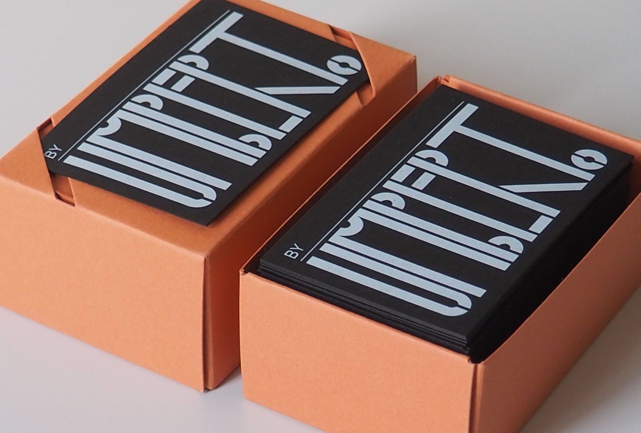
Formerly known as Signs by Umberto, Studio.Build has refreshed the name to become byUMBERTO. By removing 'signs' from the brand name, it shifts the focus onto the individual at the heart of all the studio's projects, celebrating Robert as the star of the show. "The idea behind this change is a very simple one," says Michael. "All great artists sign their work. By calling himself Signs by Umberto, he was doing a great disservice. Yes, he does sign writing as a part of his offer, but that is not all he does. The simple mechanic of adding 'By' to his visual and verbal identity means he can talk about his sign work and really introduce all the other facets of his business."
At the heart of the visual identity, Michael and his team took inspiration from Robert's passion for typography, craft, detail, and keeping heritage skills alive, crafting a full custom typeface that includes a logotype. "What Rob does is special, so we wanted to make sure we designed something for him that is also unique and bespoke," Michael tells Creative Boom. "Something with character, again just like Rob! We also wanted to make the type respond to the setting, so we designed the type to be dynamic and responsive."
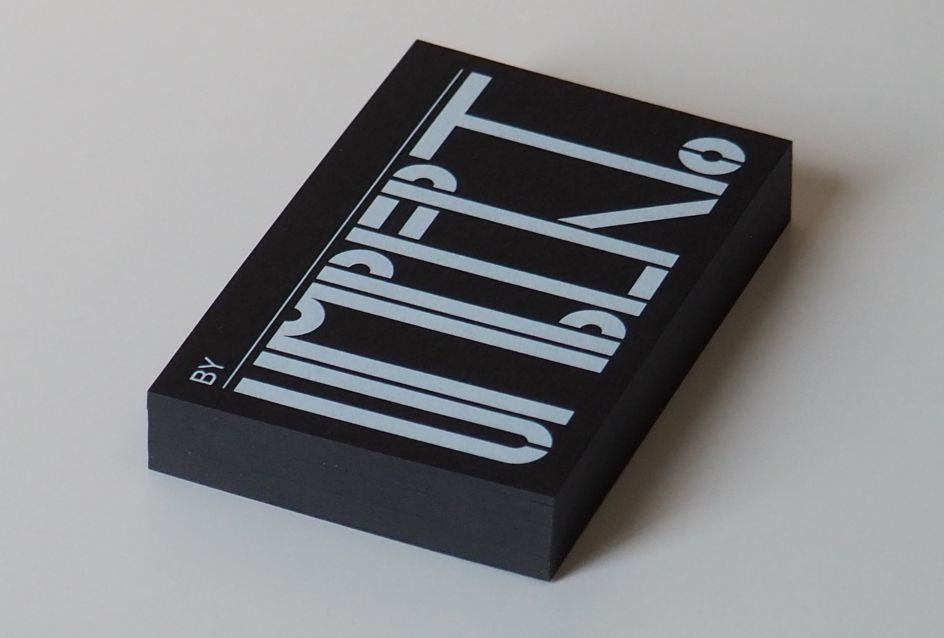
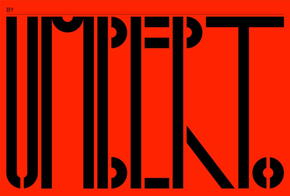
Michael was also keen to avoid making the typeface feel like one of Rob's meticulously researched pieces and deeply rooted in history. "That isn't to say that ours didn't enjoy the same effort," he says. "Rob and I spent a day in Leeds poring over some of his favourite type references. We took various cues from different styles and came up with the custom type that you now see. The intention is that Rob will eventually take the type, and he will do versions of it using various techniques like Verre Églomisé, gilding and brilliant cutting."
Looking at Robert's previous identity, which featured a charming 1950s-inspired cartoon mascot, this refresh marks a new chapter for the artist. "The mascot was supposed to be a cartoon version of myself," Robert tells us. "At the time, it felt right and relevant, as my studio at the time had a focus on all things sign writing with a love of 1950s lettering, including music, packaging and wider '50s graphic design. However, five years on and the website, logo and type used across the studio did not reflect the level of detail and rare techniques I now practice today."
](https://www.creativeboom.com/upload/articles/cf/cf1ed9188bcbc010fd769df47216f6c90edaa9ed_944.jpg)
Photography by Arran Cross
](https://www.creativeboom.com/upload/articles/e7/e7683e9e5ac1d58ee5b49aef548d59c849c8b6ba_944.jpg)
Photography by Arran Cross
As part of the rebrand, Sheffield-based photographer Arran Cross was brought in to create a series of personal images for Robert's new website. Arran spent three days with Rob at his studio and on location, working alongside him to capture a sense of what he does and reveal more of his personality. "From the day we met, it was obvious that Robert was an incredibly passionate and skilled craftsman," says Arran.
"As our friendship has developed, his obsession for detail, raw talent and unbelievable work ethic has continued to impress, so I wanted to make images that demonstrated these attributes. I also wanted to explore Rob's personality, the breadth of his skill set, and his craft's intricacies."
](https://www.creativeboom.com/upload/articles/3b/3bcc71a9d34056dc0c1c1a6581f1a6d3379f7fdb_944.jpg)
Photography by Arran Cross
](https://www.creativeboom.com/upload/articles/d8/d833b4f9af8b2364fa79a172d59ca6865d67a003_944.jpg)
Photography by Arran Cross
Alongside the visual identity, Michael and his team at Studio.Build worked with Robert on strategy, written identity, website design and build plus presentation templates. "Both of us see this as a long-term relationship," he says. "We really believe in what Rob is doing and what he hopes to achieve in the future, and it has been a real pleasure to help him achieve his goals and desires."
Anyone who knows Robert in the creative industry will know that he is a passionate artist and highly skilled at what he does. "He is a very eloquent person who is very humble and wears his heart on his sleeve," adds Michael. "I love that about him. It was refreshing to work with someone so honest and invested in the process."
With such a strong start to the year, it will be wonderful to see what Robert does next. The fresh identity has been rolled out across all of Robert's channels, from website and social media to business cards. "It was an honour to work with Michael and Nicky Place and their wonderful team. They've injected a huge amount of confidence in me to take myself and my work to a new and exciting level."
](https://www.creativeboom.com/upload/articles/e3/e34db186bb7937e83b4ed2c87b008ef7640ce9c3_944.jpg)
Photography by Arran Cross
](https://www.creativeboom.com/upload/articles/c7/c78a4813e3e8608a6d211452d5d41f5b582191d5_944.jpg)
Photography by Arran Cross
Editor's Picks


Trending


Editor's Picks
Further Reading