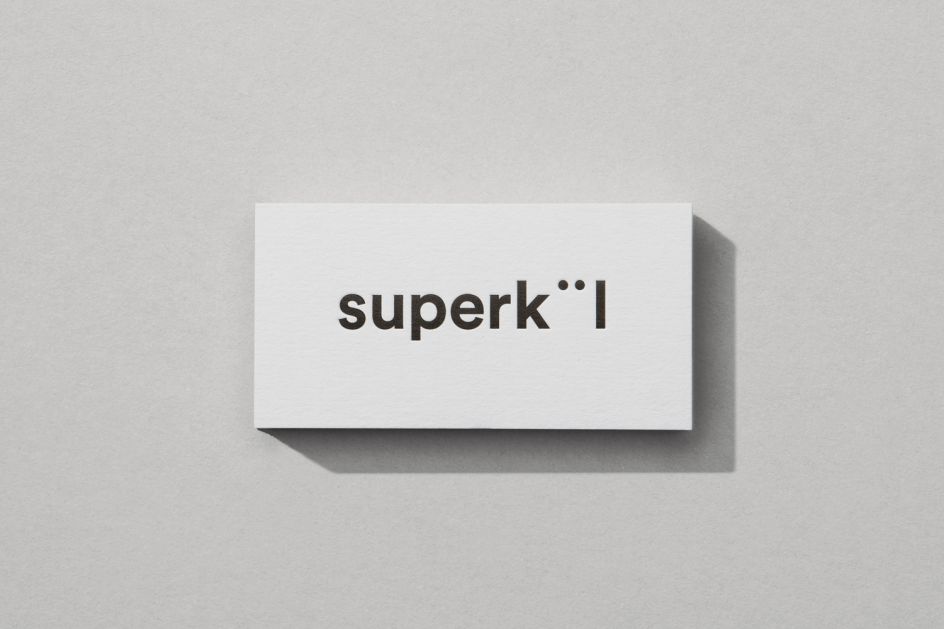
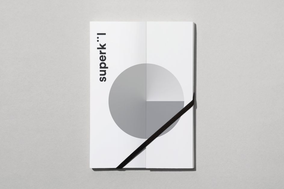
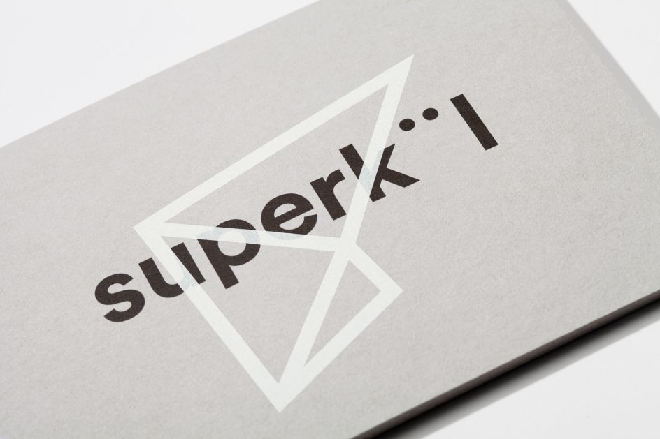
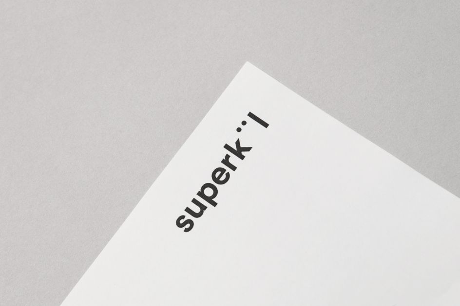
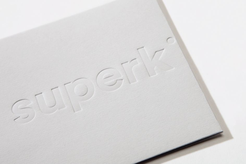
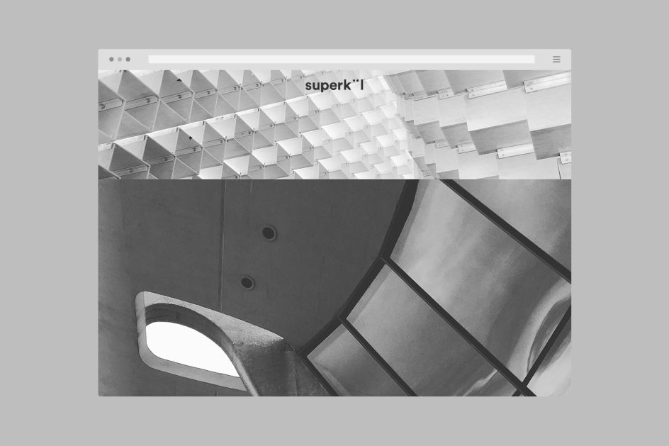
Blok Design builds a crisp, geometric identity for Canada's superkül architectural firm
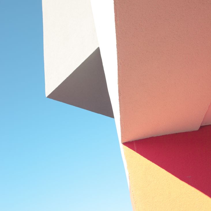
Blok Design's clean identity for prominent Canadian architectural firm, superkül, was apparently inspired as much by the values that distinguish its practice as those that define great architecture.
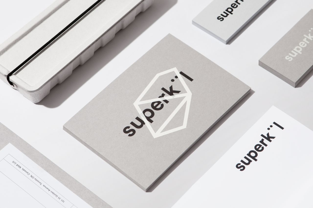
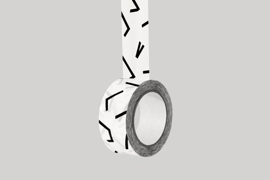
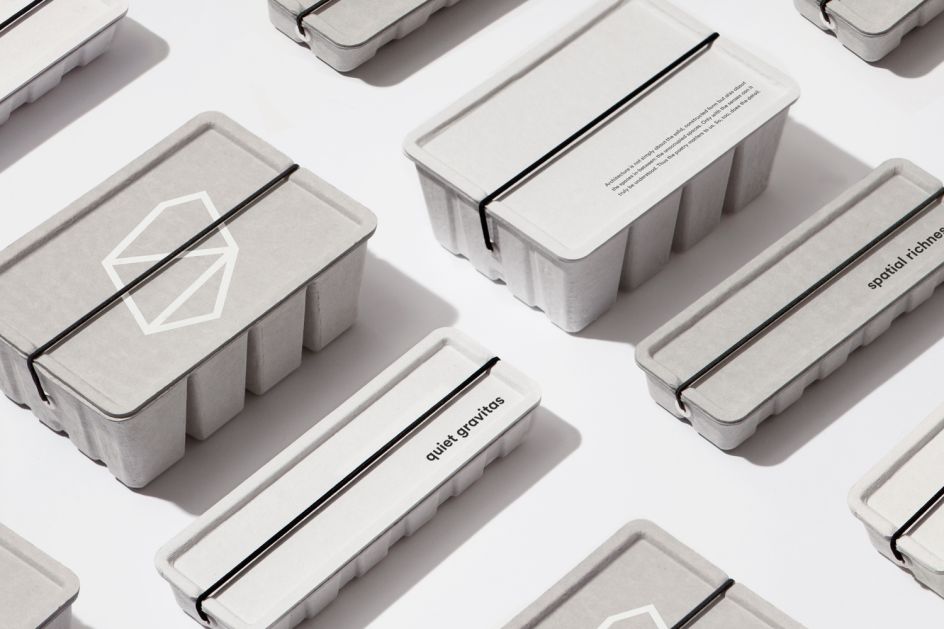
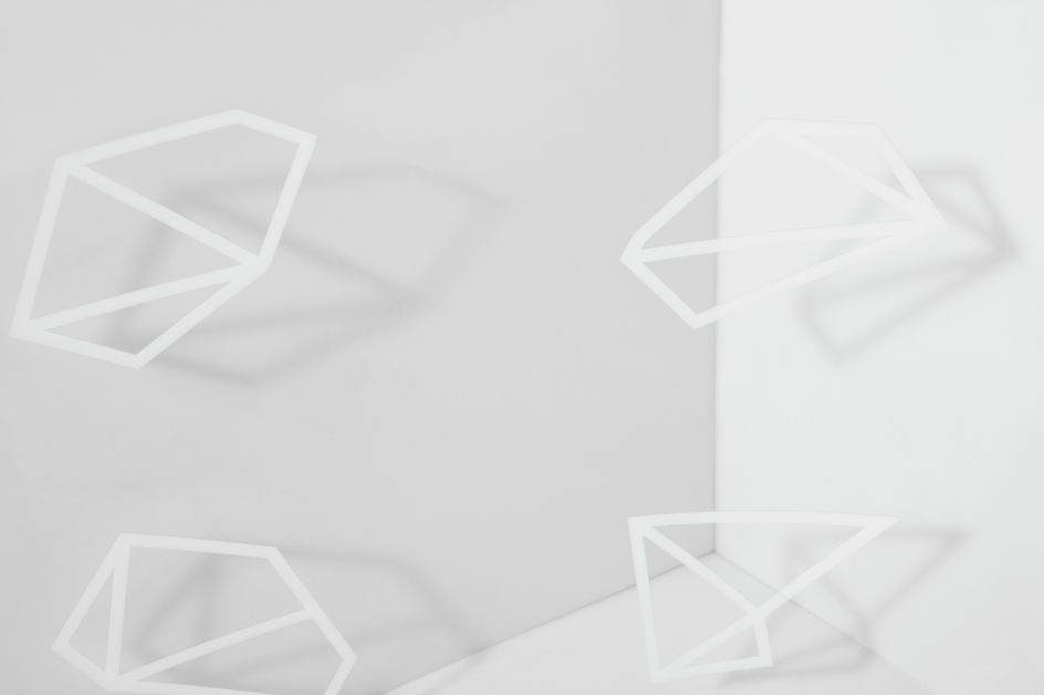
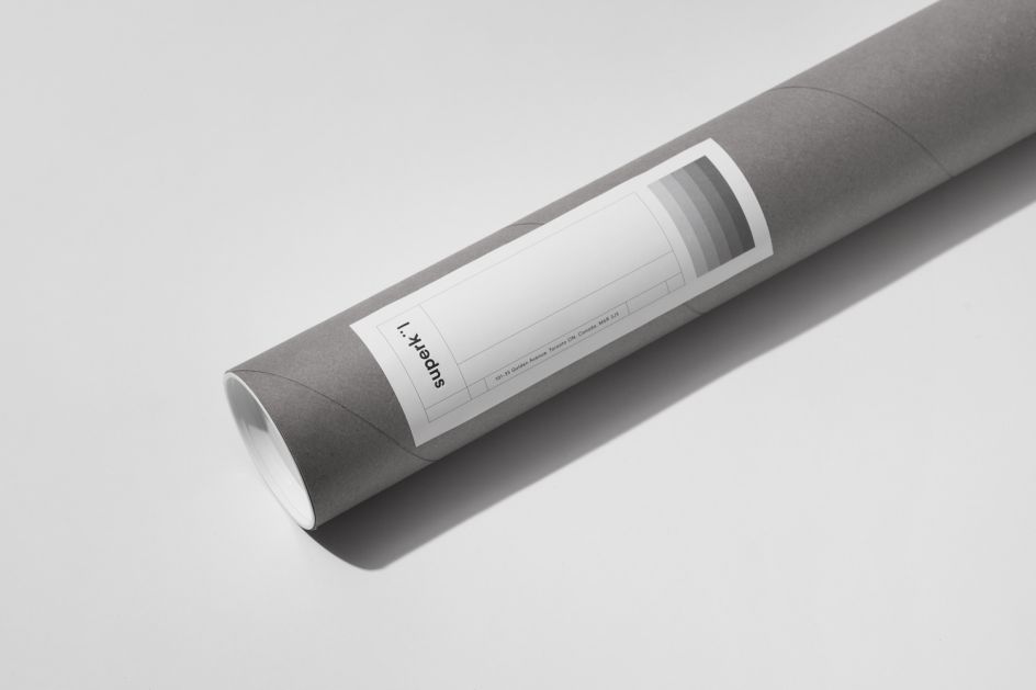
"It’s said that only with the senses can architecture truly be understood," said Blok, of its latest project. "For superkül’s new brand identity, we created a sensual conversation and interplay between process, colour, shape and materiality, inspired by the balance of subtlety and spatial richness found in the firm’s work, and the purity of their own geometric forms.
"Within the design can be found a series of deliberate 'unoccupied spaces', a reflection of the fact that architecture is as much about the spaces in-between as the built form."
Blok is a design studio based in Toronto and specialising in brand identities and experiences, packaging, exhibit design, installations and editorial design. Clients range from Nike, Design Exchange Museum and Pepsi to Toyota and Roots. Discover more: www.blokdesign.com.
Editor's Picks


Trending


](https://www.creativeboom.com/upload/articles/86/862919952c0ad18439004228895a431dc6e45ffc_732.jpg)
Podcasts


Editor's Picks
Further Reading