East meets West in Shiseido's first-ever brand code in 150 years
"Dynamic, universal and unified" is the sentiment behind Brody Associates' new identity for Shiseido, the iconic Japanese brand that began life as a family-run pharmacy in Tokyo 150 years ago and went on to become one of the most respected names in the beauty industry.
Porfolio. Credit: Nick Rochowski
Its new look follows three years of research by Neville Brody's agency and an "utterly fascinating" delve into a huge archive of avant-garde marketing campaigns and science-meets-nature products across the brand's three main categories: skin-care, makeup and fragrance.
Was there anything that stood out especially in the archive? "Probably discovering that in Japan, Shiseido has always been considered creatively and culturally avant-garde," Neville Brody tells Creative Boom. "The brand has broken down many barriers in terms of supporting women and has always been a pioneer in diversifying the Japanese beauty market, featuring tanned models like Bibari Maeda as far back as the 1960s, which was quite a shocking game-changer at the time. It was important for us to bring that avant-garde-ness and bravery forward again."
As Neville puts it, Shiseido is renowned for its unique and inclusive approach, having created a slogan to "love the differences" and create "beauty innovations for a better world" – it wanted to build on its heritage yet look to the future.
"Shiseido's philosophy is characterised by deep respect towards ancestors, nature and the earth, which it had always interrogated in a very authentic and respectful way," adds Neville. "While being a global brand, Shiseido has maintained a very strong sense of 'Japaneseness': in that sense, Shiseido's philosophy has historically been characterised by a certain dualism: Western science meets Eastern art, high-tech engages natural ingredients, perfection is found in imperfection, simplicity in complexity."

Porfolio. Credit: Nick Rochowski

Porfolio. Credit: Nick Rochowski
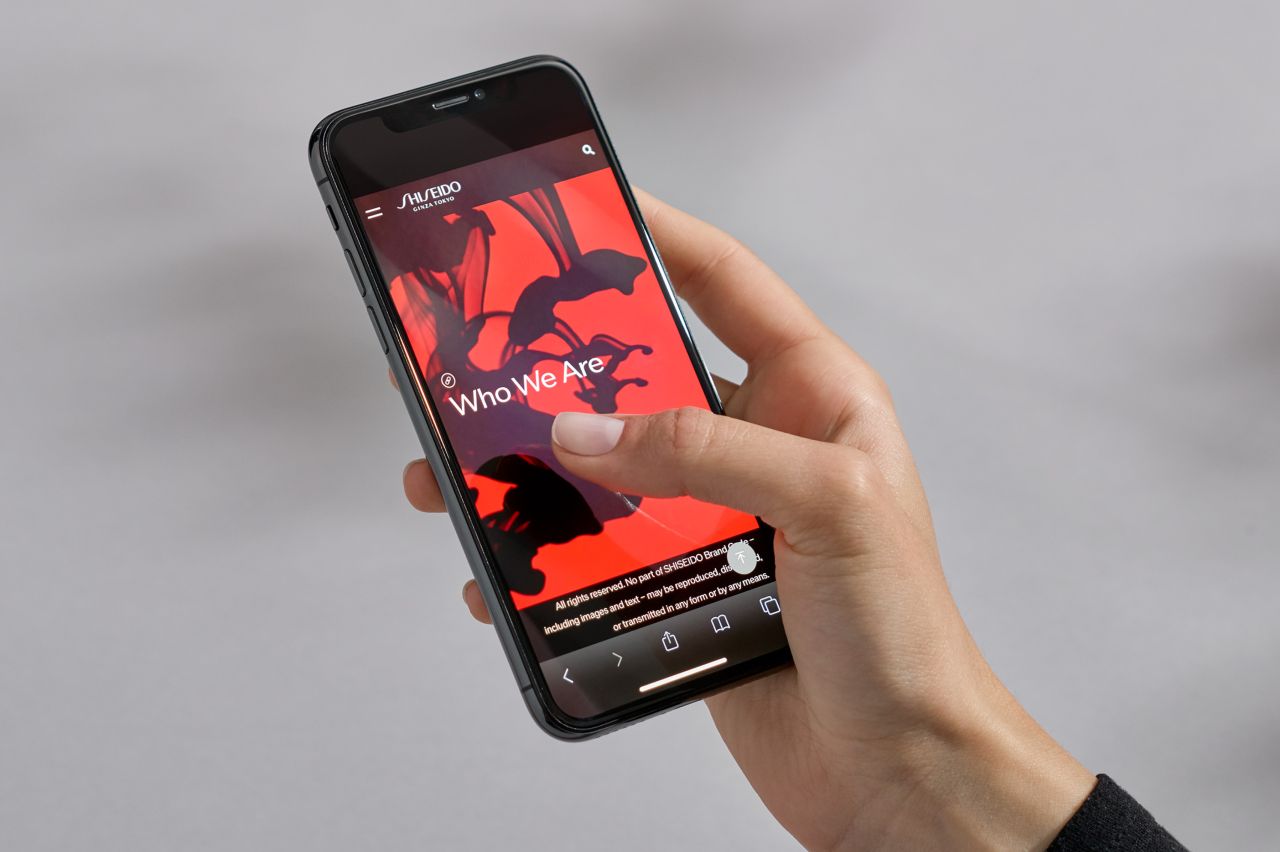
Brody's team has given Shiseido the guiding principles and tools it needs to cope with the ever-increasing demands of marketing to an audience across both physical spaces and digital channels. "Instead of dusting off brand identity elements like a logo or simply running through a re-styling exercise, we sought to capture the brand's vision and values through extensive research," explains Philip Rodgers, director at Brody.
"Historical elements can inform a successful strategy moving forwards; more than a heritage or nostalgia piece, handled sensitively they enable the brand to reimagine itself in a very modern way without losing its sense of authenticity," Philip adds. "Like an infinity spiral, every time it goes around, it comes back, more agile, adapting itself to changing market needs, consumer demands, marketing and communications platforms. The key was to embrace Shiseido's rich history but make it relevant to use today."

Porfolio. Credit: Nick Rochowski

Work in Progress. Credit: Nick Rochowski
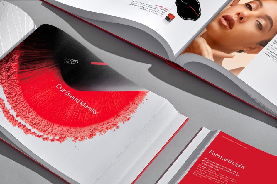
The result is an essential toolbox for Shiseido to construct its global marketing and communications; a larger system that allows the different creative teams to express themselves yet keep consistent with the global brand language. In true Japanese fashion, the overarching theme is balance: an enviable legacy with a digital edge, the esoteric "East meets the industrial West".
"I think that we managed to translate a difficult cultural perspective into something more shareable and usable. Authenticity needed to sit at the heart of the brand code, and out of that, we were able to create a wide set of guiding principles, as opposed to just a book of rules and restrictions," says Neville Brody. "We took the concept of opposites meeting to create something new like one of our core principles, and allowed that to drive everything from image contrast – for example near and far, natural and urban – to typographic scaling and use of space, to material contrasts in physical environments and packaging.

Work in Progress. Credit: Nick Rochowski
Porfolio. Credit: Nick Rochowski
"Underpinning all this was a set of clear brand identity components and a structured visual identity narrative that allowed the different product segments to differentiate themselves while centred around the core stories. The most important thing the brand code did I think was to create continuity from the past to the future, by connecting underlying values and heritage to future-facing tools and environments."
Were there any challenges along the way? "To be honest, the rich history of Shiseido was a godsend in terms of material and attitude," says Neville. "Having always been a creatively pioneering company, from small beginnings to a global brand, there has always been a sense of scalability and creativity in their approach to communications. This combination of fluidity and fixed elements really helped guide the adaption to a more digital space.
"What also really helped was the brand’s historic understanding of the strength of imagery, a perfect base with which to approach social media platforms like Instagram. At the end of the day, we saw their digital space as a connecting space – internally between markets, creatives and strategies, and externally between consumers, narratives, and creativity."


