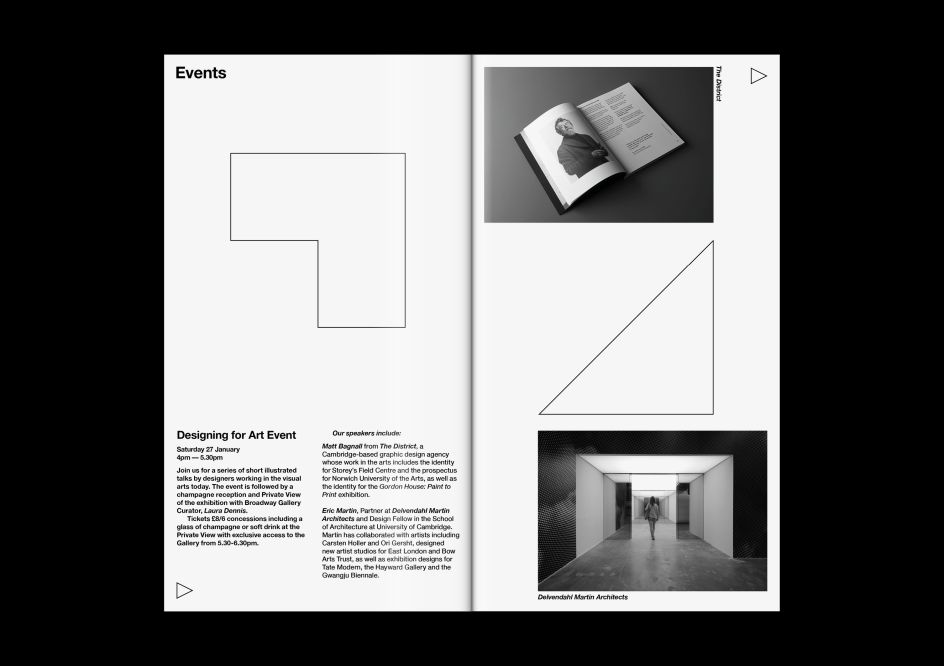
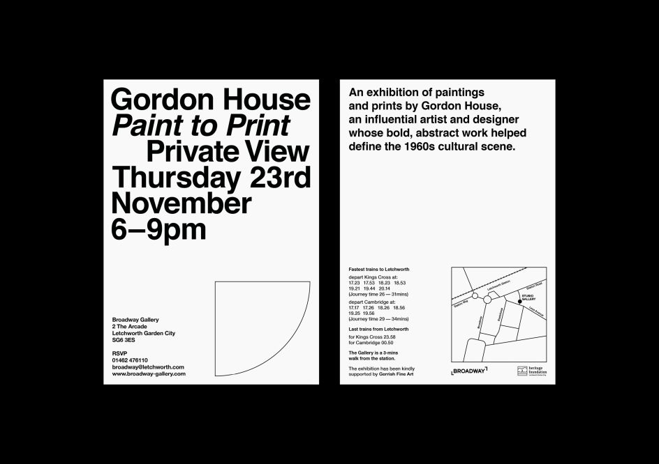
Reverting to Type: exhibition identity by The District inspired by '60s typography
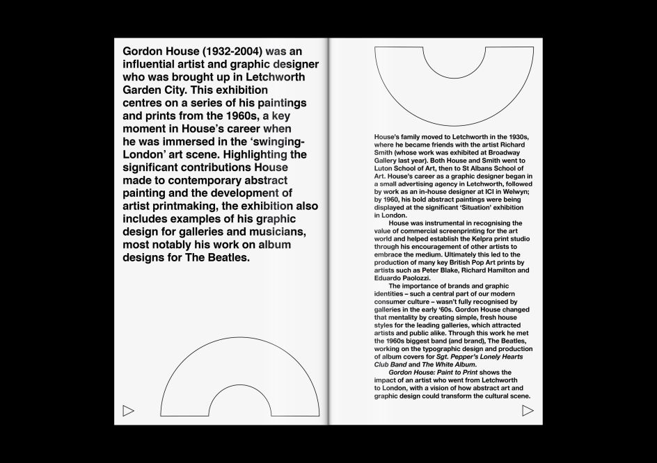
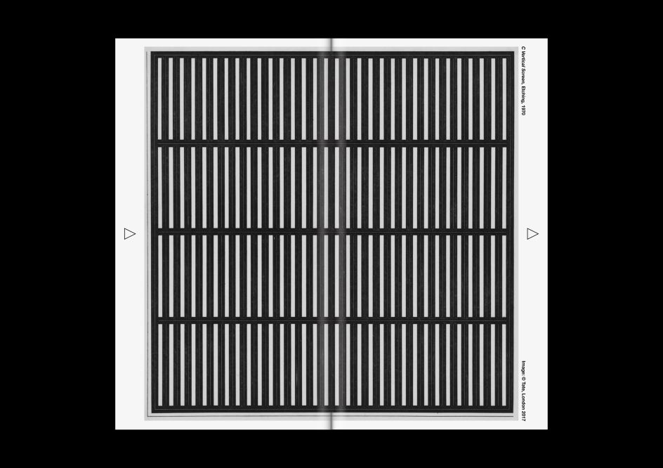
Immersed in the London art scene of the Swinging Sixties, Gordon House (1932-2004) is perhaps best known for designing The Beatles' White Album and the back of the Sergeant Pepper album. But that was just one small element of his long career producing abstract paintings and print work for the likes of the ICI, the Arts Council, the Institute of Contemporary Arts and the Robert Fraser Gallery.
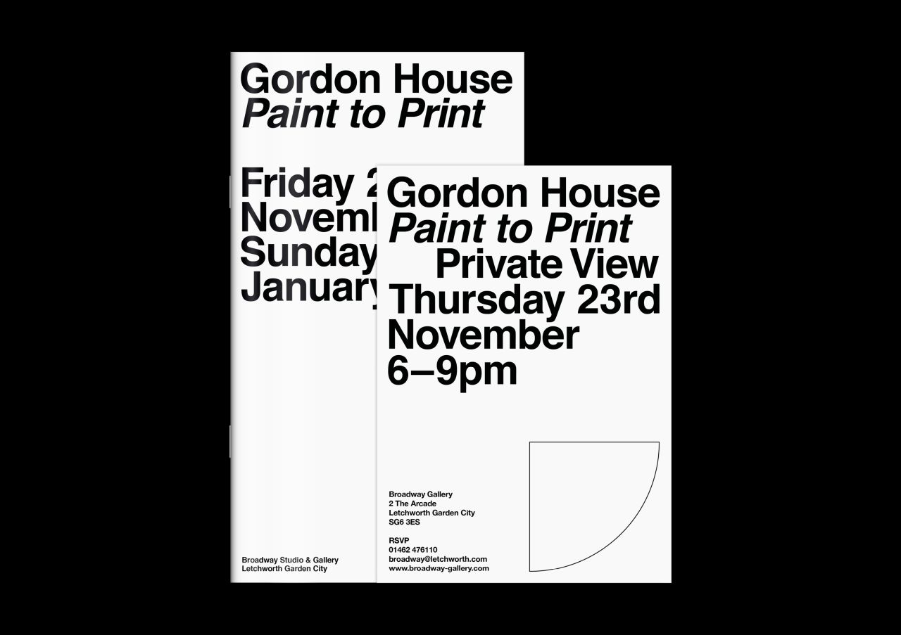
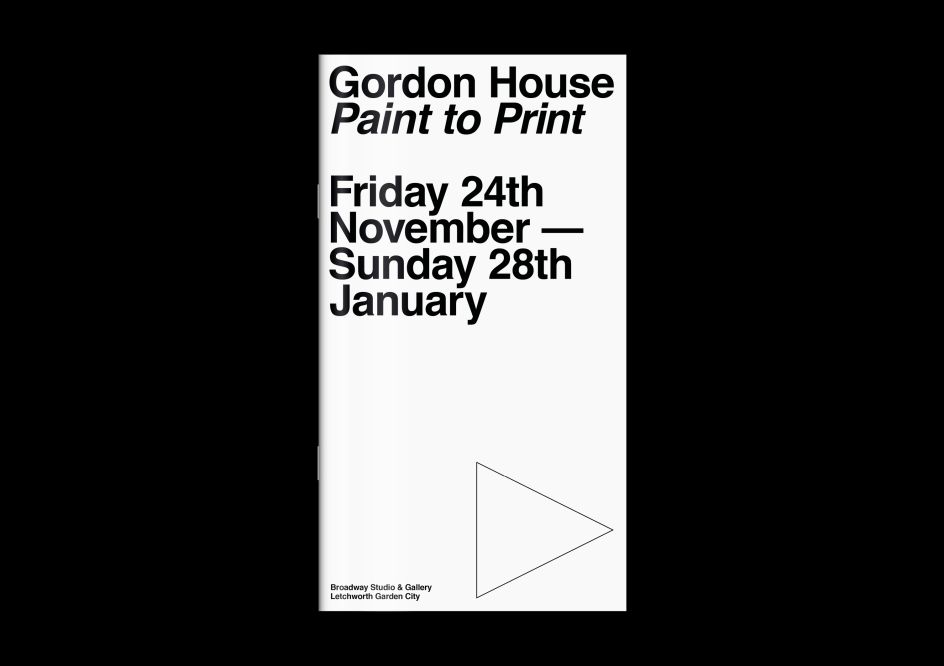
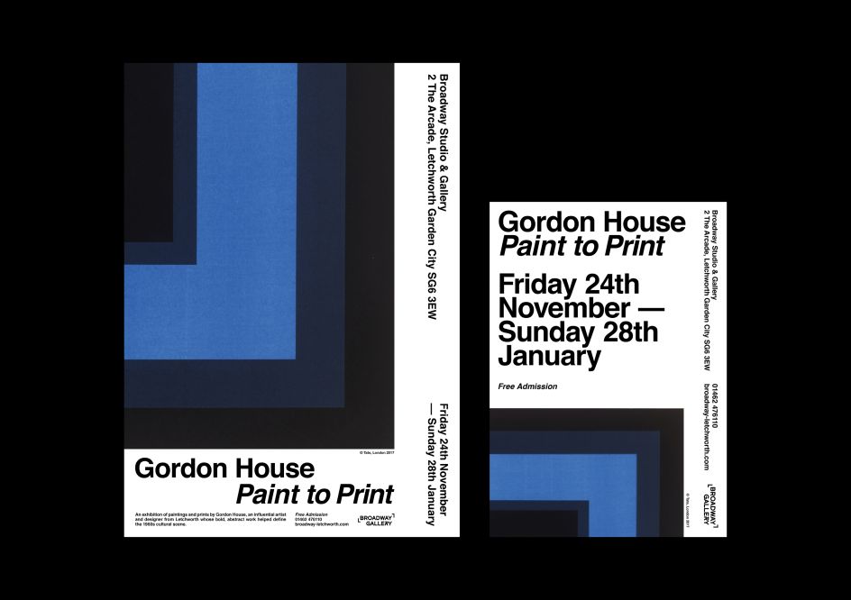
An exhibition of his work, Gordon House: Paint to Print, is running at Broadway Gallery, Letchworth Garden City until 28 January, and designing the visual identity for the show fell to Cambridge-based design studio The District.
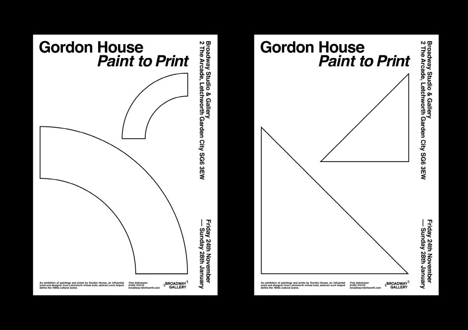
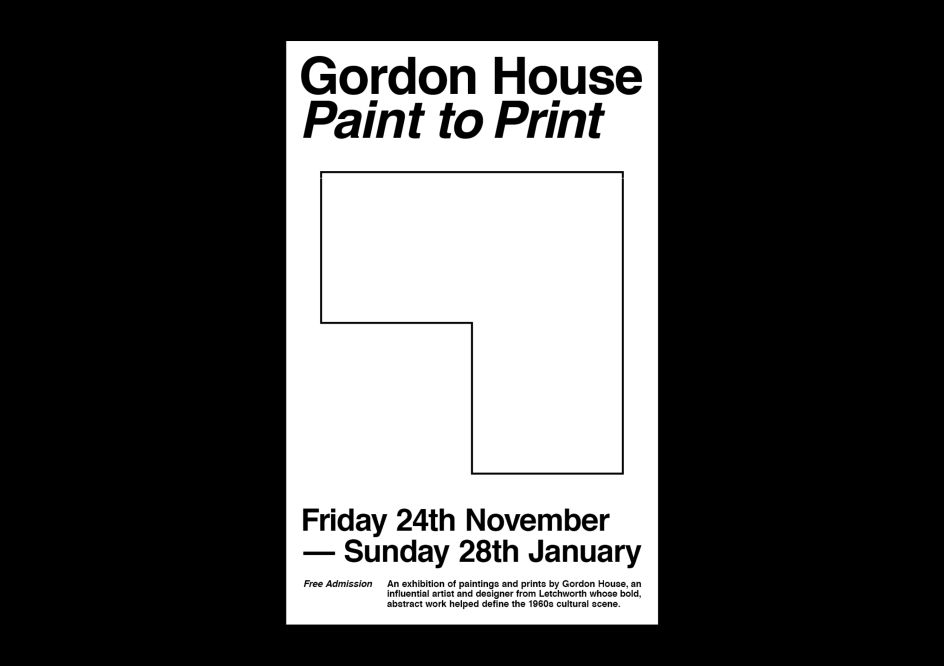
Their branding mirrors House’s own approach to typography, with a pared back but consistent typographic hierarchy that minimises variation in type and embraces negative space. Simple outlined shapes taken from House’s own work tie the graphic approach of the identity with the work on display, teasing the viewer with a vision of the show as well as performing as subtle wayfinding devices.
“Gordon’s work is familiar, but his name hadn’t crossed our paths before," says The District's creative director Matt Bagnall. "So looking at all these disparate works and pulling them together as a consistent body of work by one individual has been eye-opening.
"His commercial design work still feels very contemporary, it’s very clean and structured," adds Bagnall. "Gordon had an eye for typography which very much mirrors our own ideology at The District. Looking at this through the lens of his self-initiated artistic explorations reveals a consistency of interest in structure, alignment and pattern bordering on obsession.”

Editor's Picks


Trending


Editor's Picks
Further Reading