Ananya Mohan on social purpose, avoiding stereotypes and her dazzling practice
Specialising in identity and editorial design, London-and-Hong-Kong-based designer Ananya Mohan is a force to be reckoned with, weaponising her expertise in rich typography and vibrant colour for the forces of civilisation and social purpose through her conceptual and human practice.
Ananya Mohan, NARI, 2020
Underpinning this practice is a defining theme of culture, formed due to moving a lot when she was growing up; having been born in India before moving to Hong Kong and then to the UK when studying at LCC. "There are multiple things that interest me," Ananya tells us, "I like to observe and consume a lot of media, which I think is where a lot of my inspiration comes from," citing anything from music to film and mythology to politics as examples.
As such, Ananya explains "the themes and concepts of culture, stories, and social purpose," are what ground her work; "whether it is an aggressive political statement and social commentary," such as her SAMANUROOP fascist type project, "or just a playful graphic." The strength of these is in her deadly combination of research, understanding, and simplicity; whereby Ananya produces work that is incredibly striking and shows the utmost consideration and conceptual grounding. "I like having substance behind design, so with every new project," she explains, "I make sure I get to learn a ton through research!"

Ananya Mohan, NARI, 2020
Ananya Mohan, Only Child, 2020
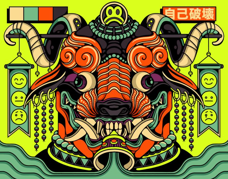
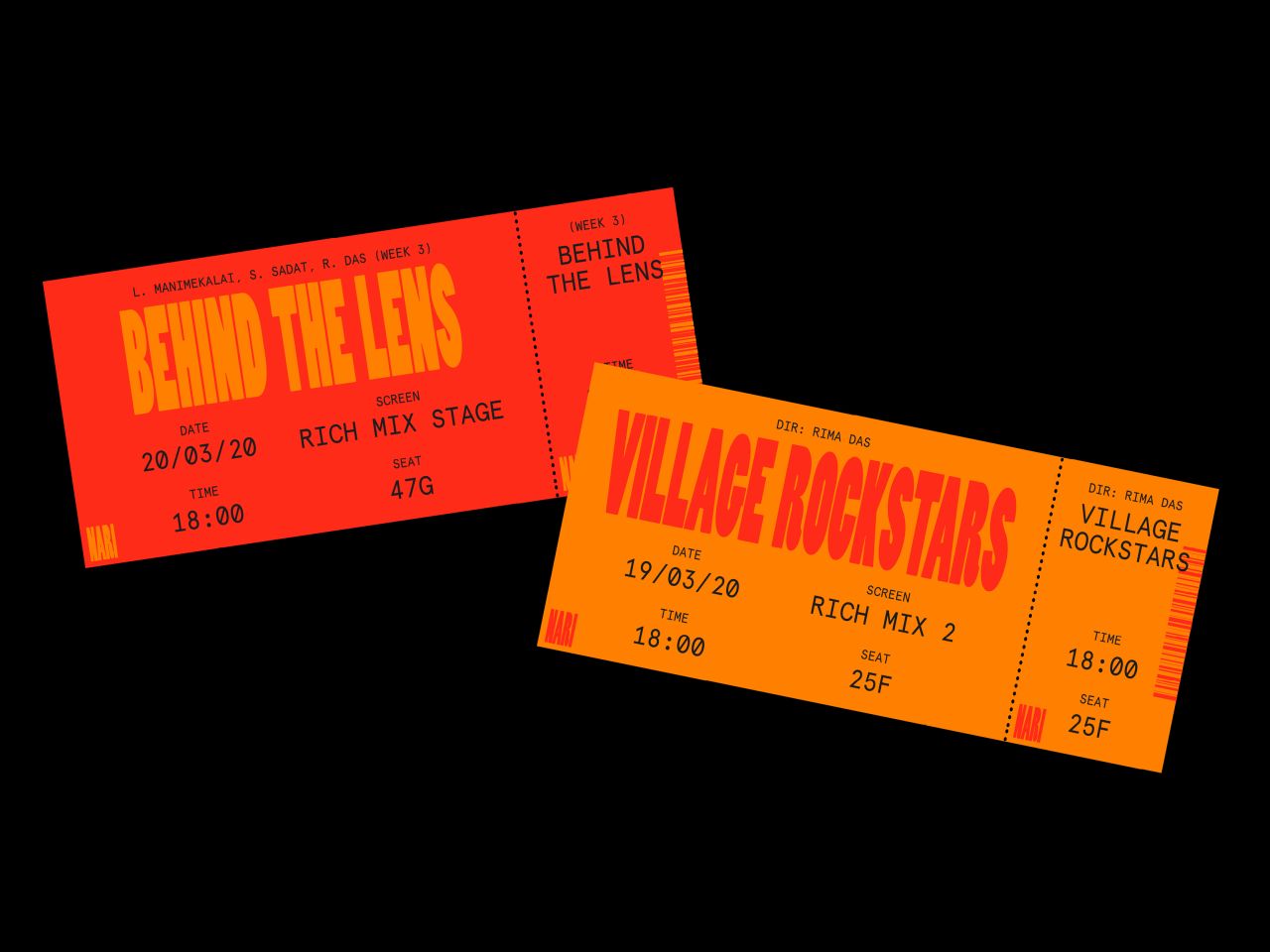
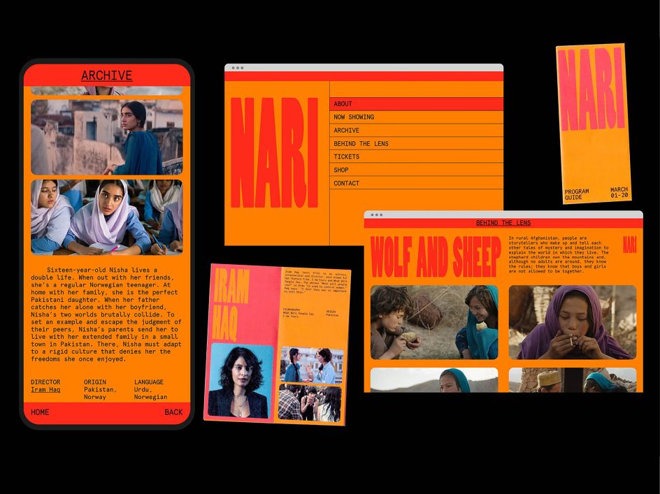
It can be no better demonstrated than Ananya's identity design for NARI; a fictional film festival that sought to exhibit South Asia's cinematic heritage and, more importantly, the women filmmakers behind it. "I wanted to curate a film festival that would change the perception of how cinema from "that' part of the world is perceived," Ananya explains, "which is generally considered to be overtly saturated/goofy/over the top."
Through alluring colours and intelligently reserved typographic boldness, the result was impactful and aesthetically dazzling identity; all of which helped to further the message of the fictional festival. "With this, I wanted to show how diverse the cinema of the subcontinent," she explains, as well as "that genuine contemporary films do exist there; and that women filmmakers deserve the recognition."
Ananya Mohan, NARI, 2020
Steering clear of stereotypically 'feminine' design tropes and colours, Ananya stuck to the basics – understood their significance – and smashed them out the park, with an austere but playful colour palette and a dynamic graphic system that went beyond a simple word-mark. "I made sure to highlight both the contemporary heritage as well as the 'film' aspect within the identity," Ananya recalls.
This manifested in aesthetic aspects such as a monospace supporting typeface and rounded frames acting referential to classic cinema, "while the bright red and tall bold type exude a sense of feminine power," she explains, noting how rewarding the project was to research and execute. "Asia is such a massive, diverse region, and seeing the stories of women being reflected on screen, as told by women themselves, was cool," Ananya tells us, having the dream job of watching countless classic films as part of her research.
Ananya Mohan, NARI, 2020
Ananya Mohan, Only Child, 2020
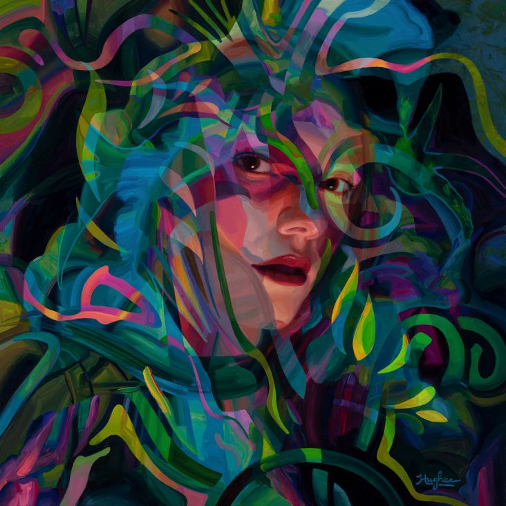
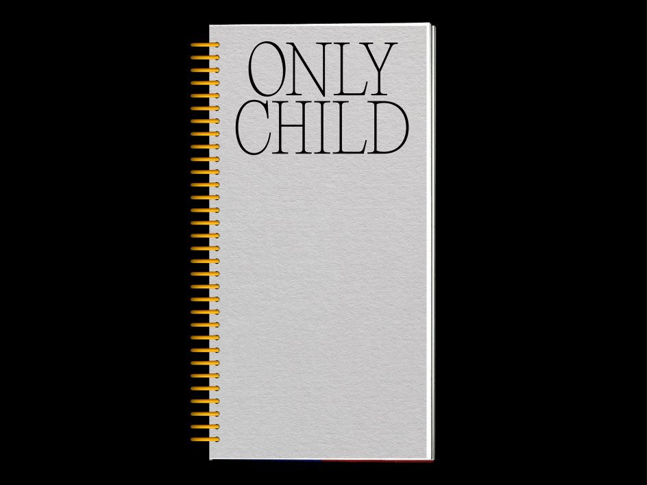
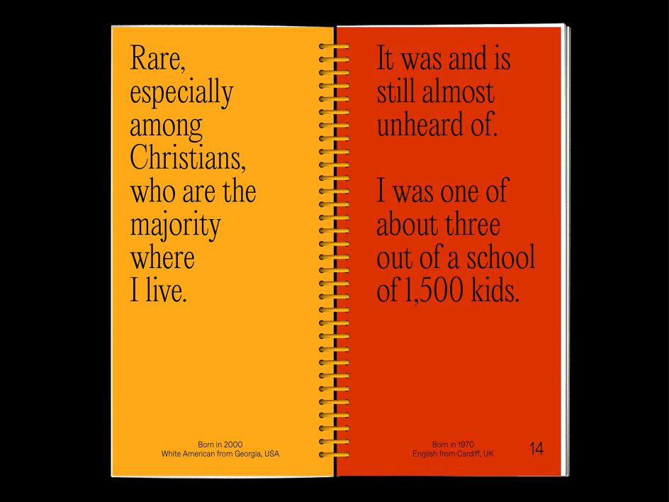
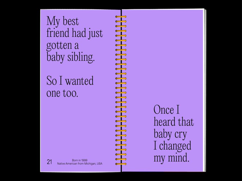
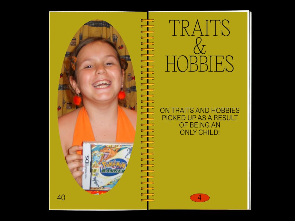
As much as some of Ananya's work looks at society on a larger scale, so too does some look more inward, such as her incredibly personal project 'Only Child' – an endeavour that collated experiences from only children across the globe from a great array of backgrounds, including herself. "It was important to discuss factors such as cultural background and upbringing," she tells us, such as how common it was to be an only child in their area and the cultural perceptions of them. In a format similar to Ananya's practice herself, with both a playful and serious side, the more "lighthearted" conversation was also brought up, such as what their ideal sibling would be like.
"I designed this publication in a way that would be playful and have a childlike essence to represent the feeling of growing up as an only child," Ananya explains, manifesting in contemporary, emboldening typography, ecstatic colours and oval framed images nostalgic of family photo books.
"For the structure itself, I deliberately chose to make it a thin and rectangular book" Ananya details, "emphasising the idea of being singular, an "only"; and colourful ring binding as a toy-like element." The result is an incredibly moving and visually beautiful piece of editorial design; radiating empathy through her refined typographic skills, whilst maintaining a charisma and character representative of the individuals involved.
Ananya Mohan, Only Child, 2020
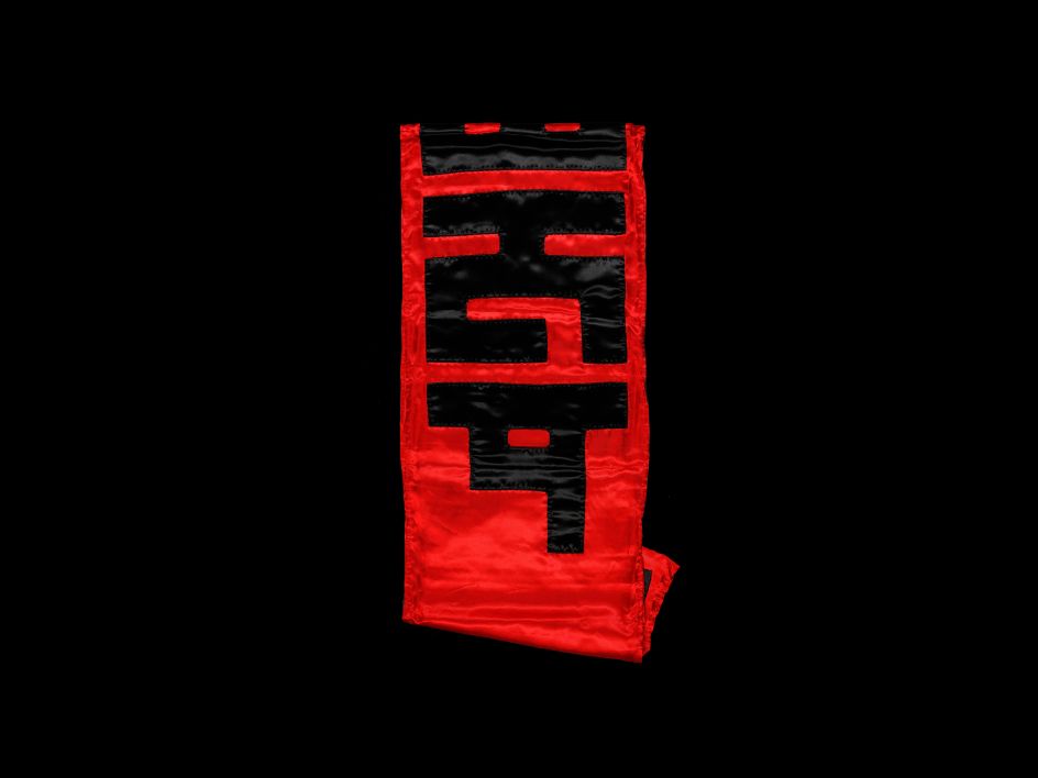
Ananya Mohan, SAMANUROOP, 2020
The impact of 'Only Child' is far from limited to just the audience, but also to Ananya herself. Whether it was from the responses she got to the questionnaires given to only children or learning how relatable it was to be an only child regardless of the diverse array of individuals worldwide, Ananya is thrilled to have done the project.
"I am grateful for the many personal childhood experiences & stories as contributed by the people," she concludes, "and the fact that I had the opportunity to share them for this project which gave it so much sincerity and substance."
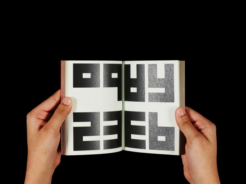
Ananya Mohan, SAMANUROOP, 2020
Editor's Picks


Trending


](https://www.creativeboom.com/upload/articles/86/862919952c0ad18439004228895a431dc6e45ffc_732.jpg)
Podcasts


Editor's Picks
Further Reading