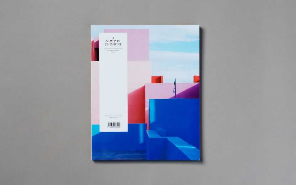
A New Type of Nordic? Imprint continues to delve into the world of Nordic design
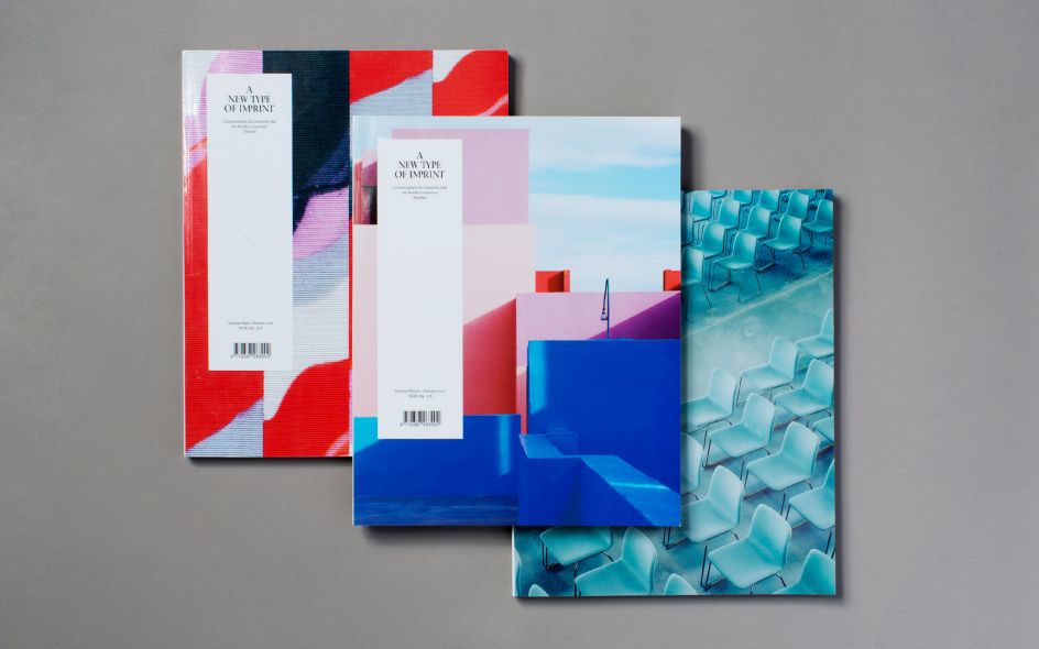
With its ongoing Nordic collection, A New Type of Imprint continues to challenge the perception of what Nordic design really is. Functionality, light and minimalism are words that tend to be used when defining Nordic design — a definition that is constantly being challenged as the popular magazine dives into the design culture of the Nordic countries. Now they are ready with the collection's third edition: Sweden.
"Trying to capture the creative sphere in the different countries has been just as fun as it has been surprising. We're seeing strong tendencies of breaking with, and challenging of, the deeply rooted design traditions in the Nordic region, which is very exciting," says Editor-in-Chief Veronica Mike Solheim.
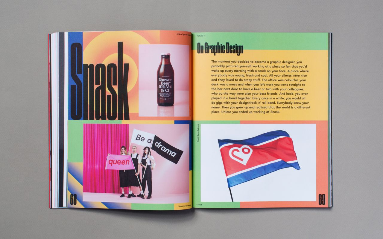
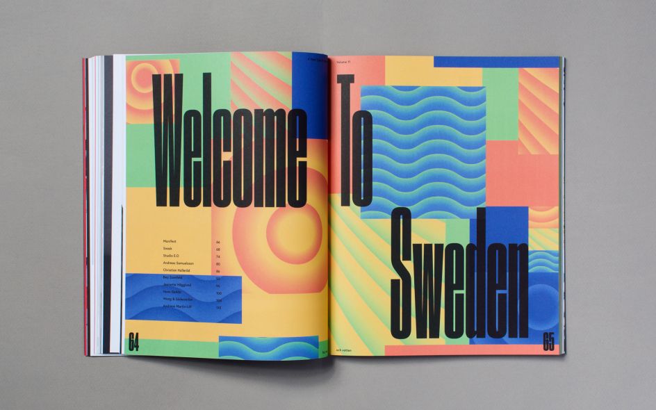
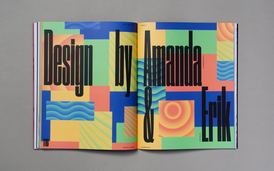
The magazine's second chapter is designed by the Swedish Erik Kirtley and Amanda Berglund. Like in all previous editions, this chapter’s content and design is dedicated to the theme of the issue.
"We have tried to stray away from what is typically referred to as Swedish graphic design," Kirtley explains, "and therefore gone for a warm graphic tone, and a colour palette inspired by the classic Swedish folksong Sol, Vind og Vatten (sun, wind and water) by Ted Gärdestad. To us this is a contrast to the gentle coolness that is often associated with Swedish design."
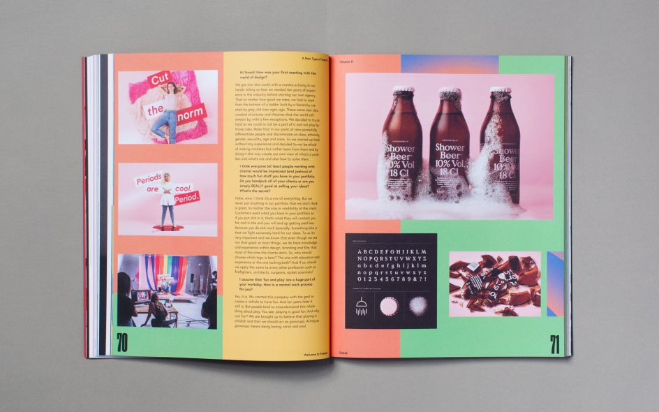
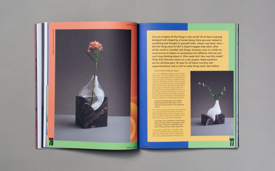
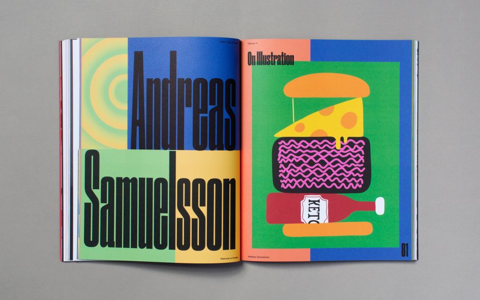
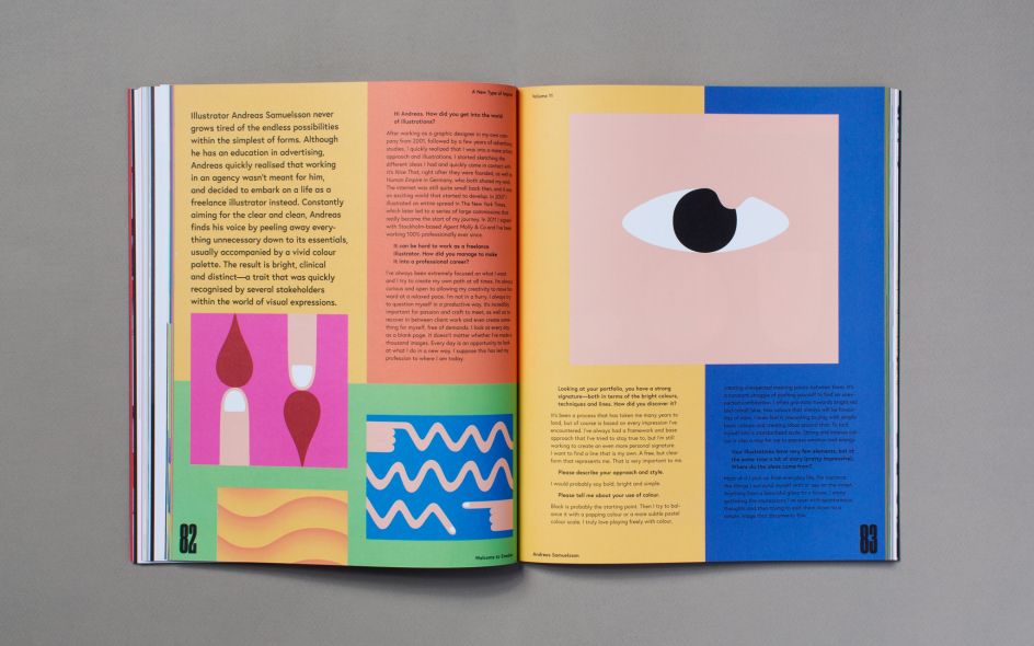
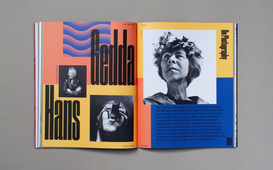
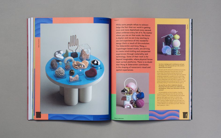
Consisting of interviews and showcases of acclaimed Swedish contemporaries such as Snask, Hans Gedda and Andreas Samuelsson, the 50-page-long chapter paints a comprehensive picture of the Sweden's creative culture and design.
A New Type of Imprint is a quarterly magazine on creative culture and design, band in Oslo. It’s created and published by ANTI and distributed all over the world. Details at anewtypeofimprint.com.

Editor's Picks


Trending


](https://www.creativeboom.com/upload/articles/86/862919952c0ad18439004228895a431dc6e45ffc_732.jpg)
Podcasts


Editor's Picks
Further Reading