Two tones, two sets of symbols creates an appealing paper catalogue for designers
If you're a graphic designer and you like to keep an eye on all the latest resources, then Europapier might well be on your list of recommended paper distributors. Established for over 40 years and providing paper to more than 13 European countries, it's a brand that has built a solid reputation.
But how would you feel if you were tasked with the design of its new product catalogue? Would you feel the pressure, knowing that the entire industry would see and potentially scrutinise your work? For Metaklinika, a design studio in Belgrade, Serbia, the challenge was more than welcomed.
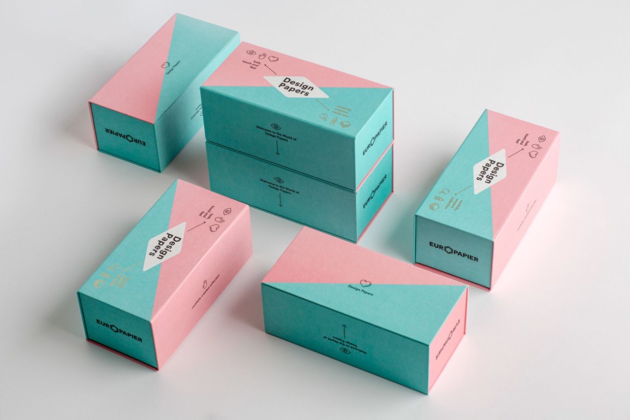
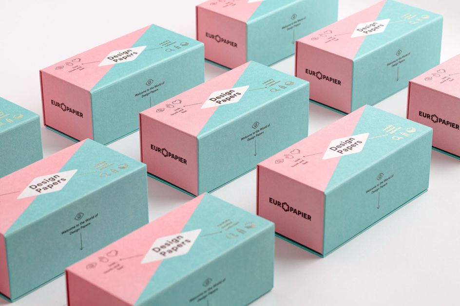
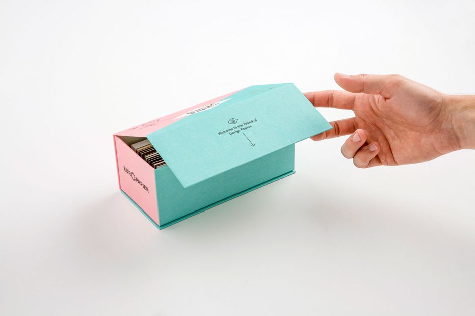
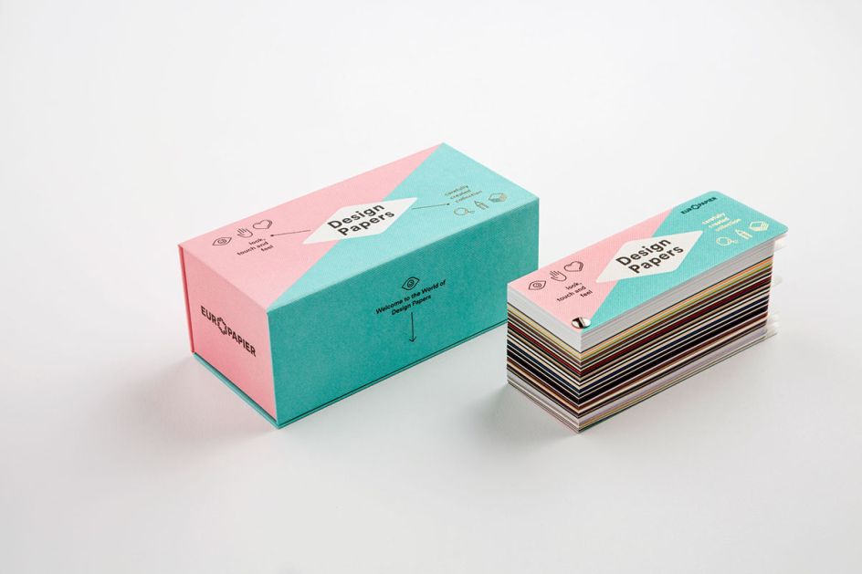
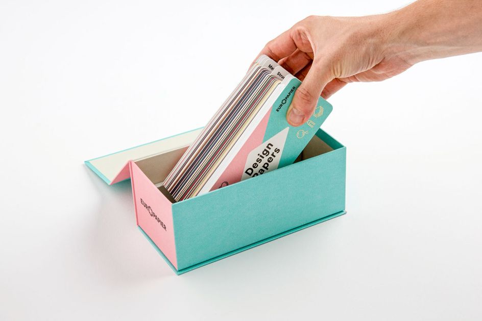
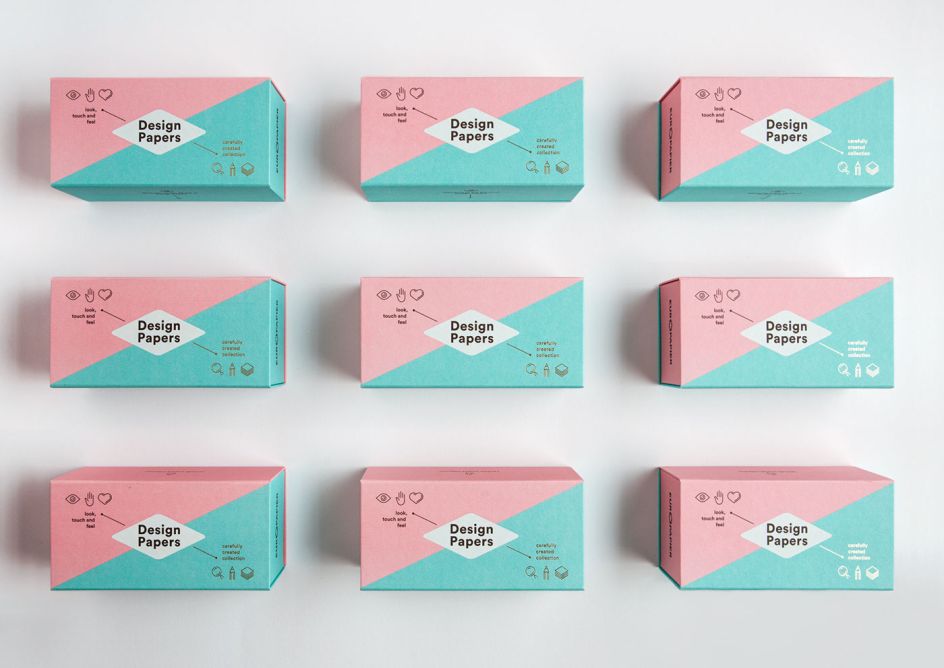
Called Design Papers, the document contains 240 types of paper, and is designed as a box divided into two colours, Rose and Turquoise, with two groups of pictograms including a rhombus forming the central point. "The idea was to add a decorative dimension to the usual functionality of a catalogue, with attention to both its visual and tactile aspects," explains Metaklinika.
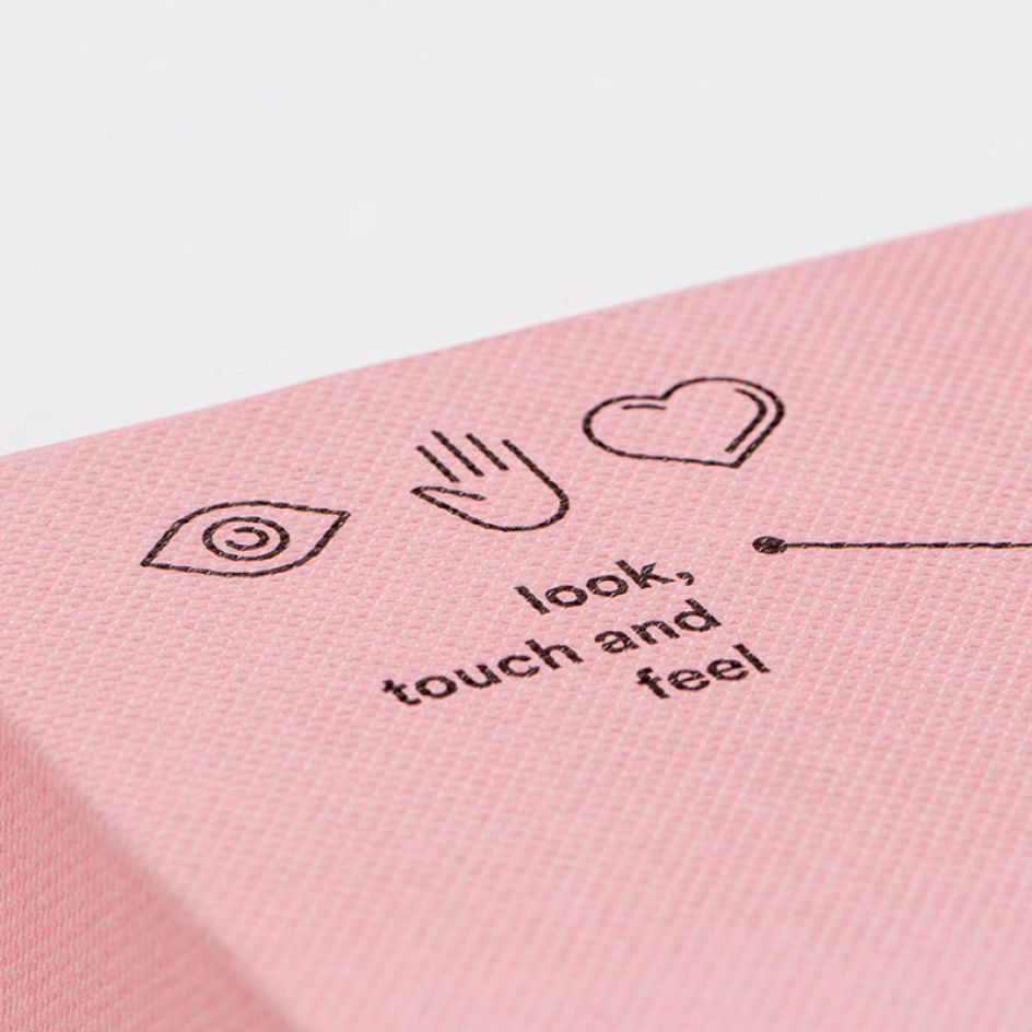
The title Design Papers, positioned inside the rhombus, is intersected by two areas. The rose-coloured part contains the first group of pictograms that focus on touch and feel, emphasising the interactive aspect of the catalogue and treating it as an object and packaging. The other group has a gold foil finish on a turquoise background and the words: 'Carefully created collection', highlighting the excellence of the catalogue and its outstanding quality.
Discover more beautiful work by Metaklinika via www.metaklinika.com.
Via Behance

Editor's Picks


Trending


Editor's Picks
Further Reading