The French graphic designer whose work questions 'notions of the future'
Can graphic design question the future? Can typography help us imagine the year 2099? It can if you’re French designer Clément Le Tulle-Neyret. Based in Lyon, the designer works across graphic design with a focus on typography and printed matter.
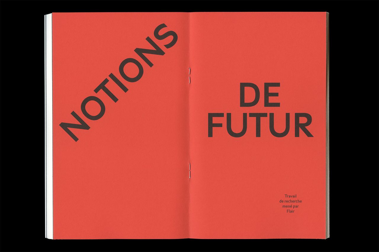
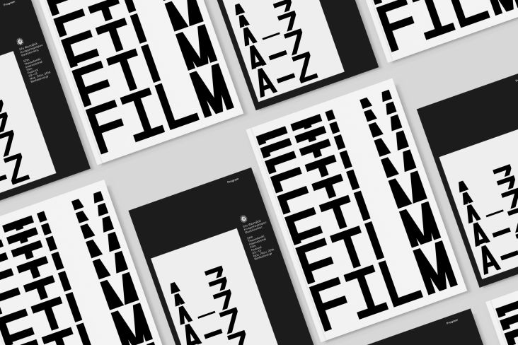
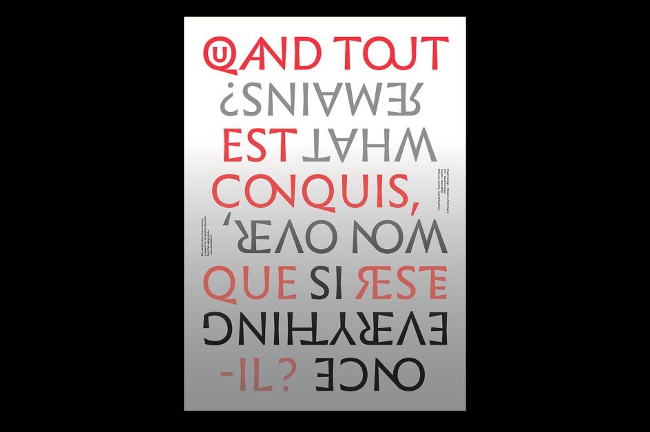
Among the delights in his portfolio are books, catalogues, magazines, brochures, newspapers, visual identities, posters and album covers; but the recent work that caught our eye was his publication and poster designs for Notions of the Future, an essay publication by Gauthier Roussilhe of French design agency Flair.
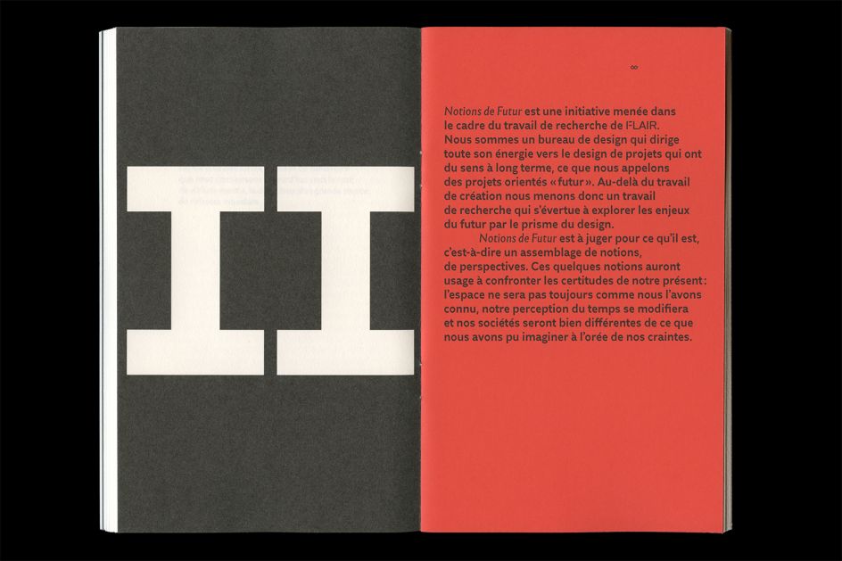
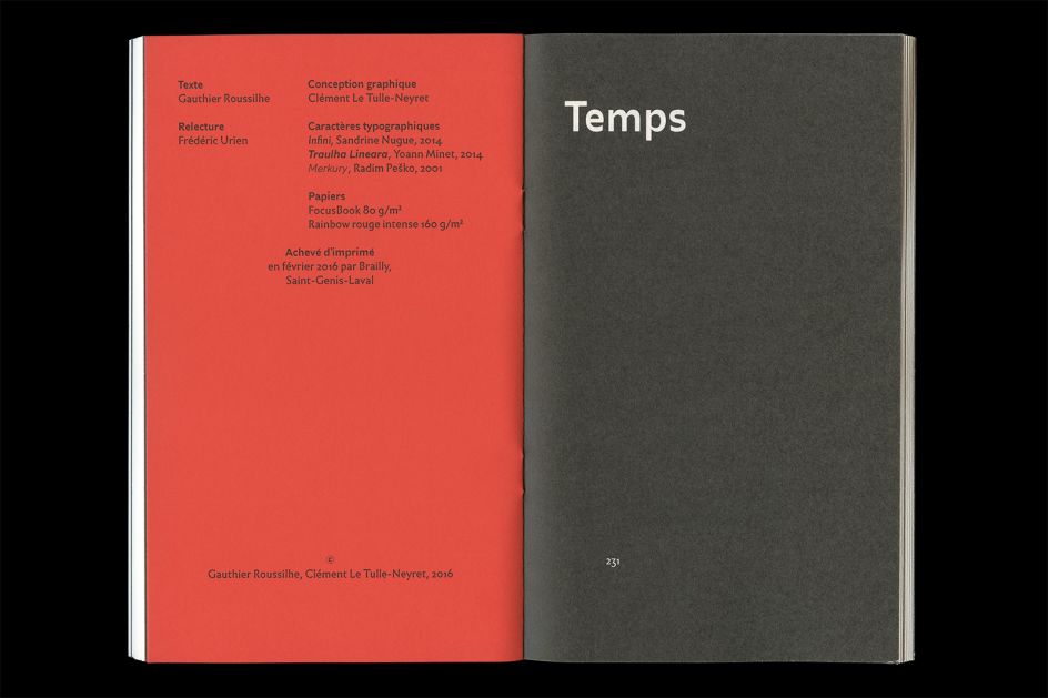
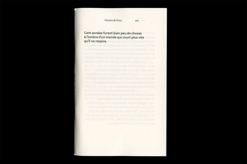
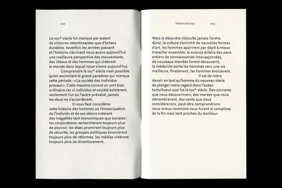
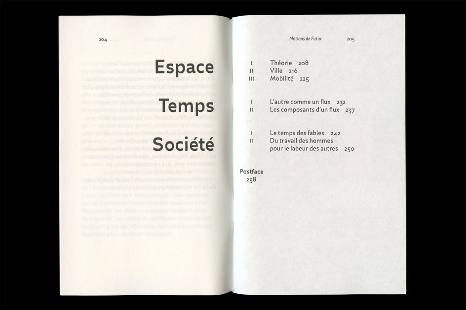
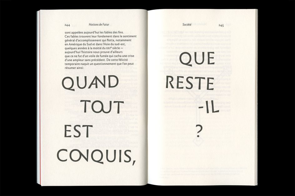
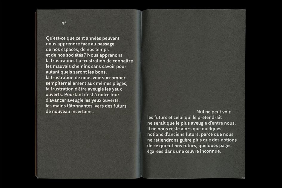
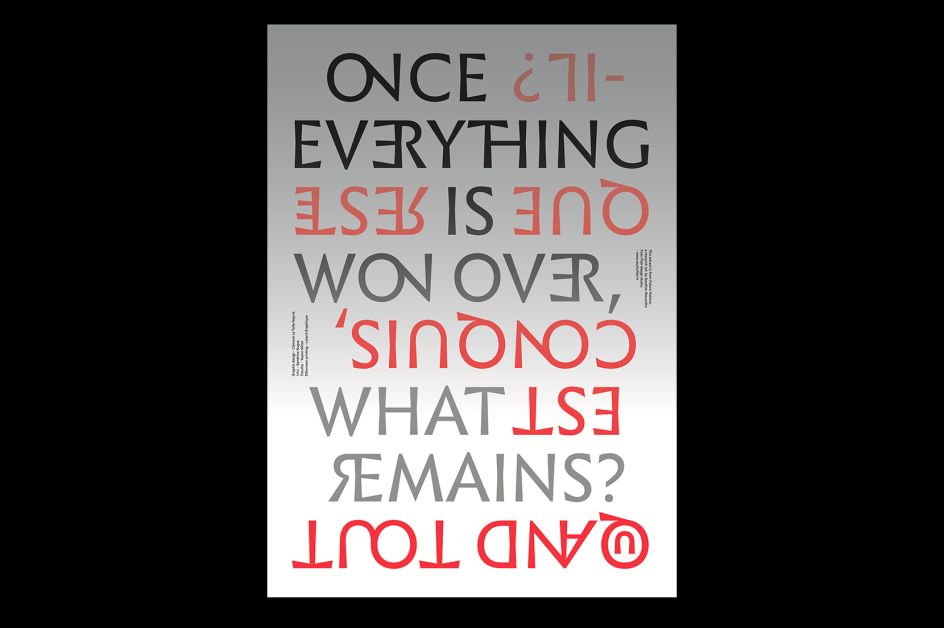
The essay, Notions de Futur in its creators’ native tongue, explores “the evolution of notions of space, time and society from 2000 to 2099,” and the designs offer a thoughtful counterpoint to usual notions of the “futuristic.” Eschewing Geocities style post-internet typographic free for alls or silvery space-age colour palettes, the designer seems to have looked to Russian futurism instead, using reddish orange and black redolent of Soviet era graphics and a suite of beautiful and unusual typefaces including Infini, Merkury and Traulha. According to Le Tulle-Neyret, the book’s format was designed to create “a dialogue between classicism and anticipation” through the use of a grid that divides the page into nine sections both vertically and horizontally. It also rather obtusely begins on page 201, meaning that the “cover” is actually on the inside of the publication.
Le Tulle-Neyret has exhibited across the world at events including Graphic Design Festival Scotland and Saint Etienne’s International Design Biennial. You can see more of his work on his website and Instagram.
Editor's Picks


Trending


Editor's Picks
Further Reading