Michael Gericke and Michael Bierut's welcoming new identity for America's art museum
Pentagram partners Michael Gericke and Michael Bierut have collaborated on a new visual identity for the National Gallery of Art in Washington, DC, one of the most beloved and visited museums in the US. Its goal is to "reflect the vibrancy of the institution and its diverse collections, programming and audiences".
The brand strategy informed Pentagram's work. Developed with AEA Consulting, it aims to strengthen the National Gallery's vision, mission, and values, and hopes to "better reflect the country, make the institution more accessible and inclusive, and position it as the nation's primary resource for art and creativity".
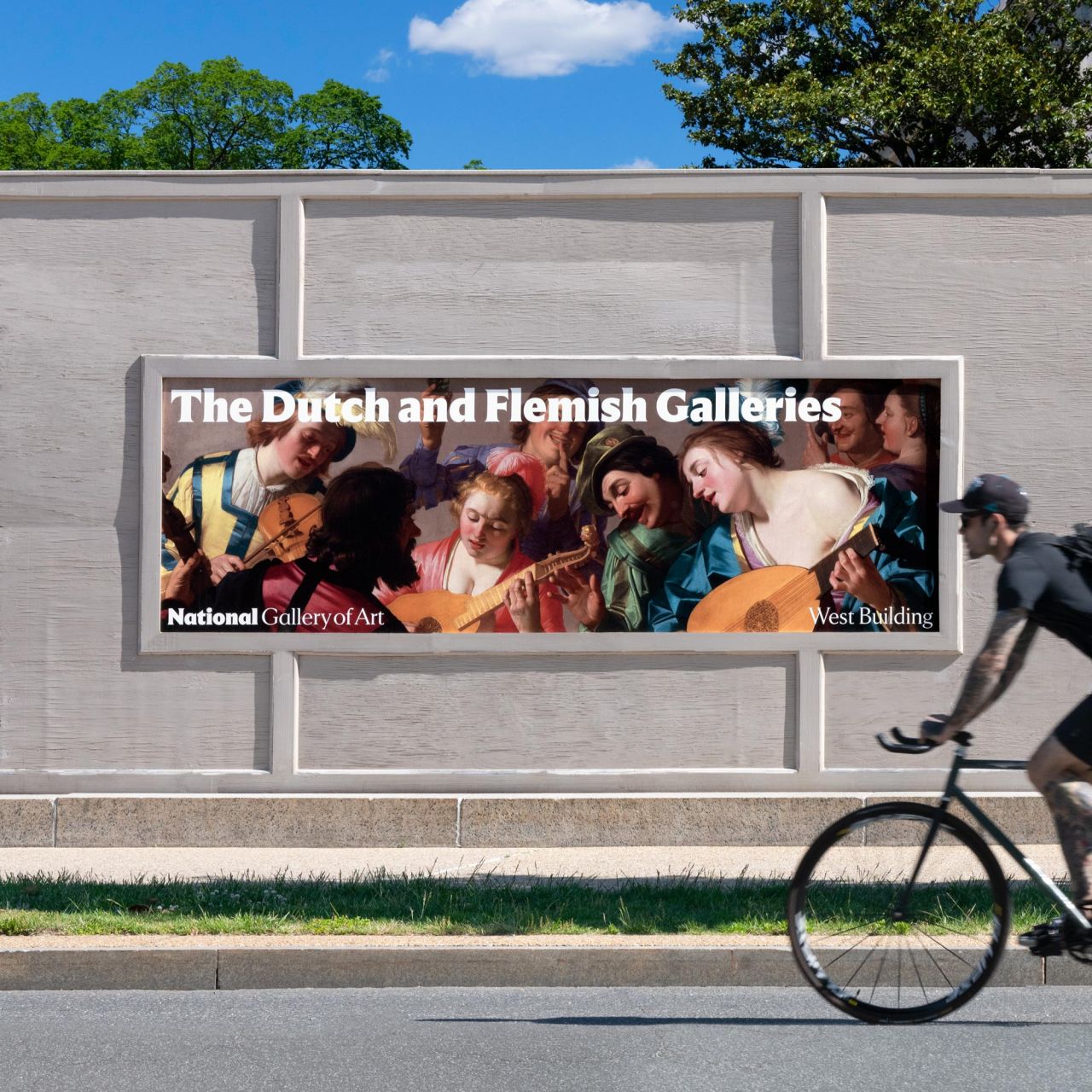
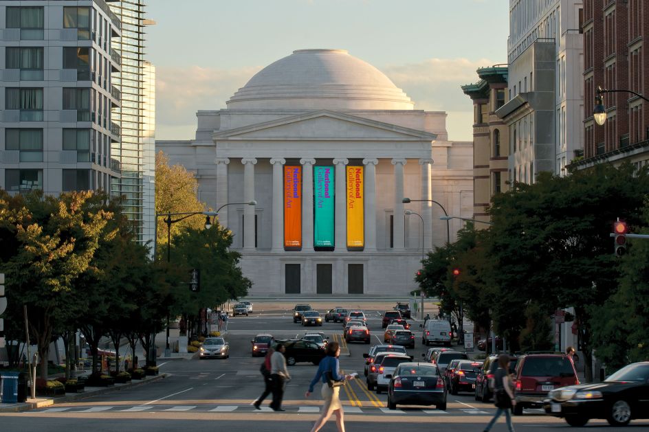
Located on the world-famous National Mall, the institution encompasses John Russell Pope's stunning neoclassical West Building, I. M. Pei's iconic modernist East Building, and the National Gallery of Art Sculpture Garden. The logo itself is inspired by this architecture with typography that references the incised inscriptions on the buildings.
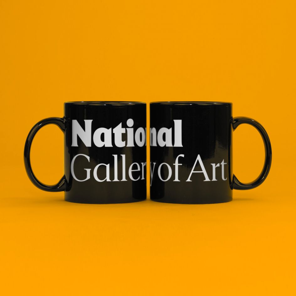
The new wordmark is tailored from a bespoke version of Empirica, a new serif typeface designed by Tobias Frere-Jones and Nina Stössinger at Frere-Jones Type. It has "stature but is friendly and welcoming, conveyed in the deliberate shift to upper and lowercase type," says Pentagram.
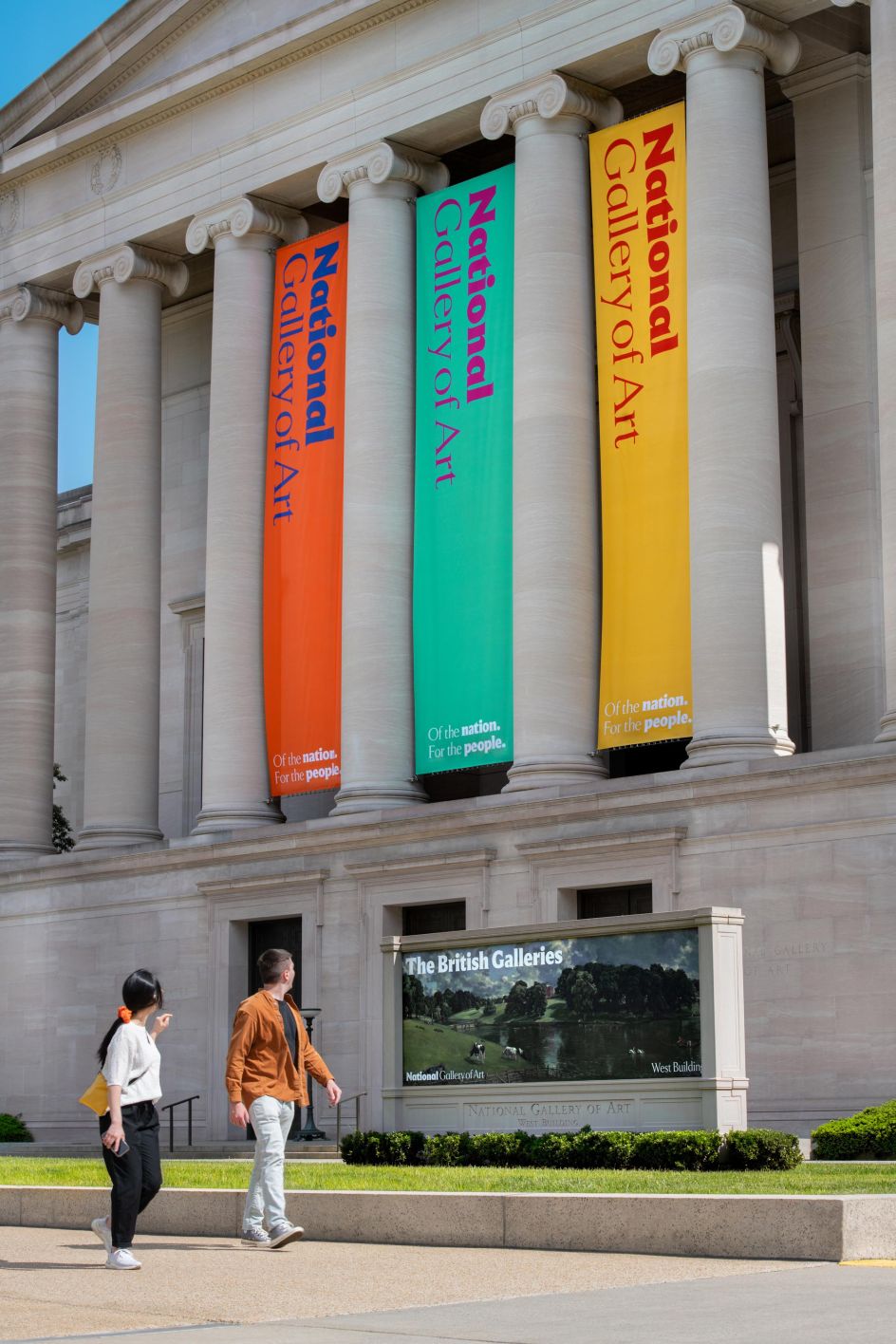
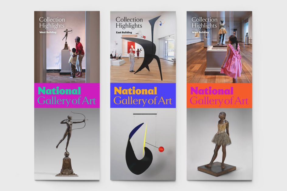
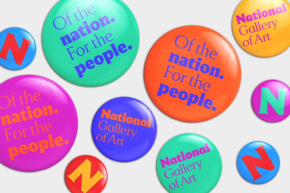
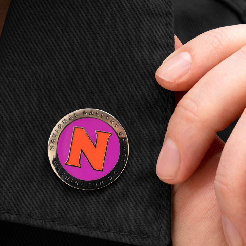
Pentagram also highlighted 'National' to reflect the commitment to serve as the nation's art museum and there's also a unique 'N' letterform that combines both serifs and simple geometry. The icon is a recognisable avatar for social media and an imprint for National Gallery publishing. Supporting typography is set in the sans serif Mallory typeface, also by Frere-Jones.
"We sought to create a broad identity for the National Gallery that reaches out to be welcoming, inclusive and is connected the old and the new, the classic and the modern. The new logo is quite contemporary but derived from the essence of the carved letterforms that have been embedded in the facades of the West and East Buildings for decades," says Gericke.
Pentagram collaborated closely on the project with the National Gallery's Director Kaywin Feldman and the institution's leadership team. It was a two-year process that included the development of a new logo and visual language, brand strategy and positioning, messaging, and verbal identity.
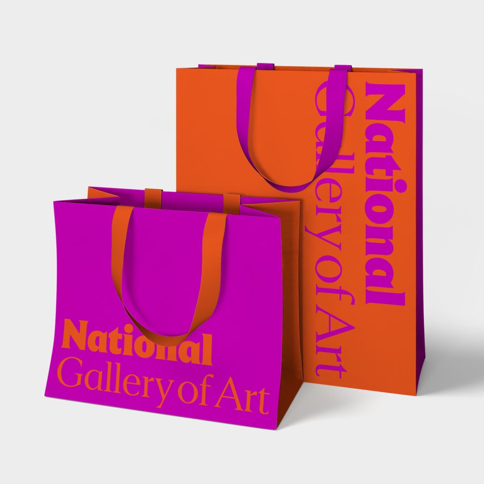
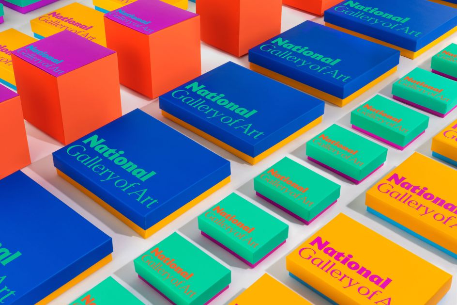
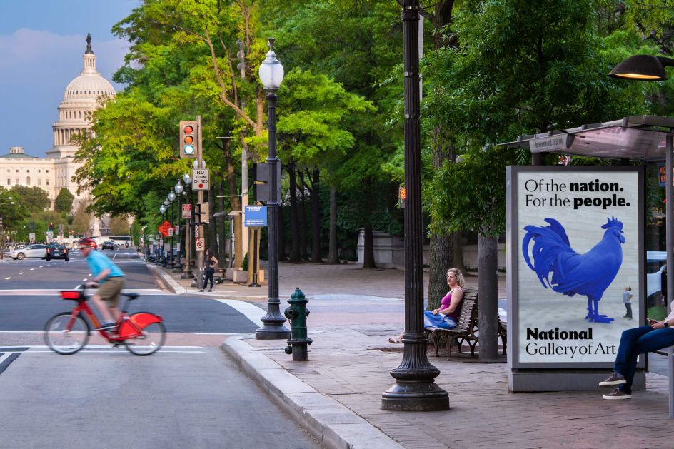
Along with the visual identity, the programme introduces messaging developed by Pentagram that is "friendly, distinctive, and welcoming". This is captured in the new tagline, 'Of the nation. For the people'. "The National Gallery is not a monochromatic place or experience," adds Gericke. "A full-spectrum colour palette portrays its energy and vibrancy, the immense range of their collections, and expresses the diversity of its visitors."
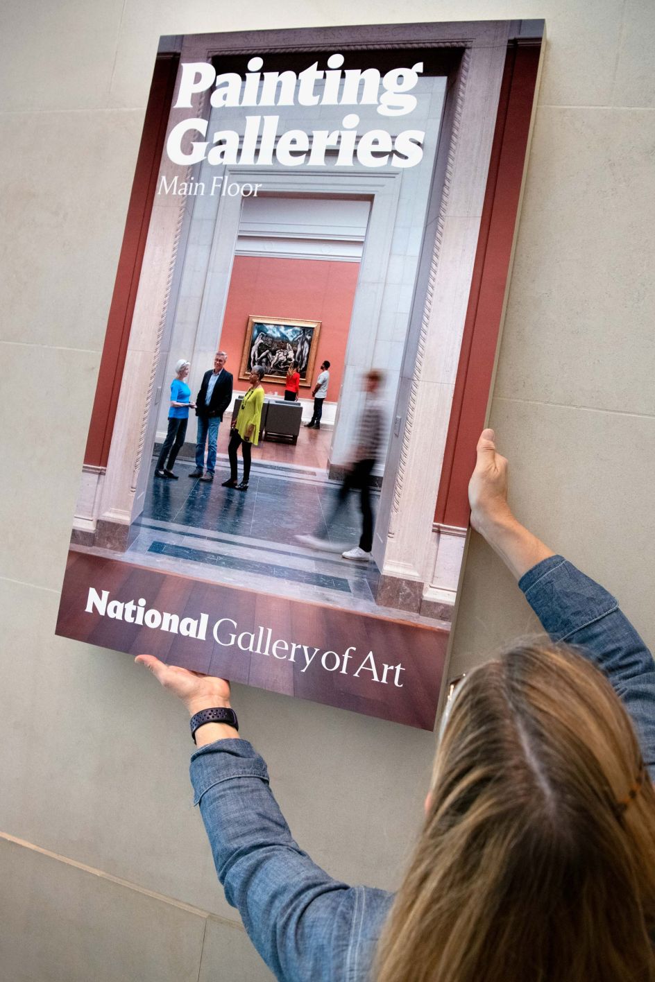
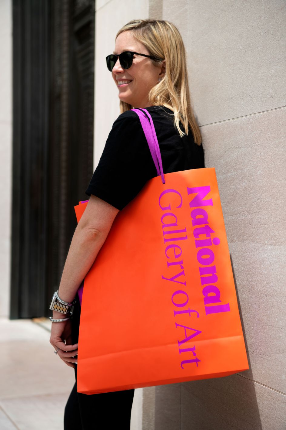
It's certainly a bright and vivid identity, with its colours used in unexpected combinations across banners on the façades and landmark signage at the entrances; interior signage and wayfinding, and banners at the Sculpture Garden.
The launch of the identity coincided with the reopening of the National Gallery's West Building earlier this month after a six-month closure due to the pandemic. It also rolled out to a new website, exhibition posters, advertising campaigns, and social media while fresh packaging, bags, and products were created for the Gallery's shops.
"With our doors finally open, we re-present to our public how the National Gallery will meet our mission of welcoming all people to explore and experience art, creativity, and our shared humanity– – with generosity, inclusivity, and joy," says Feldman.
Editor's Picks


Trending


Editor's Picks
Further Reading