Record sleeve and tape designs inspired by Brutalism and Sainsbury's branding, by Blank Editions' David Blanco
Five years ago, east London-based graphic designer David Blanco decided to embark on a project that was to take up vast swathes of his time and passion: he founded a record label and became art director for all of its releases, and graphic designer for many of them.
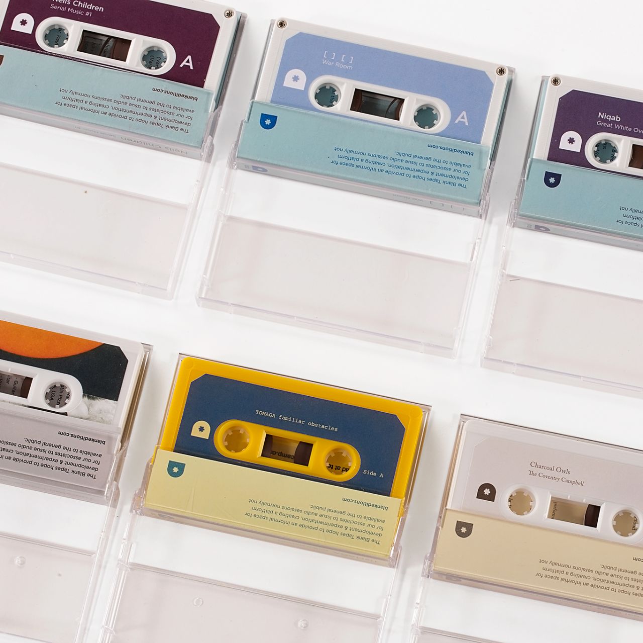
Blank Editions tapes
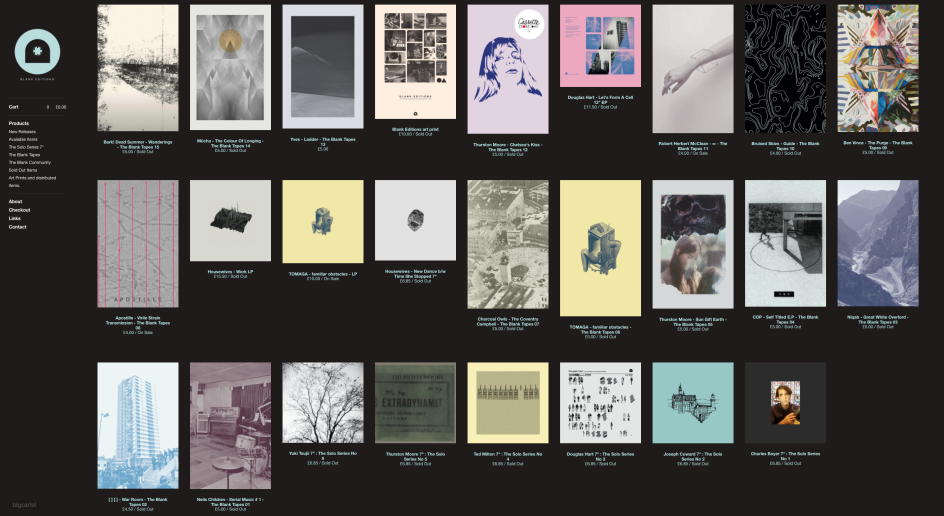
Today, Blank Editions and its cassette imprint Blank Tapes is going stronger than ever. Now counting 22 releases, to mark its half-decade this year there are already six new releases scheduled, as well as a celebration in the summer at Dalston’s renowned Cafe Oto.
Blanco’s designs for the label releases have a consistent aesthetic, one shaped by influences from Brutalism, minimalism, and the post punk scenes of the 1970s and 80s. The sleeves use only one or two typefaces, mainly Akzidenz-Grotesk and Gotham, and are created from his kitchen table in Stoke Newington, north east London. As they’re released in limited-edition runs, a huge amount of care and detail goes into each. For a release by Yuki, for instance, the cover’s photograph of a tree is mirrored in the insertion of a little envelope holding a leaf from a Hackney park in each record.
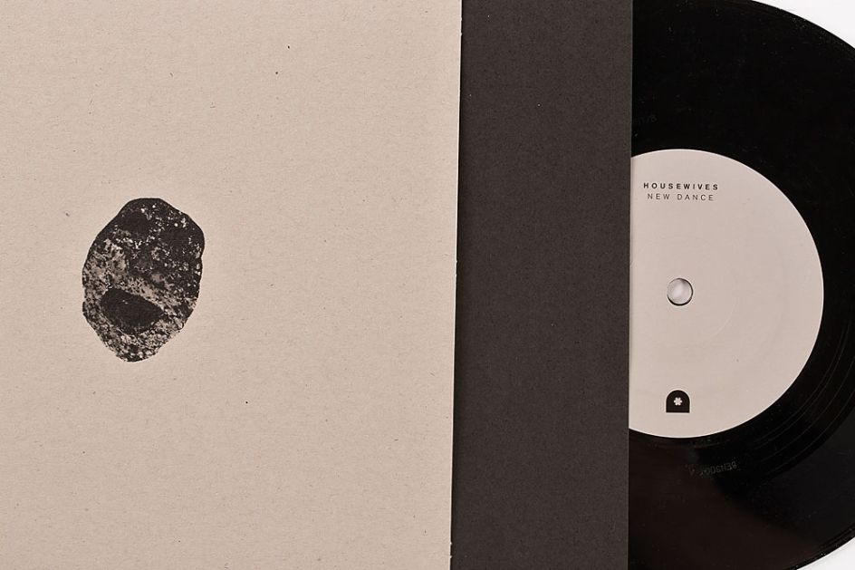
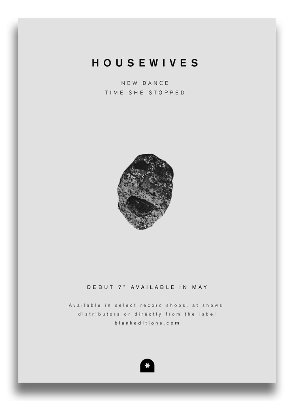
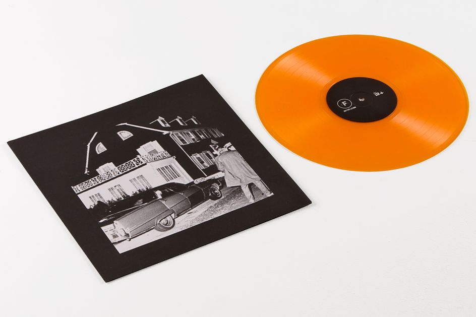
Housewives vinyl
The simple, black Blank Editions logomark is broadly inspired by Blanco’s love of the Open University logo, but is also informed by Blank Editions’ three facets – the curve represents records, the cog tapes, and the straight edge publishing.
But the designs across Blanco’s sleeves draw on some rather unexpected reference points, too. “Islington library is near where I was born and raised in Highbury – it’s still there today and has an amazing reference library upstairs full of architecture books and books printed in the 40s and 50s,” he says.
“Since I was a child I’ve always gravitated towards that section. I’ve always wanted to work in that style, so when I started the label I instantly went to that library. Every book I’d pick up there would be an picture that would blow my mind, whether it’s of a field or building or room. I just find these images stunning and I thought it would be really nice to put them on record sleeves and make that the Blank Editions aesthetic. There’s no bullshit with those images, there’s no glamour, they’re not trying to be anything apart from what they are.”
Another childhood memory that became a graphics reference point was found on the shelves of a supermarket. “The designer Peter Dixon created the Sainsbury’s brand in the mid-70s, and back then most of their buildings were really Brutalist,” says Blanco. “I was always drawn to those pack designs when I was a kid on trips to Holloway Road Sainsbury’s.”
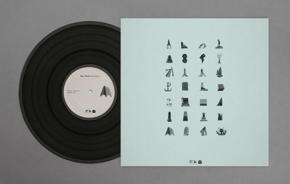
Ben Vince LP
The Blank Editions roster is made up of bands and musicians from the local area, many of which have artistic backgrounds too, offering a rich foundation for collaboration during the sleeve design process. “I’m here to facilitate ideas that people might have. The first thing I ask is if they have ideas about what they want to do – how we lay it, out any ideas for inserts or how to print it,” says Blanco. “I’m more a facilitator or art director and try and make it collaborative as possible. I think that’s the best way to work.”
Looking back on the first five years of Blank Editions’ output is a testament to this spirit of collaboration, and a DIY process owing as much to punk as the post punk ideas that lent it the monochrome, stark, Xeroxed feel across the visuals. Each tape, record sleeve or insert is beautifully considered – as minimalist designs have to be – and the collection taps into a strange and powerful corner of east London’s cultural contexts today.
So what advice would he have for people wanting to set up their own labels, or for graphic designers looking to work on more sleeve design projects?
“If you’re going to start a record label you have to really love it, that’s the most important thing,” says Blanco. “Never do these things half-hearted, as at the end of the day you’re dealing with someone else’s art. It’s very time consuming if you’re doing it properly, but if you love it, do it, and if it goes wrong then at least you can look back and say ‘I loved doing that, and I gave it my all.’ The same goes for designing sleeves – just really love it. You’ve got to do these things as a labour of love, it’s really that simple.”
Blank Editions tapes
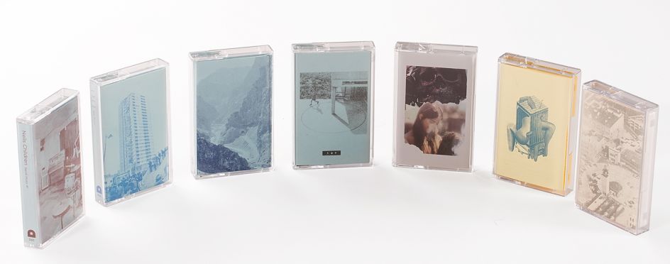
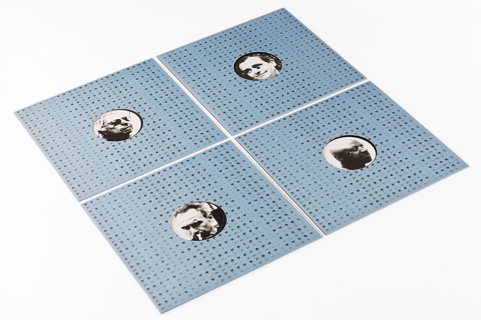
Blank Editions releases
Housewives artwork
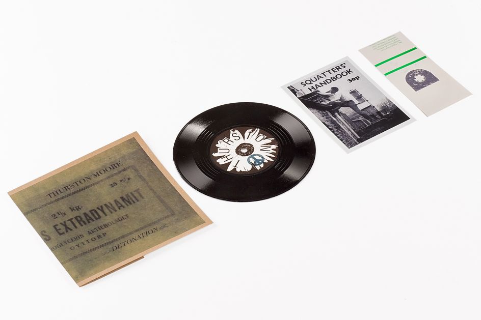
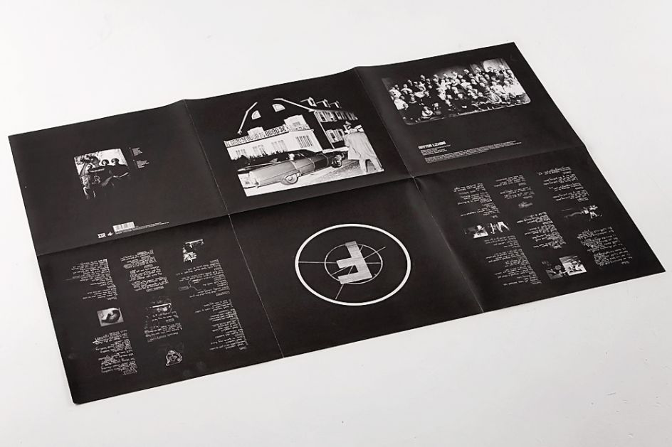
Blank Editions Thurston Moore Squatters Handbook
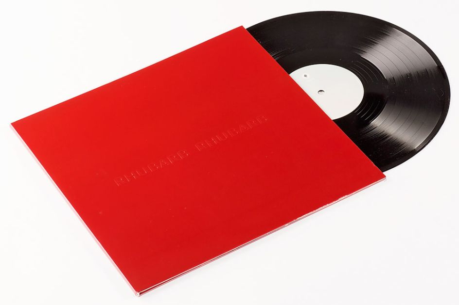
Charlie Boyer + the Voyeurs, Rhubarb Rhubarb cover
Electricity In Our Homes artwork
Flats
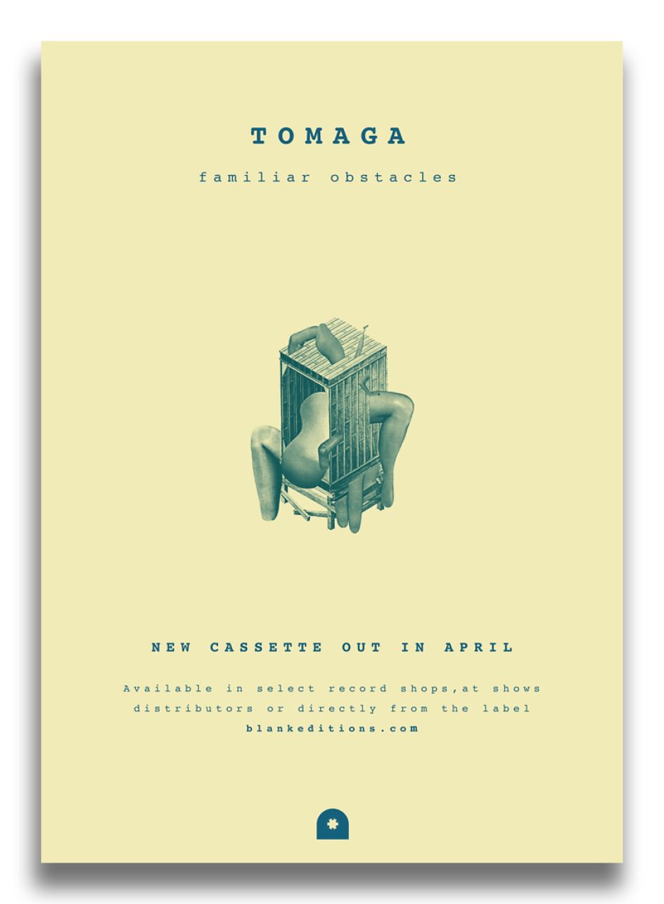
Tomaka
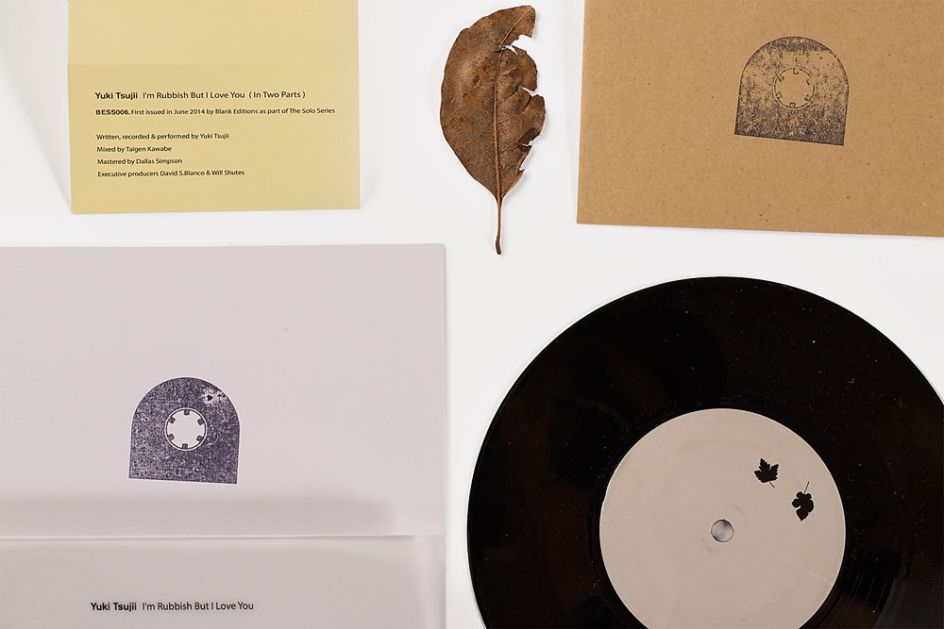
Yuki vinyl
Flats
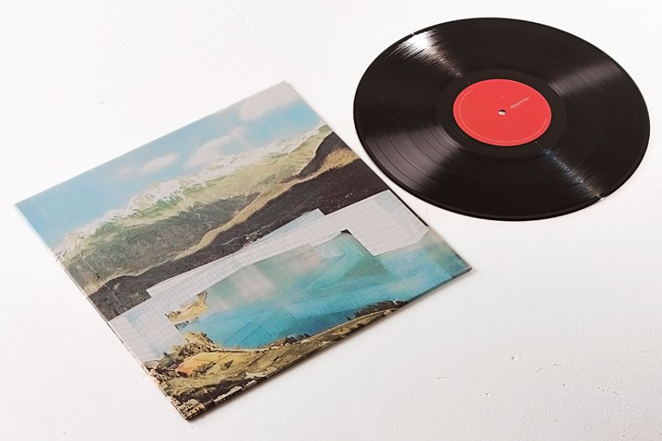
Great Lengths covers

Test Centre
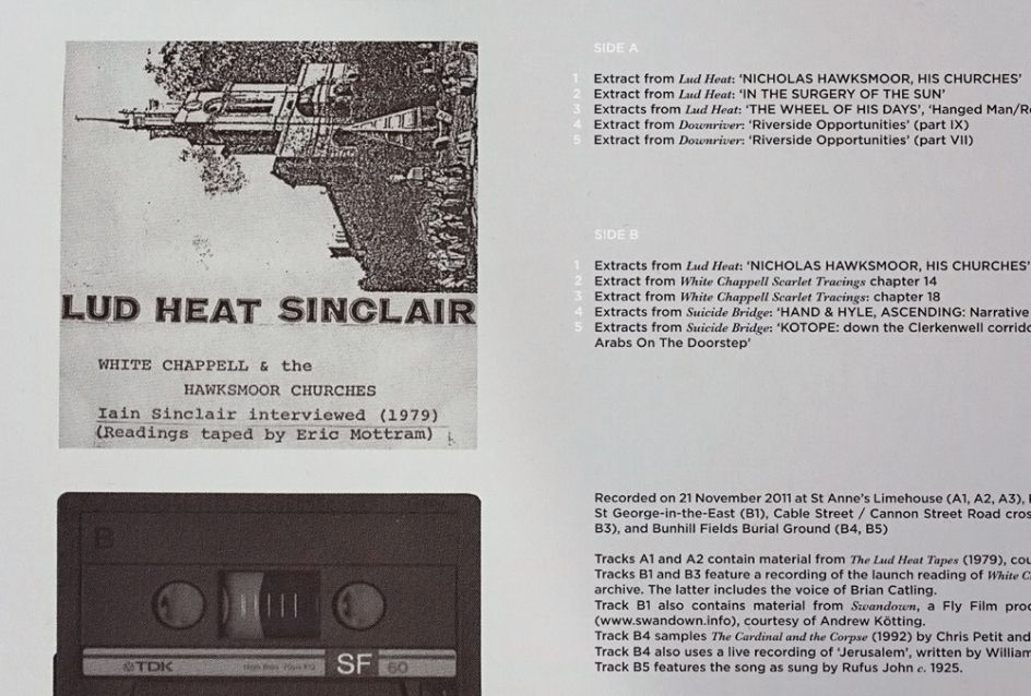
Test Centre
Editor's Picks


Trending


Editor's Picks
Further Reading