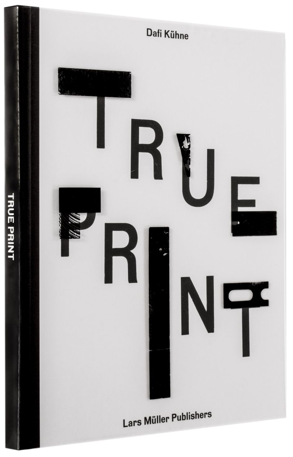
Dafi Kühne's book True Print shows how to merge analogue and digital to stunning effect
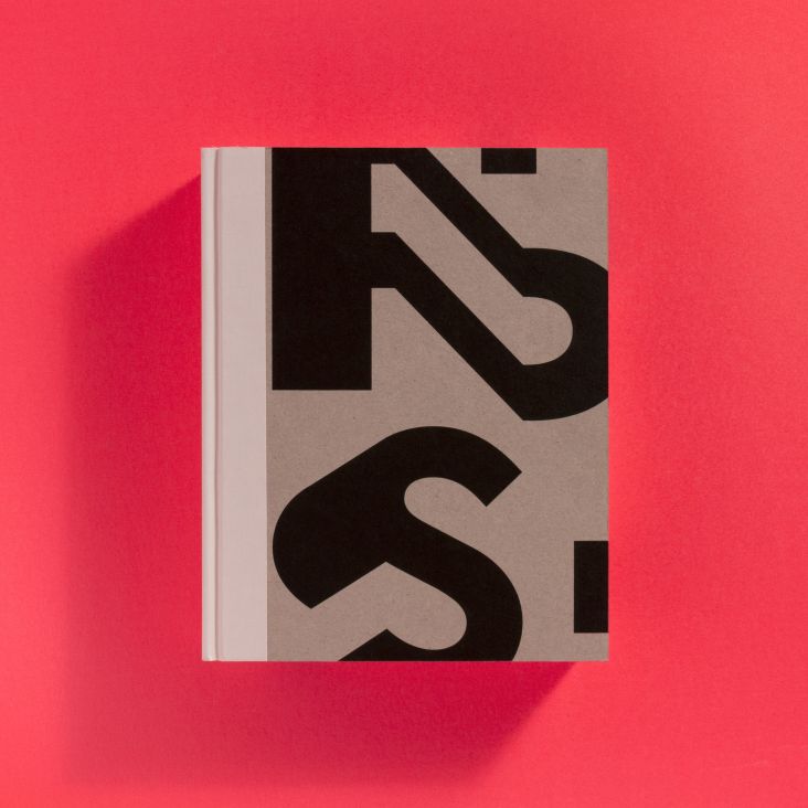
We're longtime fans of Swiss graphic designer Dafi Kühne, who works under the moniker Babyinktwice, and the end of last year heralded the release of his stunning publication True Print.
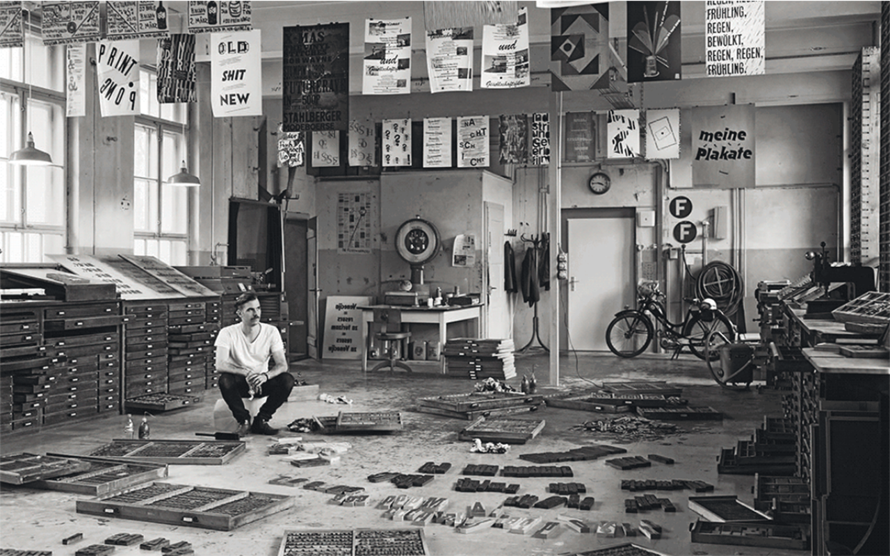
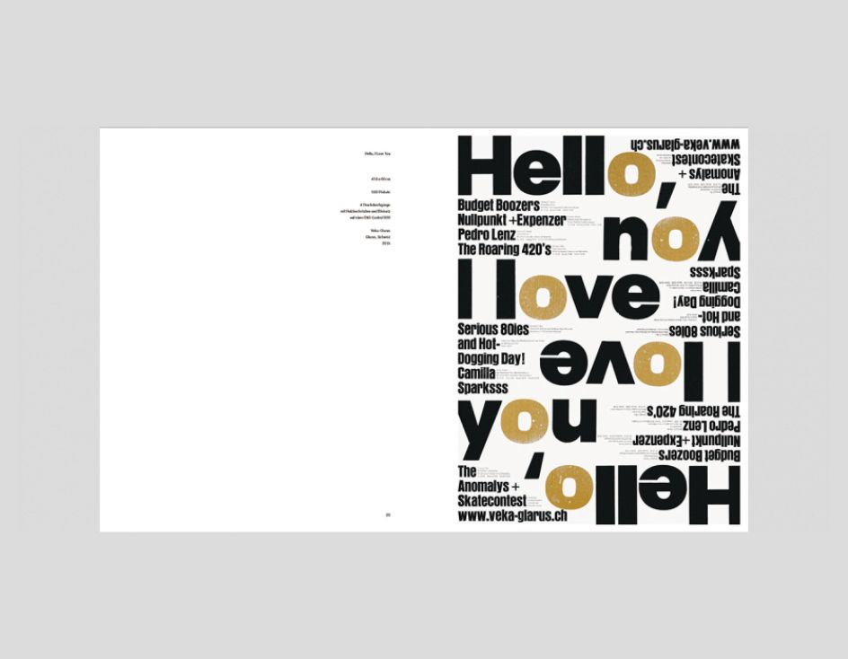
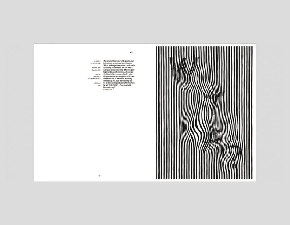
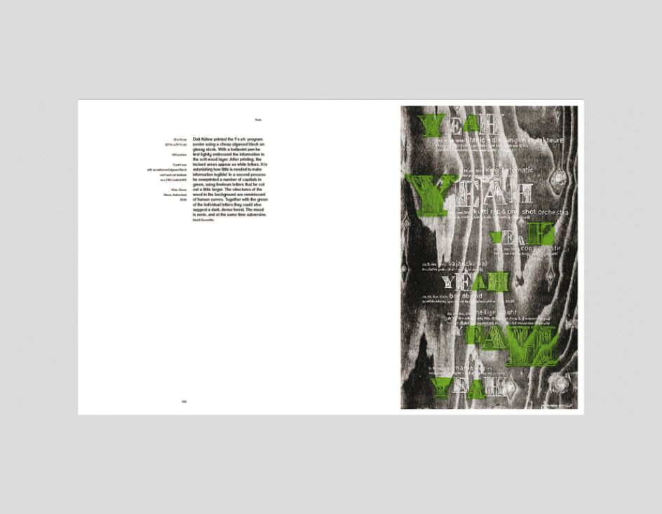
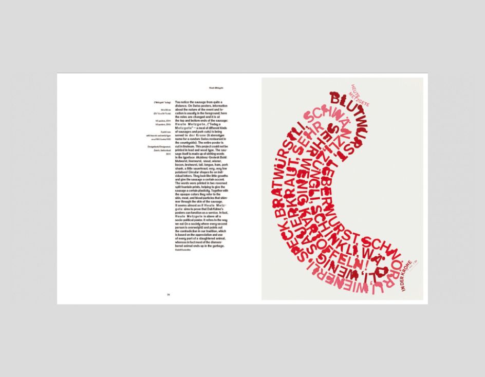
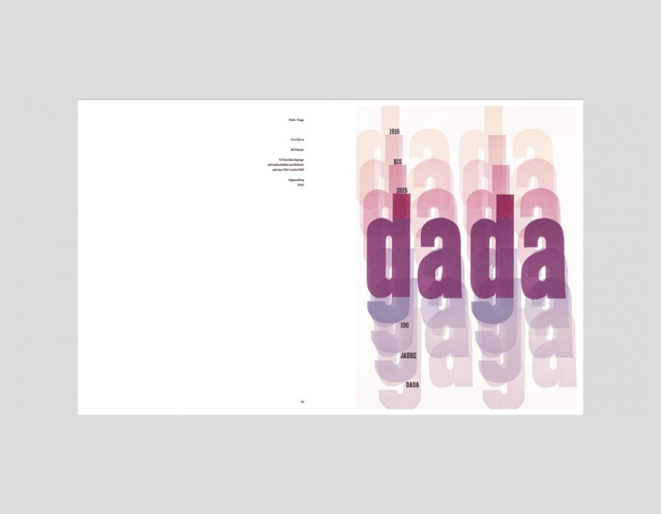
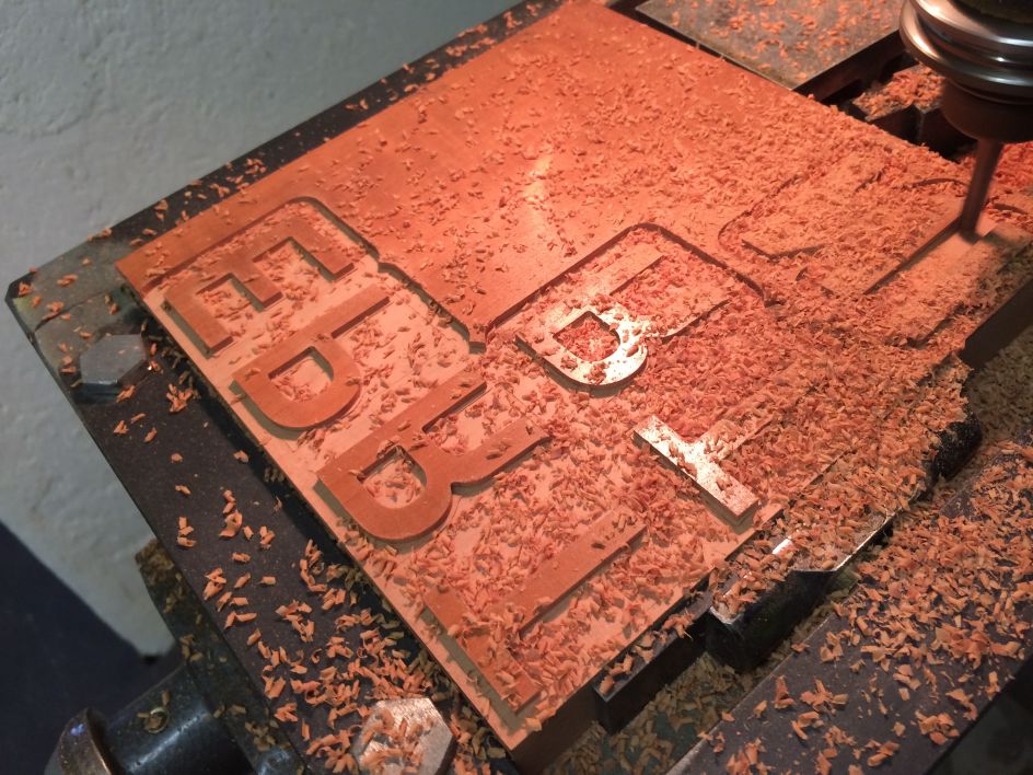
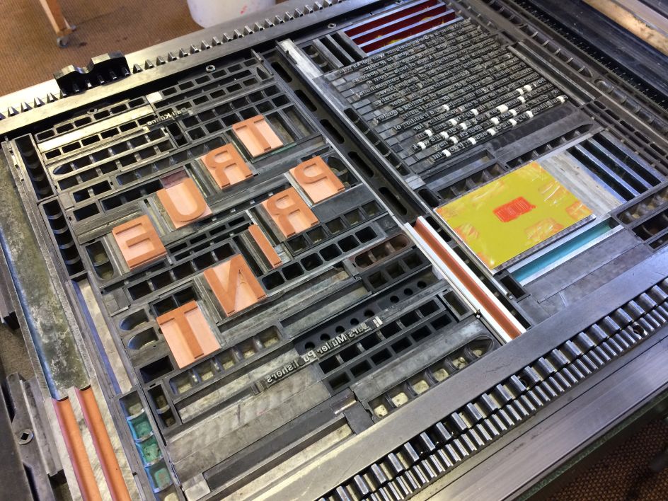
Published by Lars Mueller, the volume showcases Kühne's superb printmaking skills across poster work. These demonstrate a deft ability to experiment with type, colour and layout, and what's most remarkable is that the majority of them are created using analogue letterpress print processes and typesetting, tools that the designer uses alongside digital techniques to create his dynamic and innovative work.
"Dafi always aims to avoid his designer looking in any way 'retro' or 'handmade'," writes Rudolf Barmettler in the foreword to True Print. "He staunchly opposes romanticised, conventional ideas about wood type and cemented composition and refuses to idealise 19th and early 20th Century print technologies. Instead, he seeks out the new potential for digital and analogue design and possible new approaches to and materials for the letterpress process, beyond the familiar metal type, wood type, and linoleum."
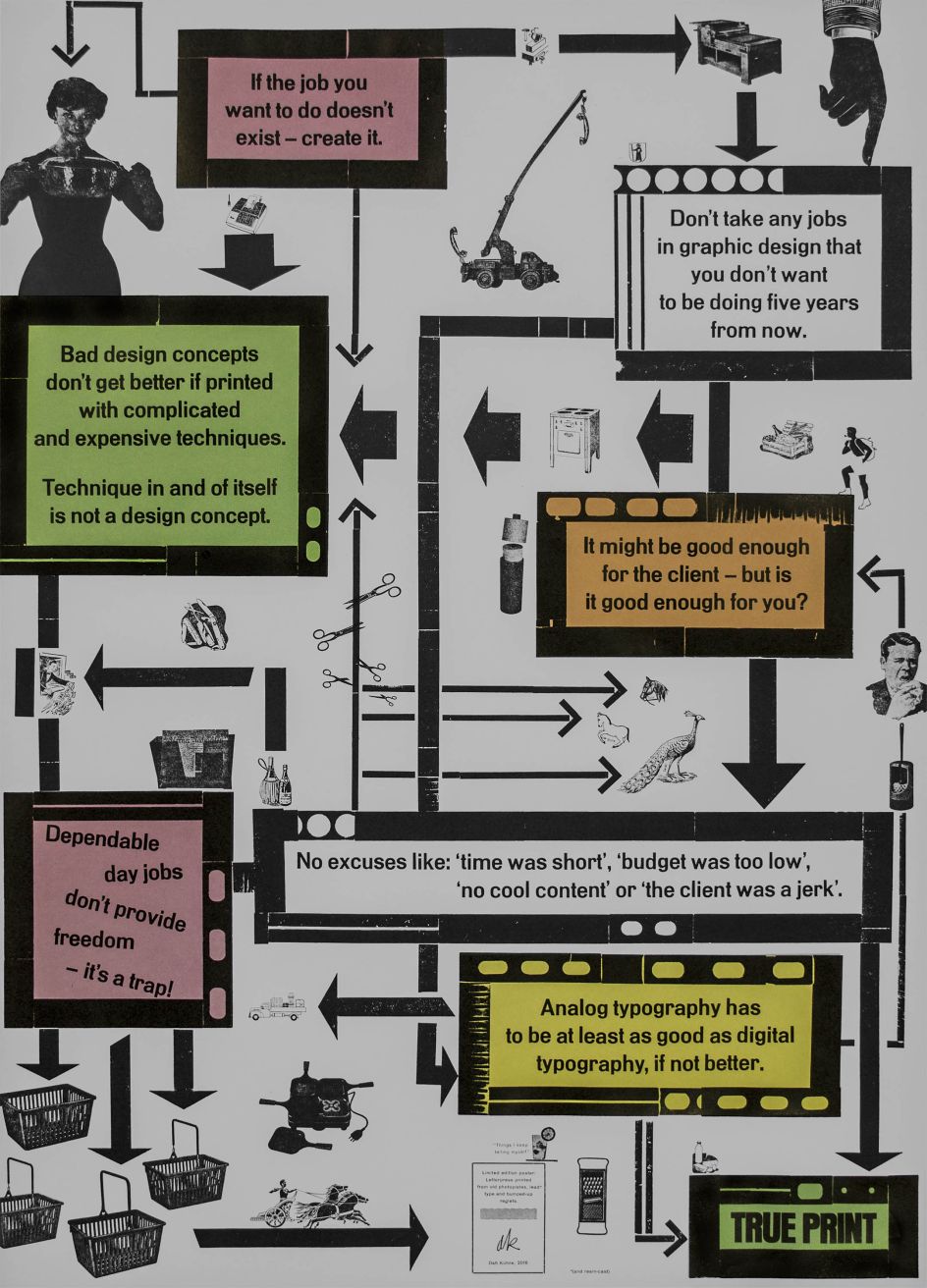
The designer himself is forthright that he is a "designer" rather than a printer: his process is about much more than the physical mechanics of making. "All that counts is the poster's design and impact," he says. "Hardly anyone knows how my poster was made."
The creation of the book itself was not without its challenges. "We faced a huge problem when we started: We had all the posters–printed as physical copies, so we somehow had to have them reproduced to make them printable files. Luckily Museum für Gestaltung offered to make all the high-quality photographs of the posters since they also hold a copy of each of my posters in their poster collection," Kühne explains.
"But then we had RGB files. From that, the lithographer from Lars Müller Publishers worked very hard to make them CMYK + spot colours. Parts of the book have been printed CMYK. Some of the pages had neon pink instead of Magenta. Some of the pages had an extra run of black (a total of two hits of black) to make them dark and intense enough. Some of the pages have been printed in eight colours (CMYK and four neon spot colours). So the lithographer had to photoshop all the colour separation, have the offset printers make proofs of each poster."
Kühne studied visual communication at Zurich University of the Arts, graduating in 2009 and working full-time in my studio designing and printing posters, stationery, brochures and magazines for music, art, architecture, theatre and film projects. For the past six years, he's also taught at various institutions across Europe and the US.
Making True Print
Making True Print
Editor's Picks


Trending


Editor's Picks
Further Reading