Breathing Colour: Hella Jongerius explores our connection to colour at the Design Museum
We see the world in a rich mix of colours but rarely do we appreciate how complex they can be. Colours are often presented to us as chemically optimised and consistent commodities, categorised according to paint charts and standardised colour systems.
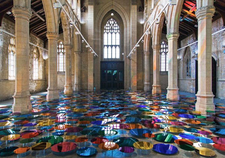
All images courtesy of the artist. Via Creative Boom submission.
Where colours were once produced by mixing pigments into infinite permutations, we now select them according to a name or code on a chart. Acclaimed artist Hella Jongerius argues that these processes of industrialisation have narrowed our experiences of colour and its cultural meanings.
Now, drawing on 15 years of research, Jongerius will present Breathing Colour, an installation-based exhibition at the Design Museum that takes a deeper look at how we relate to colour in a more intimate and personal way.
Featuring a diverse collection of new commissions that explore the effects that light conditions have on our perceptions of colour and form, Jongerius’ ultimate aim is to pit the power of colour against the power of form.
Her research has been inspired by a wide range of sources, including celebrated painters, who recognised and recorded how light affects objects and landscapes. For example, Monet painted the same haystack over and over to document the different colours and atmospheres at different times of the day.
Breathing Colour, which launches on 28 June, creates an exhibition that blurs the boundaries between art and design. Combining intriguing shapes with extensive research; the exhibition questions our preconceptions of colour and embraces its imperfection and experimentation.
She explains: "There is a phenomenon in colourimetry called Metamerism. This was the starting point in my colour research. It occurs when colours are viewed in different conditions, and describes the effect when two colours appear to match even though they might not actually do so.
"I think everyone once bought a piece of furniture or clothing in a certain colour and experienced a shock when unpacking it back home. Most companies see the effect as problematic and try to avoid it, and produce colours that attempt to eliminate it. But I want to make a plea for embracing Metamerism. As a designer, I want to make a plea for plastics, varnishes and paints to use layered pigments that provide intense colours that are allowed to breathe with changing light."
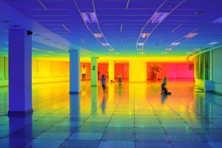
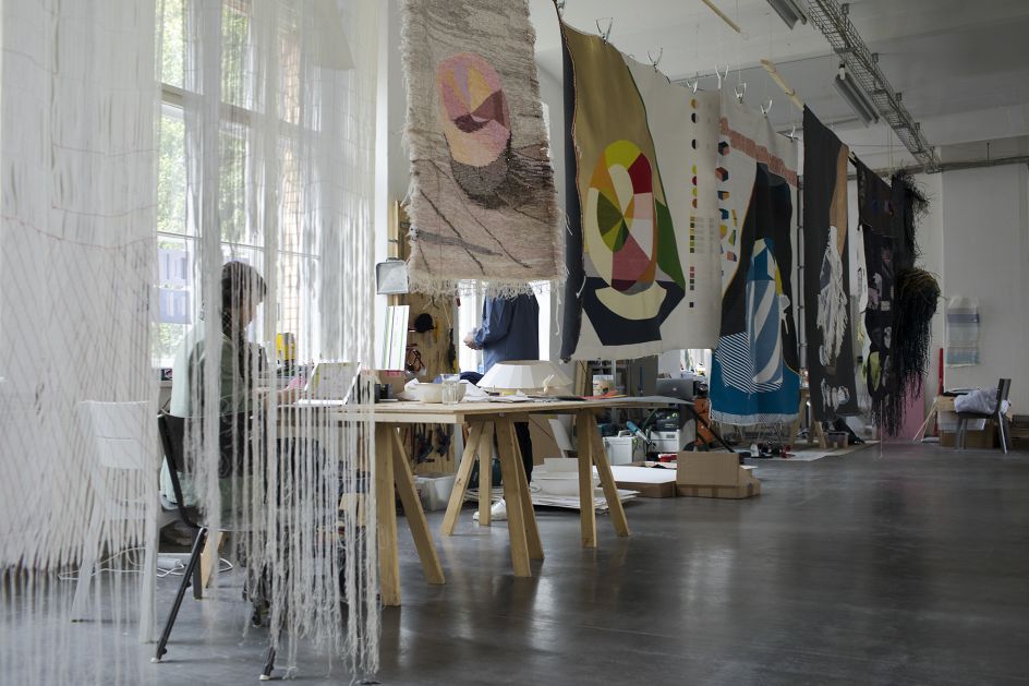
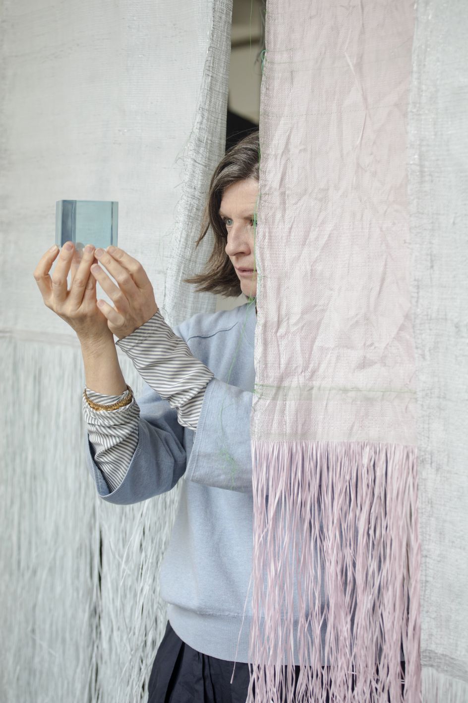
If you get a chance to visit the exhibition this month, you'll see that it's divided into separate spaces that simulate daylight conditions at specific times of the day – morning, noon and evening. These three phases explore the impact of changing daylight on our perception of colour. Each installation includes a series of three-dimensional objects as well as textiles, some of which are hand-woven while others are produced on industrial looms.
The Morning section of the exhibition explores the differences between lightness and brightness and the hazy feeling of waking up. A series of hanging translucent and semi-translucent beads are illuminated, with reflections becoming fragmented and mimicking the intense and crisp colours created by the cold morning air.
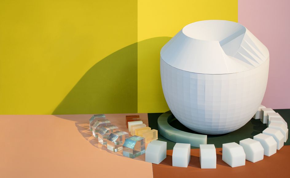
Both the circular Crystal Stones and hanging Crystal Beads explore how colour changes as light passes through them. When light travels from one material to another it changes speed, allowing it to be separated into its seven constituent colours – red, orange, yellow, green, blue, indigo and violet.
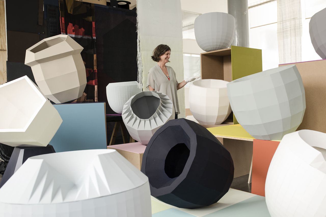
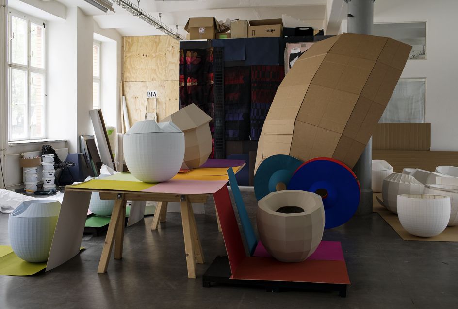
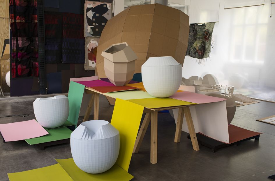
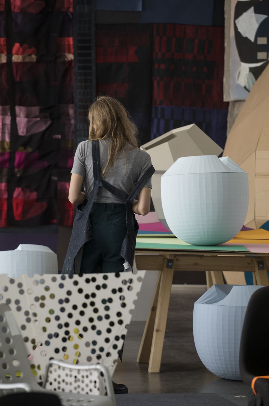
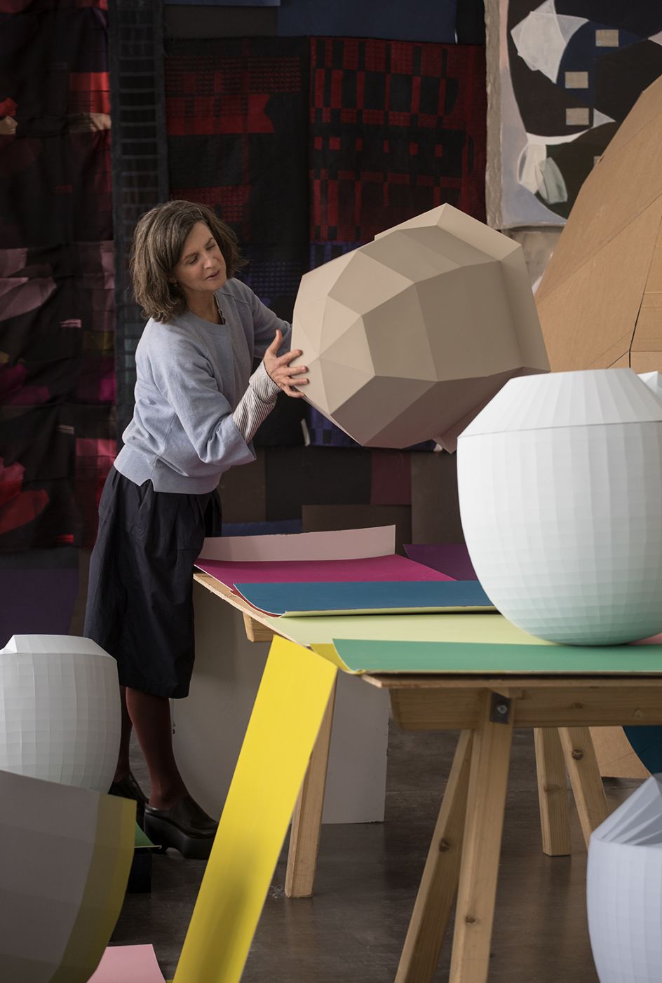
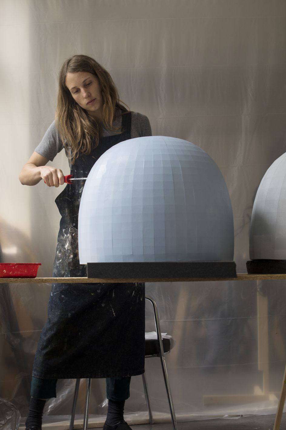
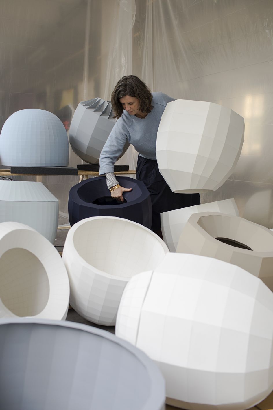
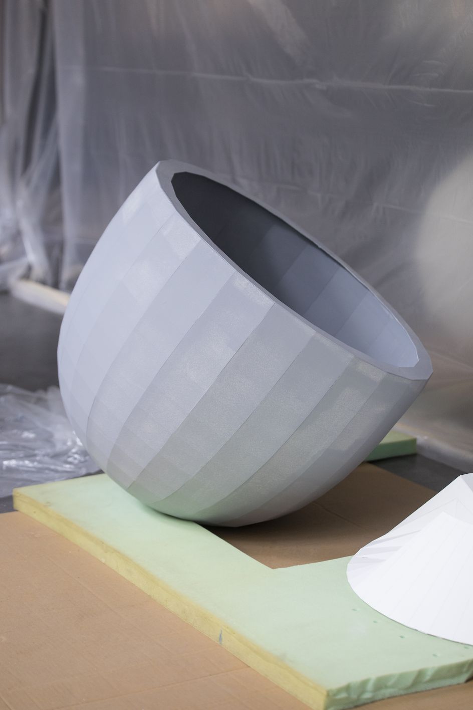
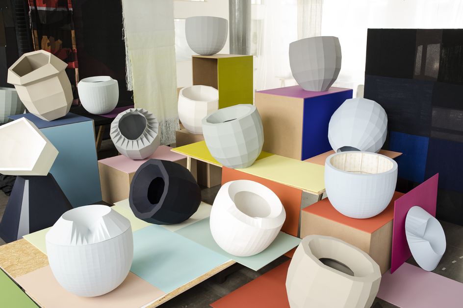
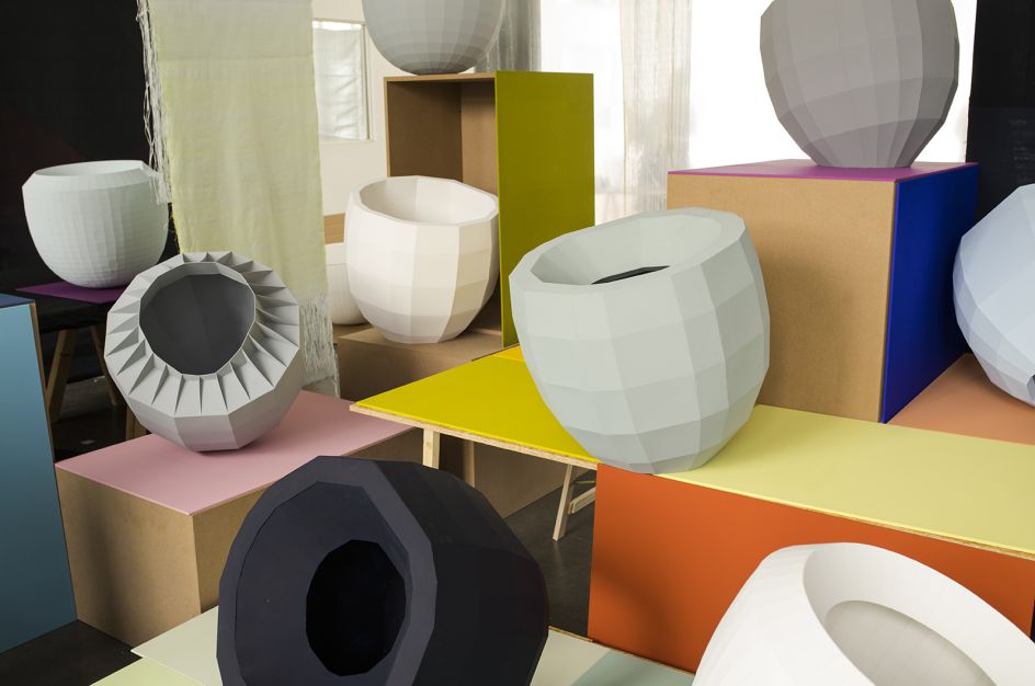
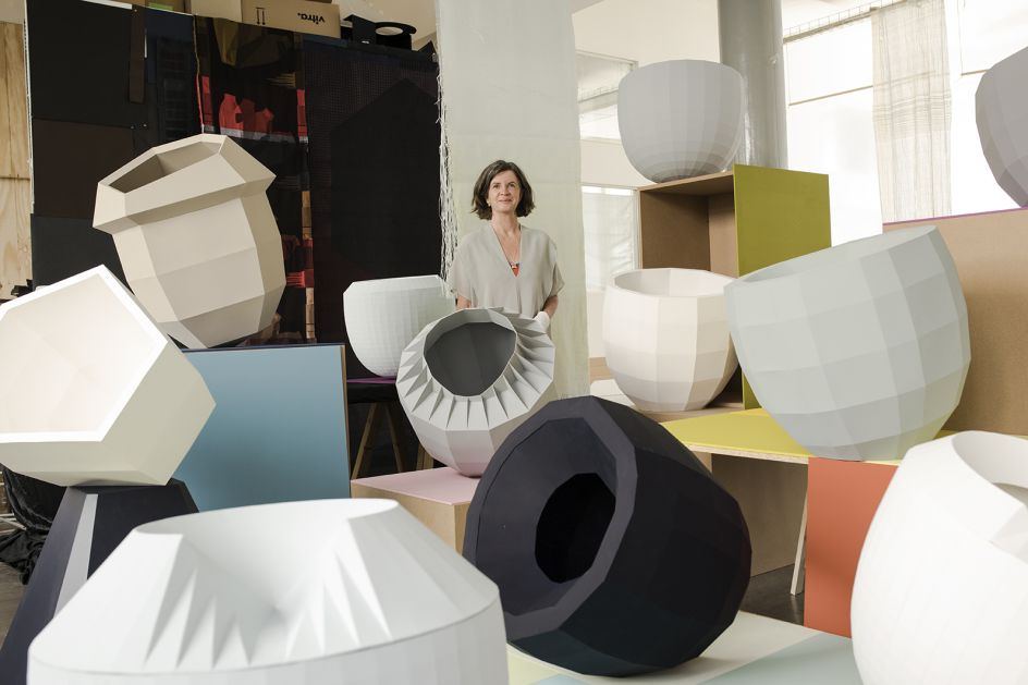
A series of three-dimension objects – that Jongerius describes as Colour Catchers – are used throughout the exhibition. They have been specially designed as an aide to study and understand colour. Created by folding and glueing complex cardboard patterns, the convex faceted surfaces absorb and reflect nearby colours. They become a three-dimensional colour chart, revealing gradations of the objects base colour mixed with reflections of other nearby colours.
Jongerius adds: "The Colour Catchers are an abstraction of all the daily objects that surround us. They are designed as the ultimate shape to research colour, shadows and reflections. They are my canvases. The folding acts as a shift between two different colours, it turns the form of an object into a generator of new colour tones."
As the sun reaches its highest point in the sky, the intensity of daylight is at its strongest. The sharp light from above casts strong shadows and stark contrasts. In the Noon section, the shape and colour tones of the exhibits become sharp and bright.
Grey Colour Catchers are displayed on bright surfaces. This enables multiple colours to be seen across its faceted surfaces despite, in actuality, remaining grey. Lighting projections create sharp shadows and transition the visitor from the haze of early morning to the intensity of midday.
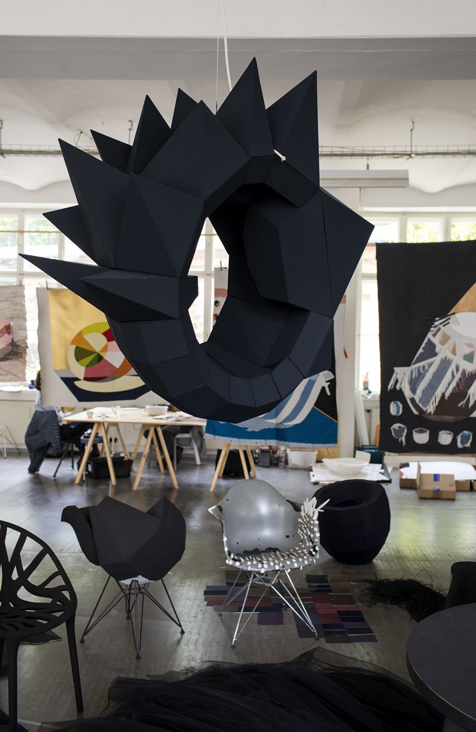
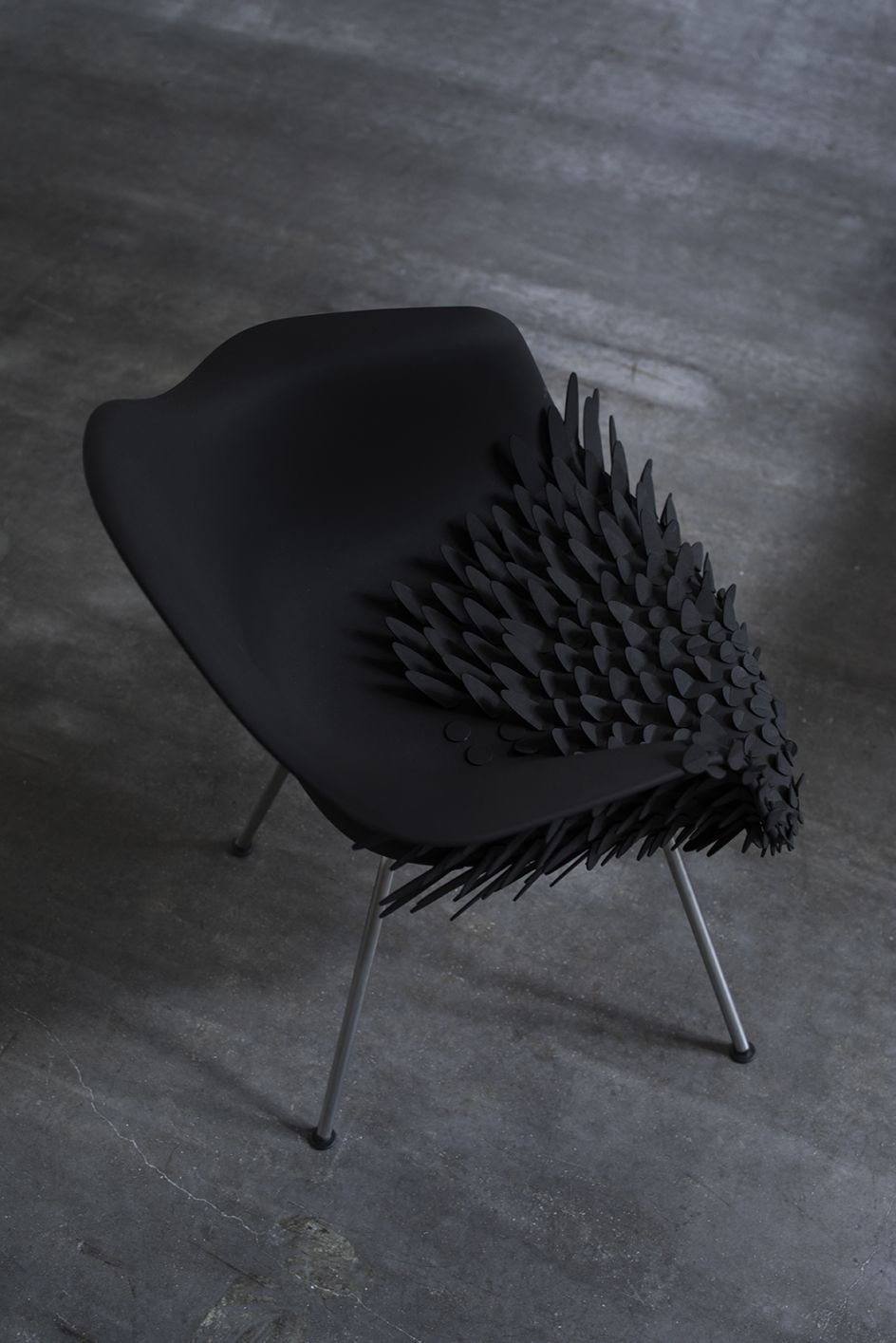
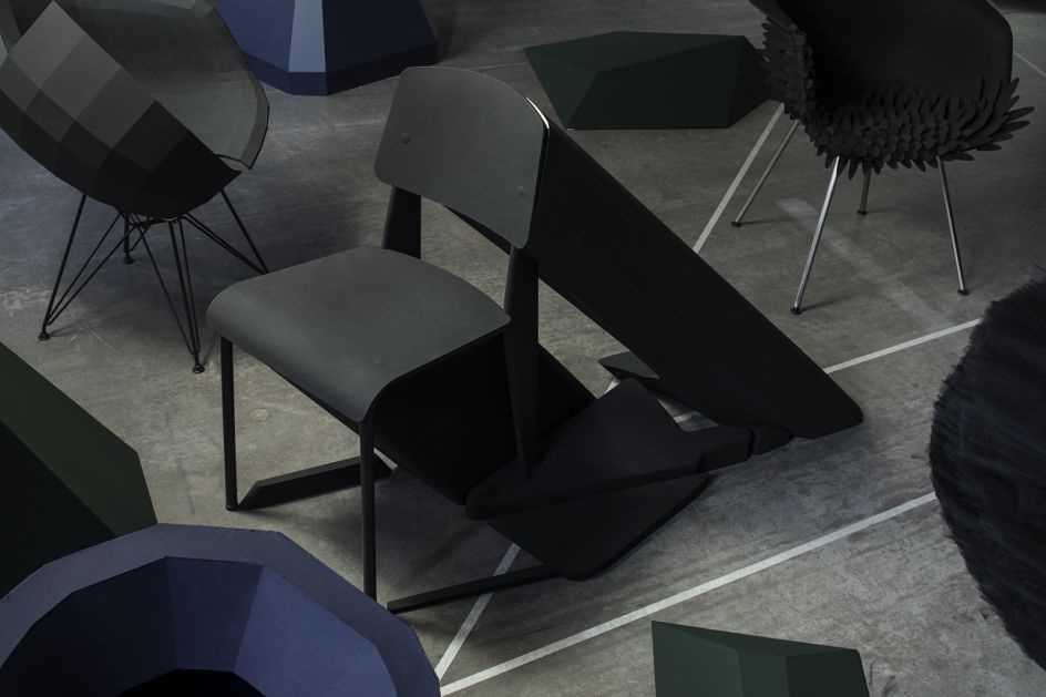
The Evening element of the exhibition provides a very different experience. As the day draws to a close and sunlight moves downwards, shadows play a more crucial role in our perception of colour.
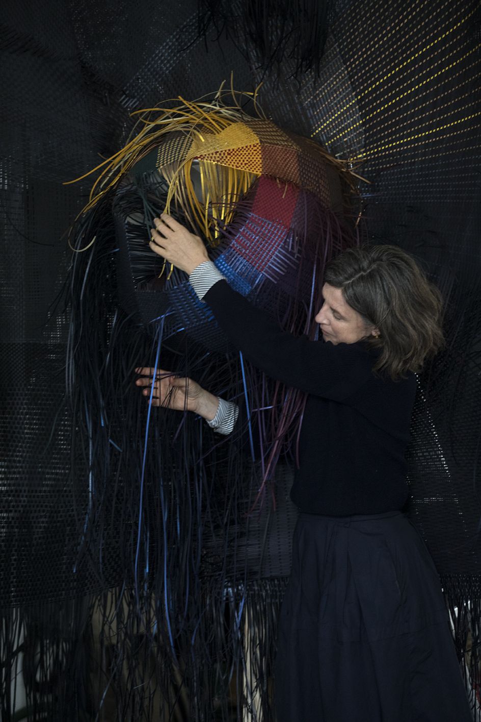
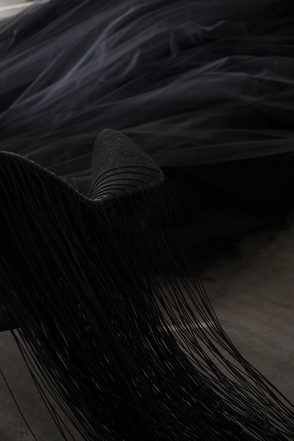
The nature and colour of shadows are explored using famous furniture designs by Charles and Ray Eames, Jean Prouve and Verner Panton. The shadows cast by this collection of furniture have been materialised and shown as physical shapes, made up of unusual textures, materials and colours.
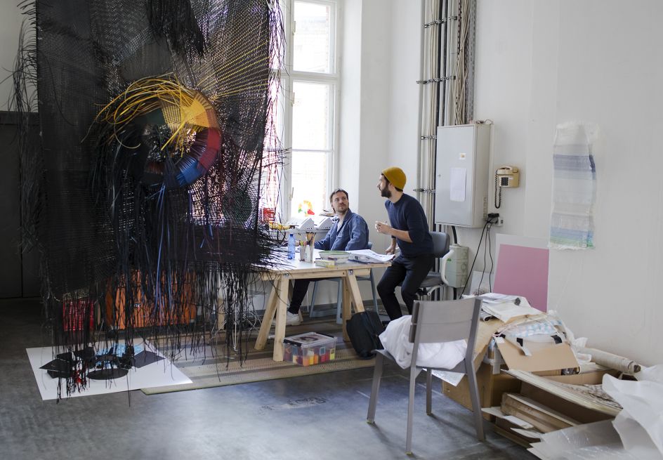
Large-scale textiles experiment in creating black tones without the use of black materials. Woven from woollen, linen and cotton threads, these textiles are an extension of Jongerius’ previous research into the colour black, and her rejection of the standard industrial approach of adding carbon to colours in order to darken them.
The textiles demonstrate how it is possible to create a larger range of colours and hues by optically mixing from a limited palette of coloured yarns. By weaving in several materials, with different textures and finishes, these textiles produce a range of vibrant colours as well as a spectrum of rich and varied blacks.
Running the length of the gallery is the Woven Movie, a series of hanging textiles that use varying colours, materials and designs to reinterpret the repetitive image of the Colour Catchers. Using a range of fabrics and techniques; the image shows the changing nature of the object through the different phases of the day.
Each of these 10 woven textiles, depicts a Colour Catcher at different times of the day. The textiles can be viewed individually but also as a sequence of still frames in an animated movie.
The Woven Movie is a continuation of the work pioneered by the German textile designer and printmaker Anni Ablers. Developed during her time at the Bauhaus, Albers’ work endeavoured to find new weaving solutions that could be produced and applied at a large industrial scale.
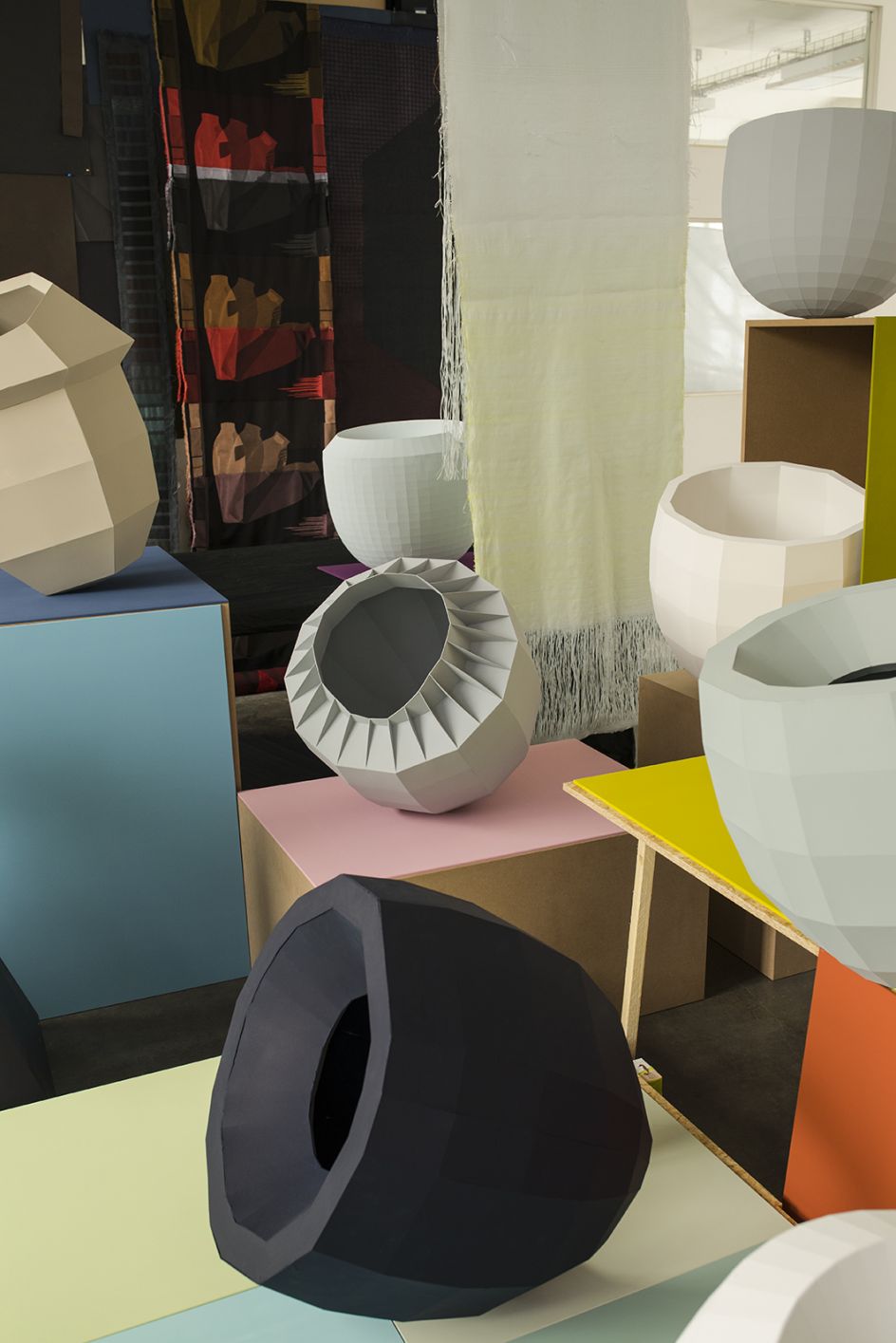
Colour Vases (series 3), a series of 100 unique vases orientated in a circular display, will be one of the existing works from the JongeriusLab archives included in the exhibition. Manufactured in 2010, the installation was part of the studio’s research into minerals and oxides; a technique no longer used because of its inability to produce stable colouring.
The lacquering of the vases with copper oxides results in a green colouring, the combination of cadmium and zirconium creates orange, tin oxides with iron produce beige and the manganese dioxide enriched lacquers develop purple tones.
Breathing Colour by Hella Jongerius will go on display at the Design Museum from 28 June until 24 September 2017. All photography by Roel van Tour.
Editor's Picks


Trending


Podcasts


Editor's Picks
Further Reading