A risqué and smart identity for the Easy Access concert series by Maximilian Mauracher
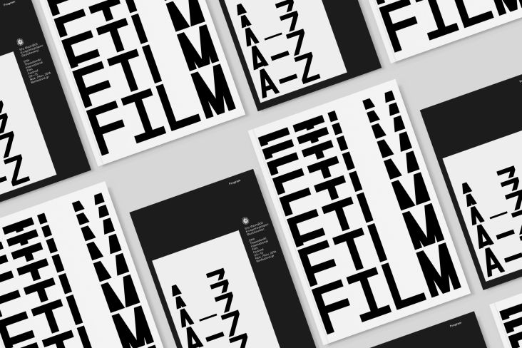
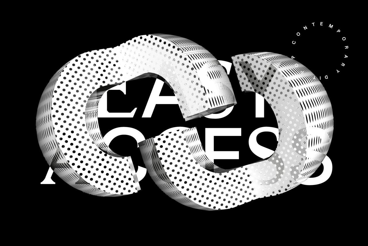
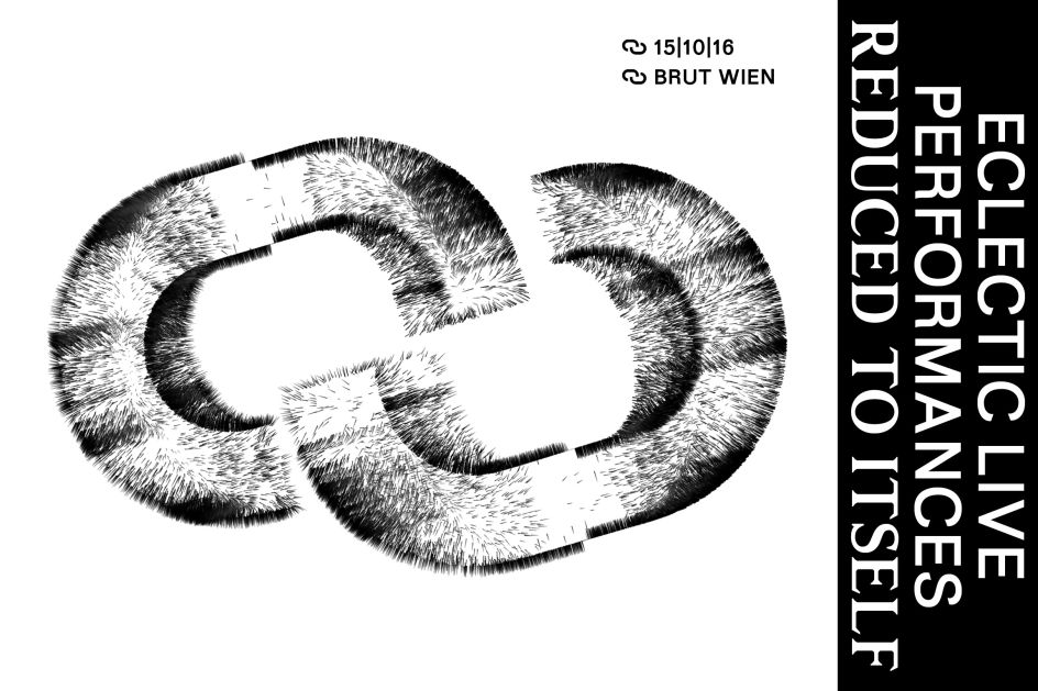
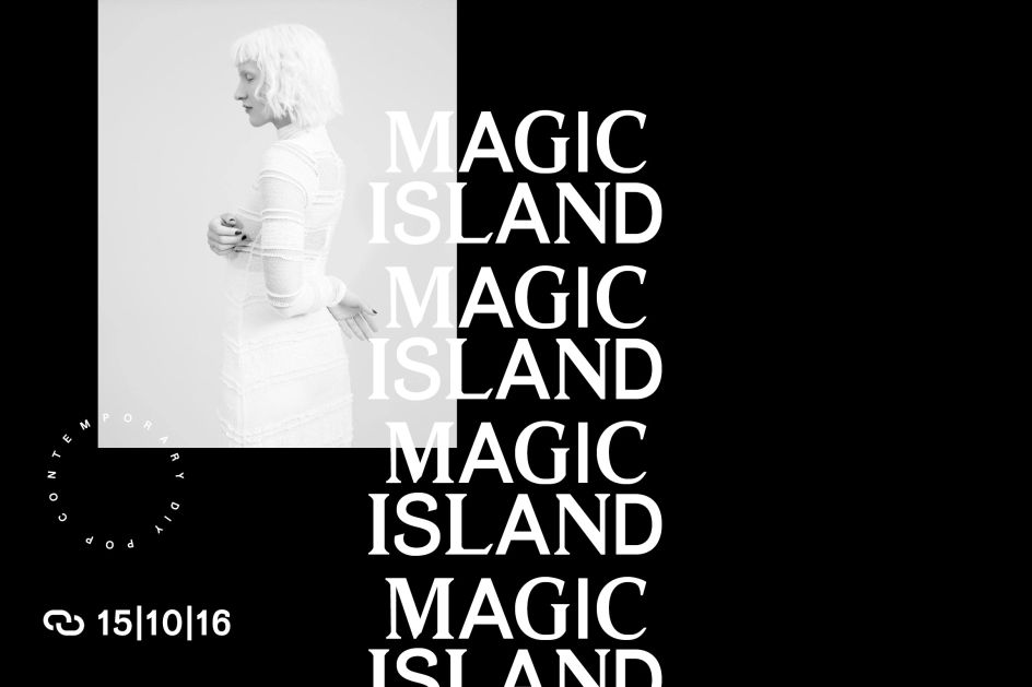
Vienna and "sometimes Berlin"-based art director and artist Maximilian Mauracher took a slightly cheeky approach in creating this superb visual identity for Easy Access, a concert series held at Brut Wien late last year.
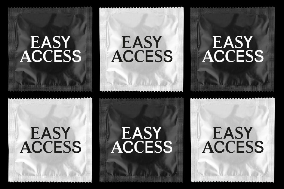
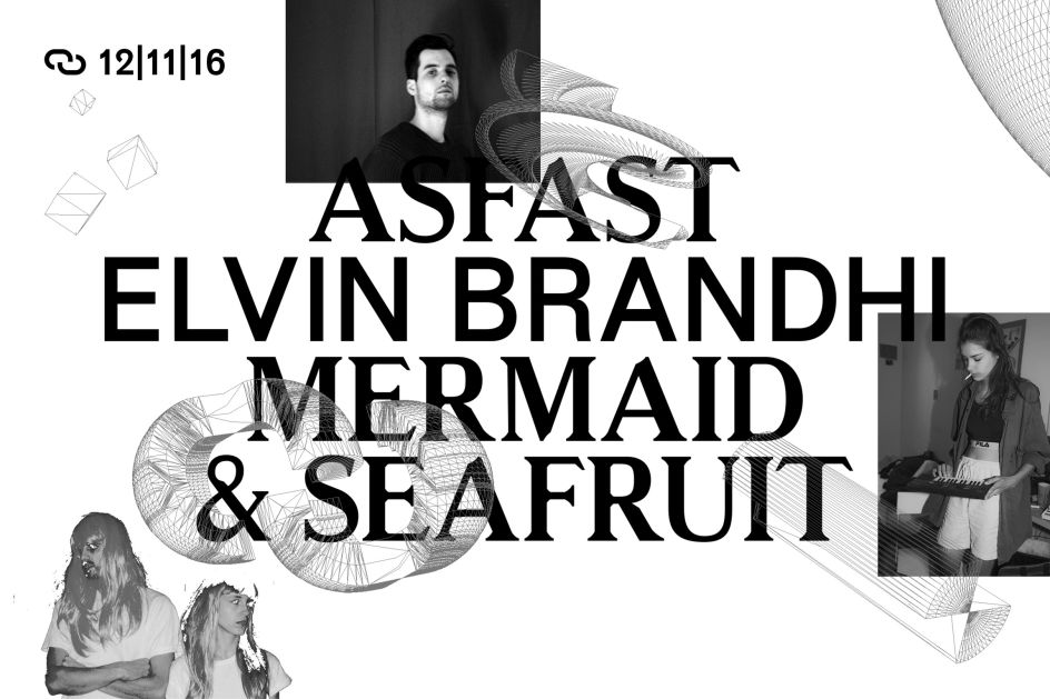
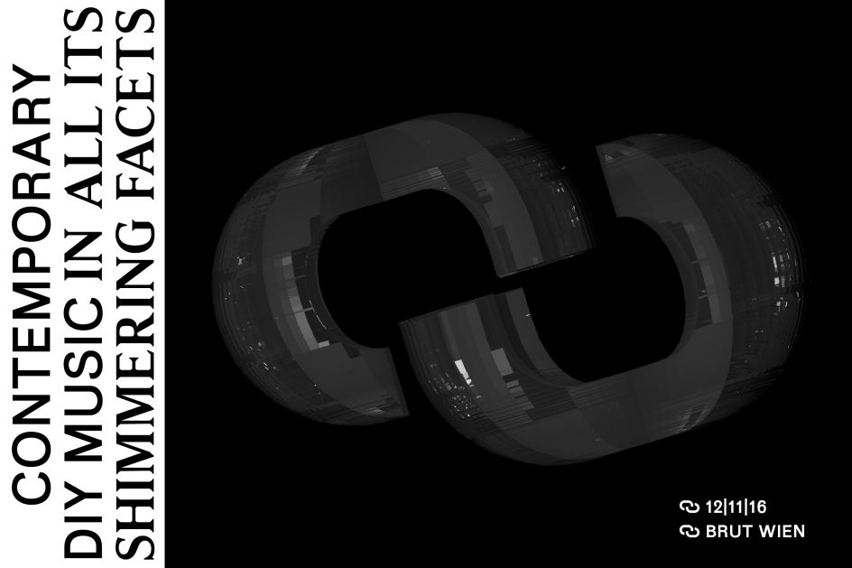
In one application, his apprach takes the name of the series into saucy territory by displaying typography within a series of mocked-up condom wrappers, and elsewhere the look draws on a 90s net art feel that manages to tread the line between deliciously trendy graphics and branding that fits a client brief perfectly.
The system uses a monochrome palette and typefaces Rasmus and Mériva (by type designers New Letters ), combining the letterforms in unexpected ways that make for an entirely original and beautifully executed identity.
Editor's Picks


Trending


Editor's Picks
Further Reading