A new identity for Abbey Road Studios heralds a new era for the world famous icon
Abbey Road Studios is not only the most famous recording studios in the world, but it’s also a global music icon. Uniquely, it is just as famous among music fans as it is among music professionals because of its exalted alumni.

Via Creative Boom submission. All images courtesy of Form
But the evolving landscape of the music industry has meant that the Studios needed to look to the future to meet the changing needs of music creators on a global scale, from professional music makers to music fans alike. And that meant a reshape of its business along with a brand new look.
Abbey Road commissioned London-based design studio Form to help with its repositioning strategy and to create a new visual brand identity to connect with a wider audience. Form was chosen because of its extensive knowledge in both design for music and large scale branding, having worked with hundreds of bands including Elbow and Depeche Mode and rebrand projects such as Reading & Leeds and Latitude festivals.
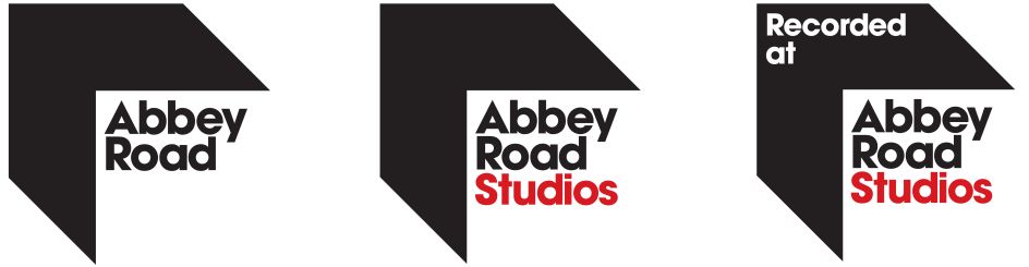
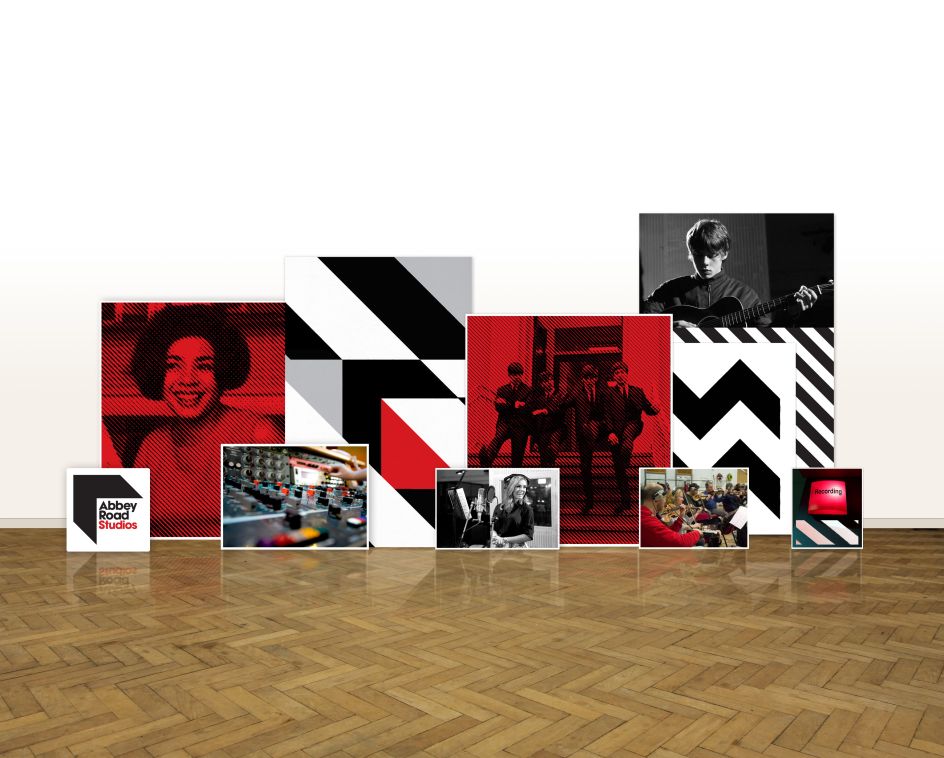
Form explained: "The need for a clear branding hierarchy to allow the development of future initiatives was identified. We achieved this by differentiating ‘Abbey Road’ from ‘Abbey Road Studios’: ‘Abbey Road’ now sits as the parent brand at the top of the hierarchy. ‘Abbey Road Studios’, the physical embodiment - the heart and home of the brand - becomes a newly defined sub-brand, as does the new education wing - ‘Abbey Road Institute’ together with other new sub-brands which will offer services and products to a wider audience of music makers and fans."
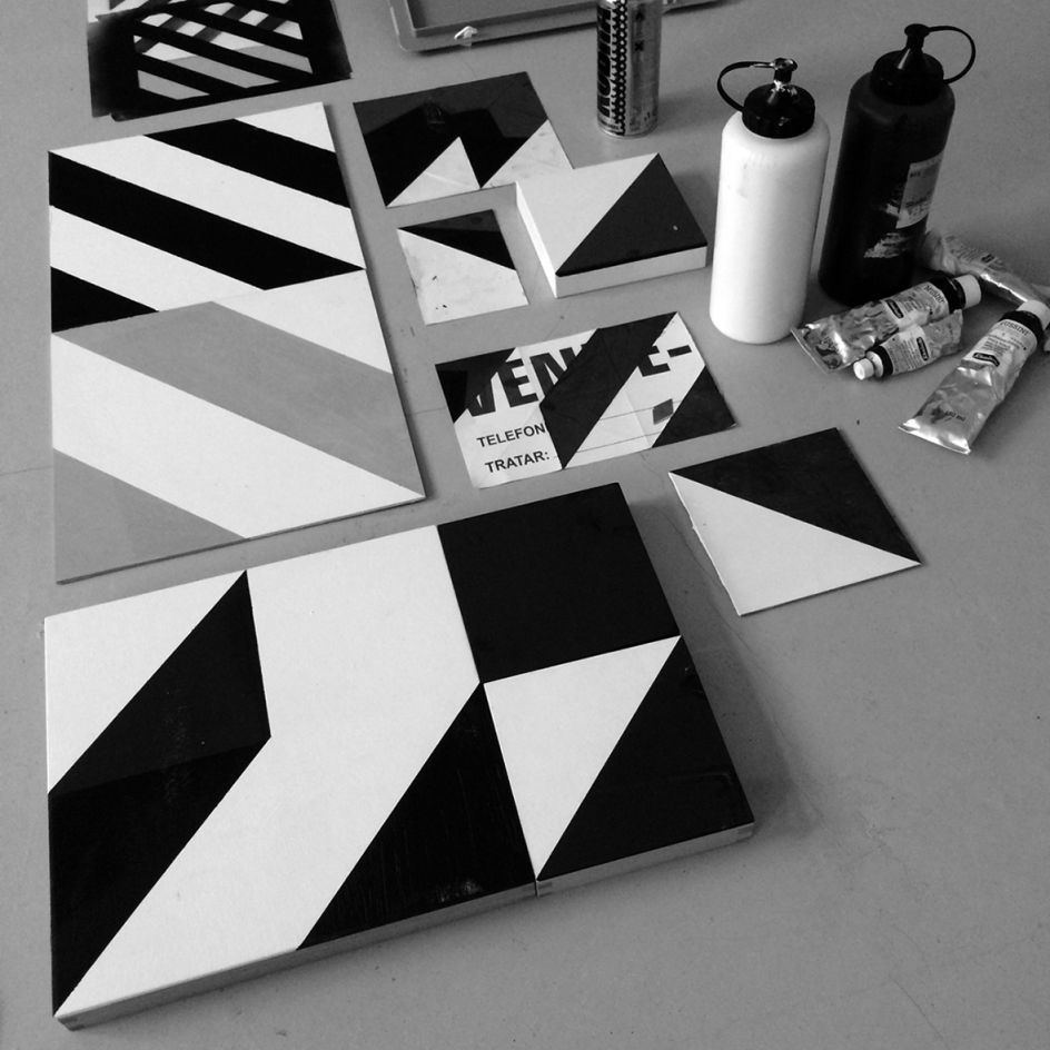
Speaking of the visual hook, Form said: "It is impossible to separate the connection between The Beatles and the Studios which was cemented with the release of the Abbey Road album in 1969. The album’s cover features the now-iconic shot of the band on the zebra crossing outside the Studios. Google ‘Abbey Road’ images and it pops up on your screen, repeated hundreds of times.
"Rather than ignore the crossings’ black and white stripes, we decided to deconstruct and re-imagine it to celebrate a new era for Abbey Road."
The parent and sub-brand logos are based around one black stripe moving across a three-dimensional plane to form a directional arrow or ‘chevron’. It points North West indicating Abbey Road Studios’ location within London and is also suggestive of the distinctive parquet flooring prevalent throughout the famous recording Studios complex. As the logo becomes more well known, the chevron shape will develop to be used as a container for other imagery as well as moving image.
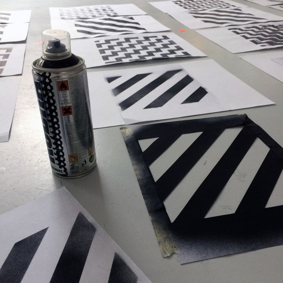
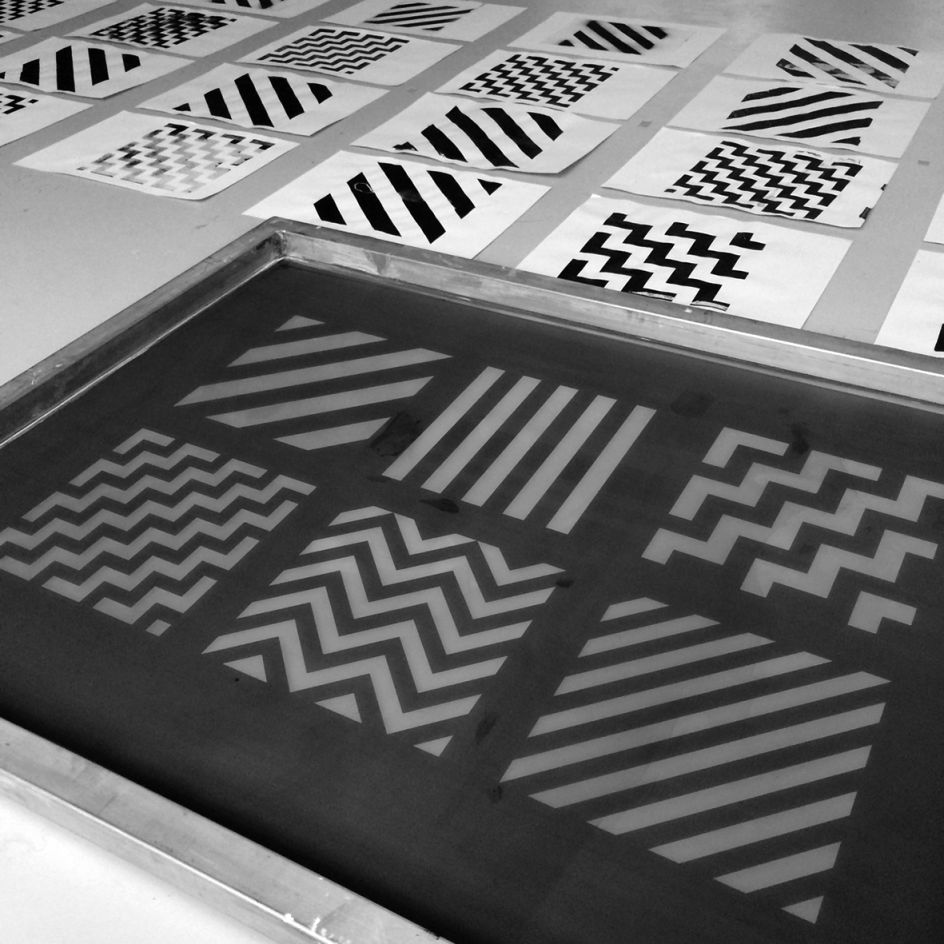
Form commissioned internationally renowned graphic artist Patrick Thomas to create a series of patterns which re-interpret and re-imagine the black and white stripes of the zebra crossing and which also feature the chevron and the new red sub-brand colour. These patterns will be used across all communications. The slightly painterly, handcrafted works hint at the craft ethic that underlies all that happens at Abbey Road.
Editor's Picks


Trending


Editor's Picks
Further Reading