Humpty Dumpty Brewery: Off the wall tasty brand identity by The Click
Located in Reedham – a small village in the heart of the Norfolk Broads – Humpty Dumpty Brewery is a microbrewery, delivering award-winning cask and bottled real ales to pubs and retail stores across East Anglia. When it came to a refreshed brand identity, Humpty Dumpty called upon the design skills of The Click, a studio based in Norwich run by husband-and-wife team Bobby and Fiona Burrage.
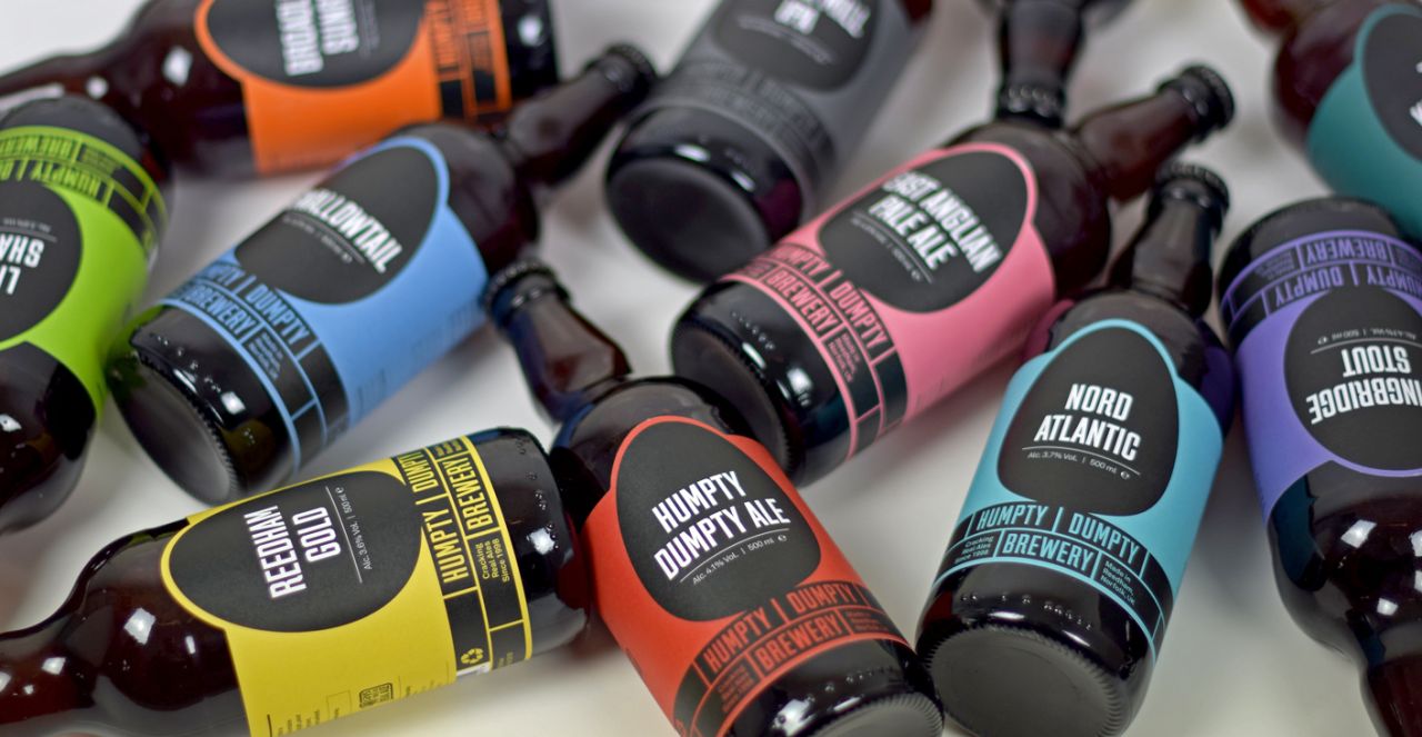
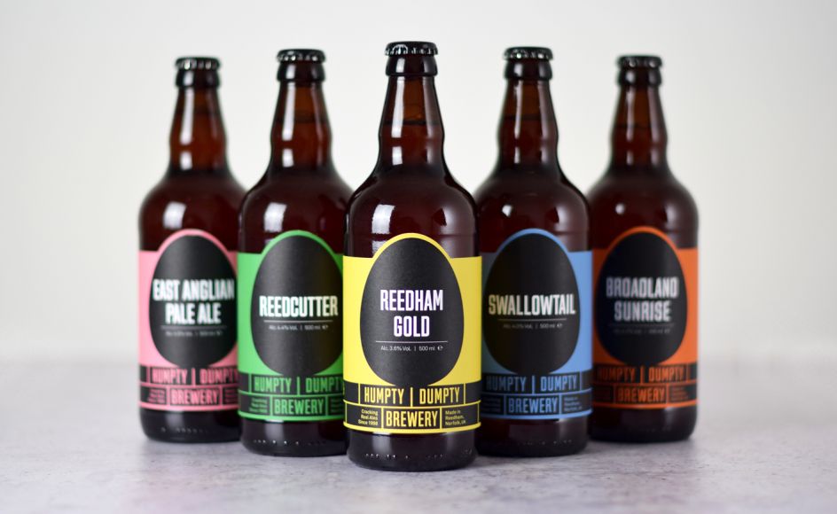
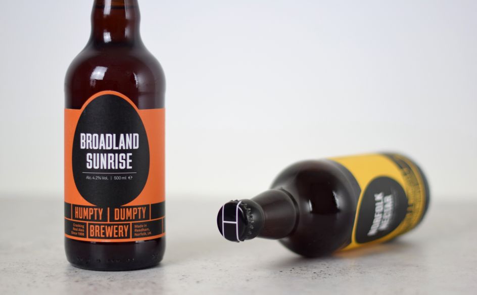
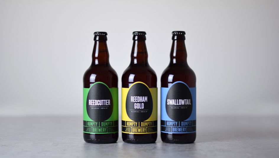
The pair explained: "We were appointed to rebrand the brewery and design new packaging and pump clips. The client wanted to shed their local, traditional and quaint ‘homemade’ identity which incorporated a range of paintings and illustrations, as well as a mix of typefaces. The new design is bold, iconic and confident – providing a solid foundation to continue building upon their growing reputation. It features a spectrum of colours, one for each beer, coupled with a base colour of matt black.
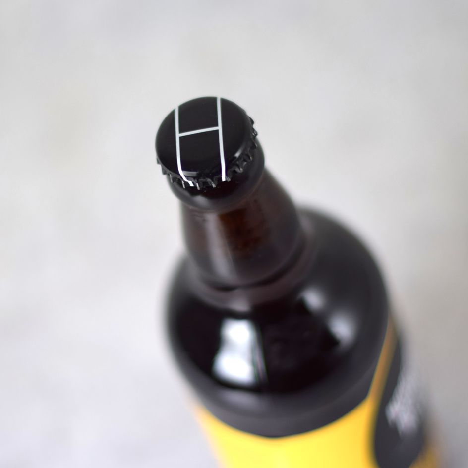
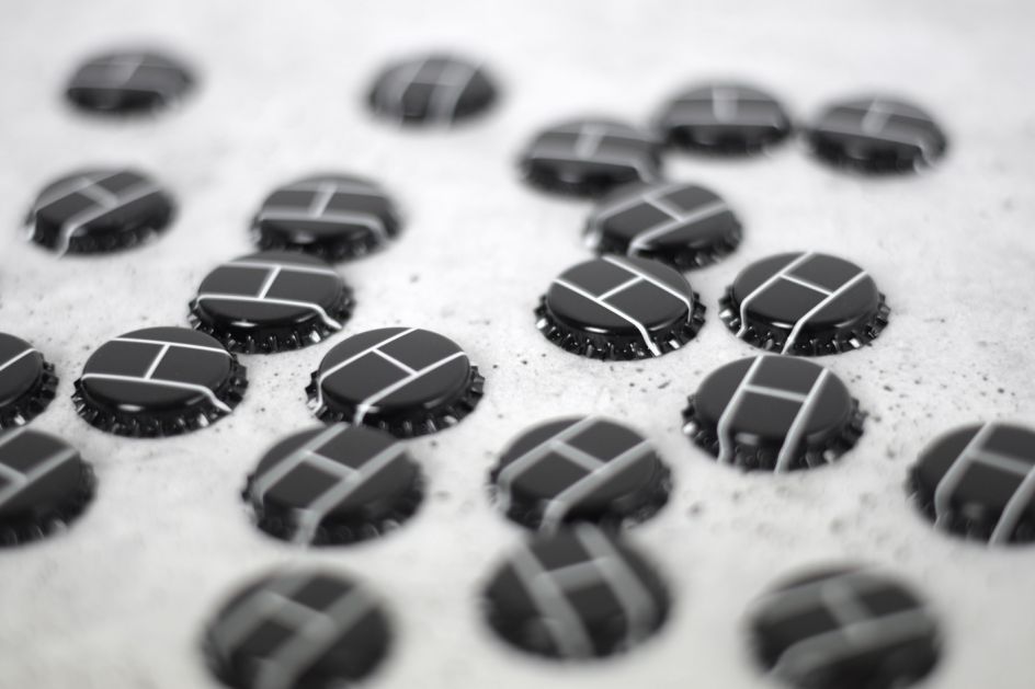
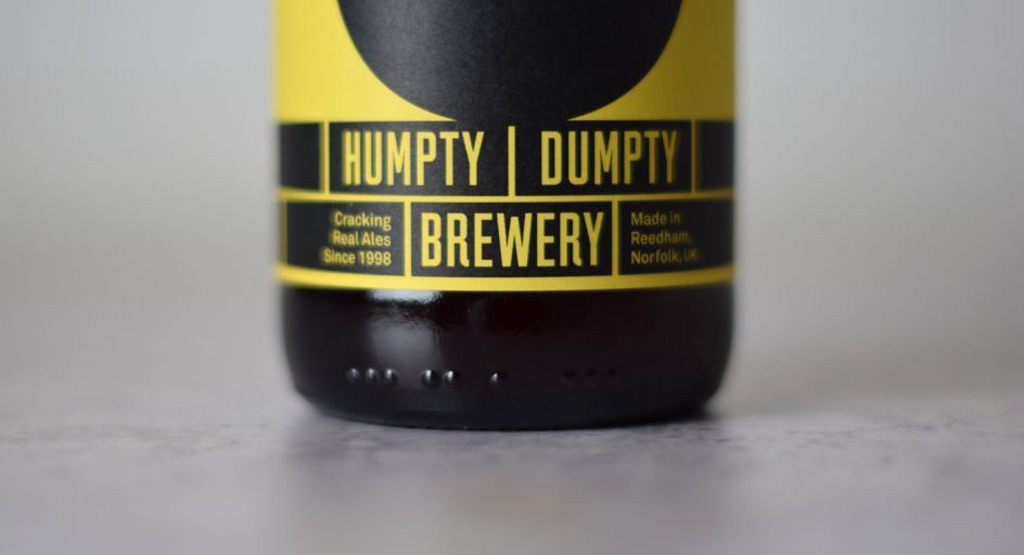
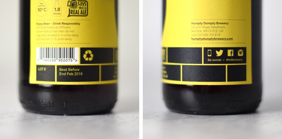
"The new design scheme is entirely influenced by the brewery’s name – from top to bottom. The bottle cap references a wall, detailing the joining of bricks, whilst the negative space between the blocks create an ‘H’ for Humpty Dumpty. The brand logo is reversed out of a graphic brick wall at the base of the bottle. And, sitting on top of that, the Humpty Dumpty egg-shaped lozenge accommodates the name of the respective beer – set in a bold condensed display typeface. The back of pack also utilises the modular brick graphics – even down to the positioning of the barcode."
To discover more work from The Click, visit www.theclickdesign.com.
Editor's Picks


Trending


Podcasts


Editor's Picks
Further Reading